A DESIGN WORLD
How Designer Holly Valentic Spins Tradition On Its Axis
Holly Valentic
Sunnita West
In a digital world, it is rare one picks up a book when to answer their question. Some may even argue that the art of real research, is a dying skill.
However, designer Holly Valentic has challenged this notion, spinning tradition on its axis and exploring a fresh and innovative approach.
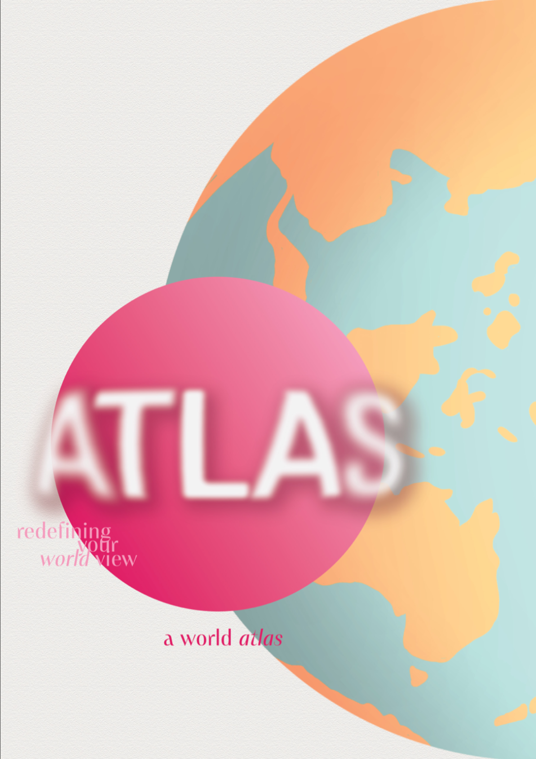
"I needed to redefine how we view an Atlas – not as a dull and monotonous mammoth of a book – but as a fun, interesting and educational piece of material."

IDEAS AND THEIR ROOTS
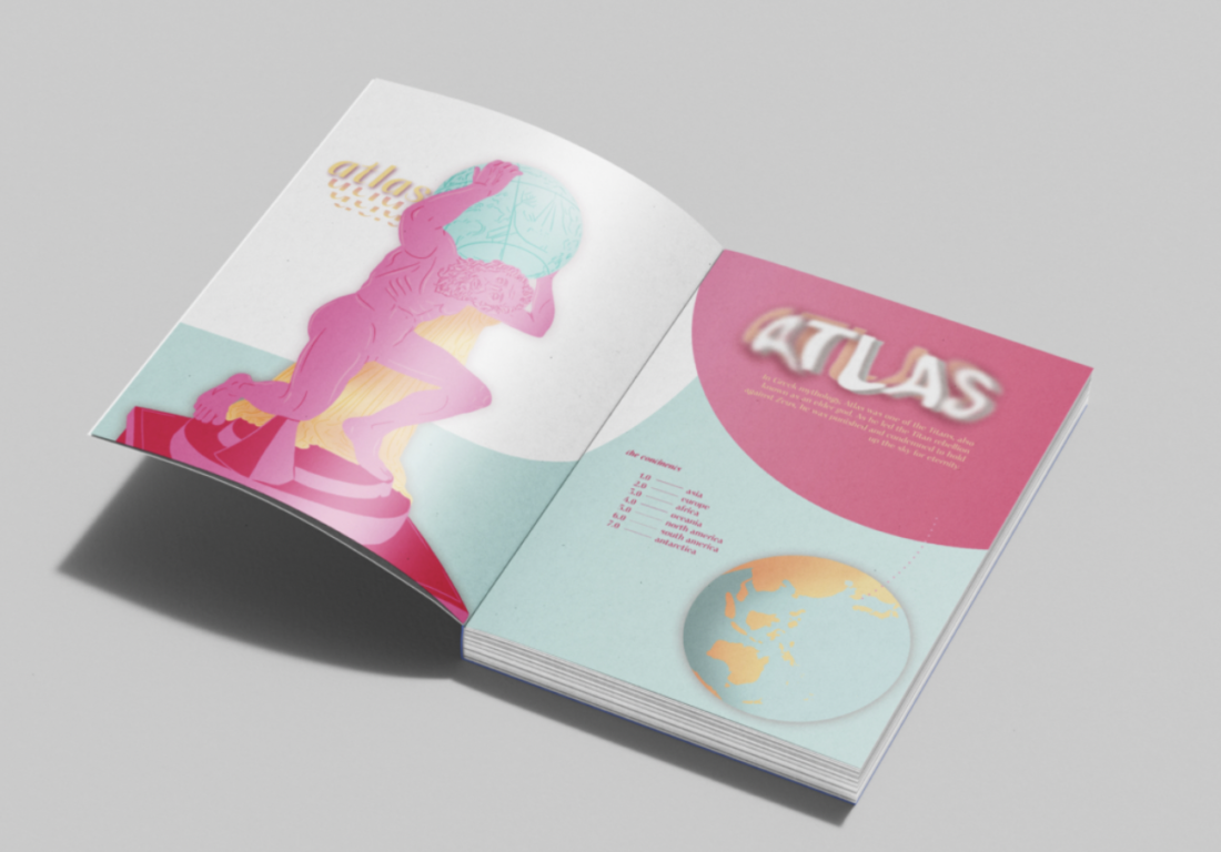
Valentic has created a bright, alternate option to the conventional World Atlas. Using illustrative and graphic elements, her pages simultaneously inform and captivate audiences, rather than nullify interest with mundanity.
Inspiration plays a key role in any creative piece. When interviewed, Valentic explained how she found influence in the unlikely and how this project strays from her typical aesthetics.
"I was inspired by the Barbie movie quite honestly, which led me to pick the colour palette...I wanted to incorporate the bright, fun colours in with the type and illustrative elements."
The lively take on a historical document creates an interesting juxtaposition, especially when Holly emulates a similar process in challenging her usual design style- consisting of more minimal, muted and natural visuals- with this bold and playful version of the Atlas.
VISUALS
This rendition of the Atlas, has included gorgeous, unique design aspects along with the accurate visuals and representation of geographical locations- no easy feat.
It is important to recognise the illustrative work that has gone into this project, varying from the usual photographic images, Valentic has incorporated her passion for drawing and breathed life into viewers experience when turning the pages of an Atlas.

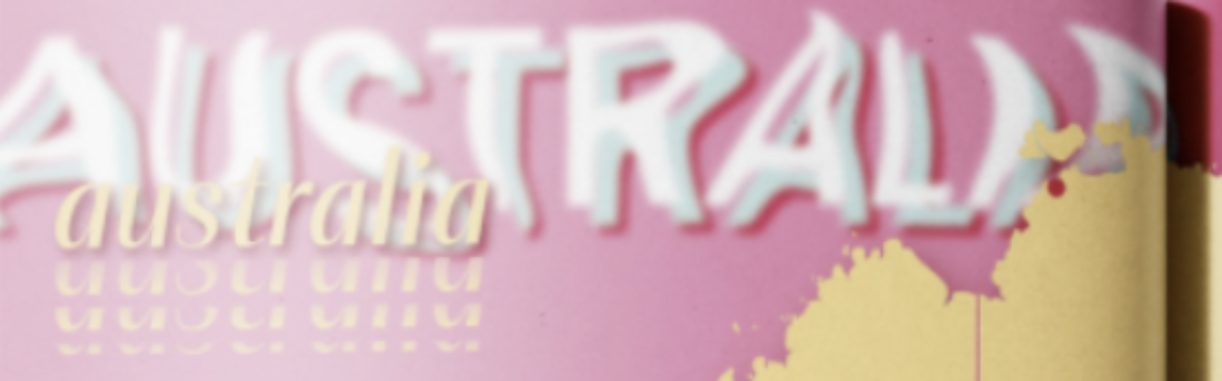
KINETIC TYPE
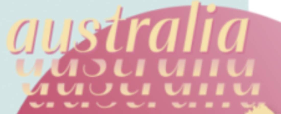
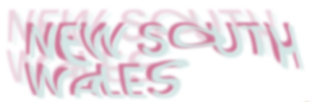
The use of kinetic type in this piece is apparent and effective. The manipulation of type through blur, warp and blend works synonymously with the curves of the designs. Movement is implied with the focus on planet Earth (through its shape and rotation) and the text embodies this with its appearance of being shaken (or spun, similar to earths pattern).
"I kept a common theme among them and created similar effects to each. In the headings, I used elements of blur and motion, and distortion. I added a blur to the words and warped them to have movement and distortion."
Overall, Holly Valentic's Atlas, invites viewers into her world of design, focusing on a playful use of colour, intentional kinetic type methods and captivating illustrative aspects.
It is safe to say she has spun tradition on its axis.