Animal Shelters Overflowing
Case Study Review
Mackenna Carroll
Chloe Burns

Animal shelters in Australia are overflowing dramatically due to the cost-of-living crisis. More animals are being turned away due to shelters and rescue centres being at capacity.

ABOUT
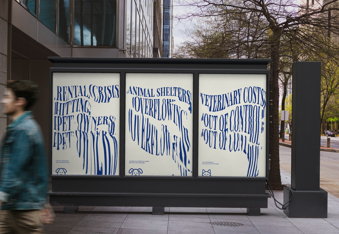
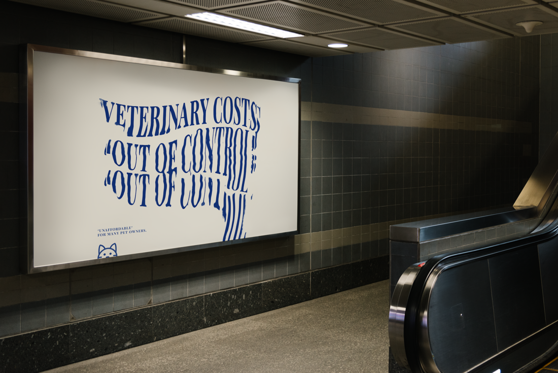
Chloe has designed three posters to raise awareness towards Animal shelters increasing dramatically due to the cost-of-living crisis within Australia. The implications of the situation involve more animals being turned away due to shelters and rescue centres being at capacity, and Australian foster carers being impacted on their ability to care for their beloved pets. Due to the rise in the cost-of-living and the rental crisis there has been an increase of animals being surrendered. Rescue centres are seeking volunteers, adoptive carers, and veterinarians for help. Raising awareness towards minimising damage occurring to the livelihood of stray animals in Australia. An interview with Chloe throughout this blog reveals her creative decisions as an upcoming designer.
"I was inspired by the number of posts I have been seeing online from rescue centres seeking volunteers and adoption" - Chloe Burns

THE DESIGN
Large variations of kinetic typography are demonstrated across the three posters as the focal point, using sentences: “Animal shelters overflowing”, “Rental crisis hitting pet owners”, and “Veterinary costs out of control”. Using uppercase text paired with impacting verbs suggests a loud and urgent message enticing viewers to read. Small animal illustrations have been placed at the bottom left of each poster, cropped to only show half of their faces symbolising how animals within shelters are struggling to be seen and taken into homes. The size of the animals emphasise neglect within shelters and bridges the connection of visual communication. Blue, the colour choice is often used in veterinary branding, incorporated to fore show the sad and dark times for animals and veterinarians.
Was there any specific design or external inspiration that influenced your work?
Ultimately, I was inspired by kinetic type, to reflect the distress that animal shelters, Australians and veterinarians are currently facing.

“The exploration of design is what keeps me motivated” – Chloe Burns
KINETIC TYPOGRAPHY
Chloe has created distorted typography within the text of each category emphasising the ‘out of control’ and ‘overflow’ that animal shelters are currently going through. Motion and blur are incorporated in smaller sections replicating a falling figure, enhancing damage and depletion occurring within these rescue groups. Distortion has helped shape the text into blocks, fragmentation and blur distinguishes the letters to be broken and falling apart. The messages on each poster reflect the distress and challenges surrounding animal shelters, Australians, and veterinarians.
What kind of visual experience do you think viewers would have when seeing your work?
I’d hope that people who see my work see the real message behind the design and notice the traditional graphic design as well as digital.
AUDIENCE & DESIGN INDUSTRY
Chloe’s posters are designed to raise awareness towards the struggles within the animal welfare and animal care communities of Australia. The target audience includes individuals who are considering adopting a pet, as well as those offering help volunteering. A safe and healthy home environment is required to house animals that need saving. Encouraging homeowners to be more lenient towards neighbours housing pets, and for people who are old enough to develop a better understanding of animal rights in Australia. All genders and individuals over the age of 18 are eligible to adopt an animal in a shelter.
The specific design industry for Chloe’s posters is advertisement applied on billboards and posters.
Do you believe that your work accurately represents your personal style and vision as a designer?
Yeah, I do. I’d say it does represent my vision as an emerging designer. I’ve always been inspired by traditional graphic design. I love creating images or type by hand, my creative process is a combination of art and technology.
