Big Kids 2020 Grad Show Identity
Big Kids: 2020 design graduation exhibition identity

Visual Communication Design
Graduation Exhibition Identity 2020
For most, growing up means the end of their creative pursuits. We are lucky enough that we get to hold on to that creativity and in a sense; never really grow up.
That’s the core of the Big Kids identity; tapping into the experience of being unafraid to make mistakes, try new things, and be in a constant state or learning. It balances nostalgia that caters to friends and family but also uses a suite of meticulously crafted visuals that affirm we know what we are doing to industry professionals. It’s off-beat, eye-catching and fun; celebrating our future career in being big kids.
A Very 'Growed Up' Visual Identity
Big Kids has to walk the fine line between looking convincingly professional whilst still retaining all the charm of the being chaotically childish. To achieve this balance, everything has been approached with an underlying grid structure for a very deliberately organised and gridded chaos that carefully grounds the hand-drawn elements of the Big Kids identity.

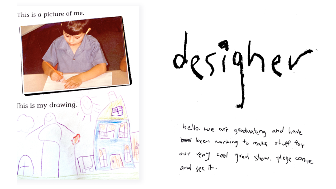
One of the key aspects of Big Kids is personalisation; each graduating student had the opportunity to draw themselves just like when they were kids. This pre-schematic visual approach to portraits is echoed in the use of hand-lettering to add another personal aspect to the Big Kids tone of voice. Think about how kids talk; they’re unfiltered and run on. For Big Kids we spelled big words wrong, we thought about which letters are hard for kids to write, and we weren't afraid to make it a little bit silly!
These hand-lettered elements were accompanied by the contrasting clean sans type choices determined elsewhere in the identity and assisted in keeping the grid in mind.
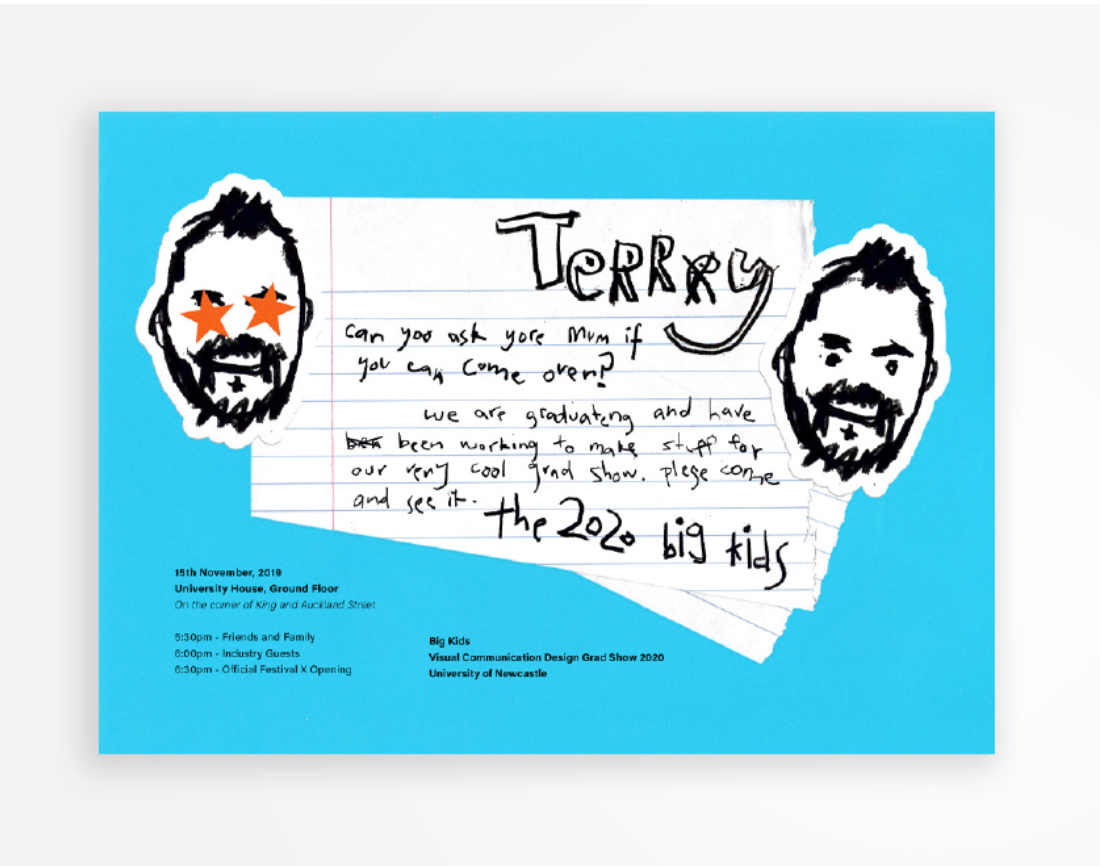
Elements of ephemera were also used to elevate designs when they’re feeling flat or it makes sense contextually. We thought about how children gift drawings and notes, and how elements of ephemera could be used to elevate designs if they’re feeling flat, or when makes sense contextually. For example, personalising industry guest invites with specific messages and custom printed stickers of themselves was the grown up way of saying we care (and still tapping in to the endearing feeling of being gifted a drawing or note from a cool fellow kid).
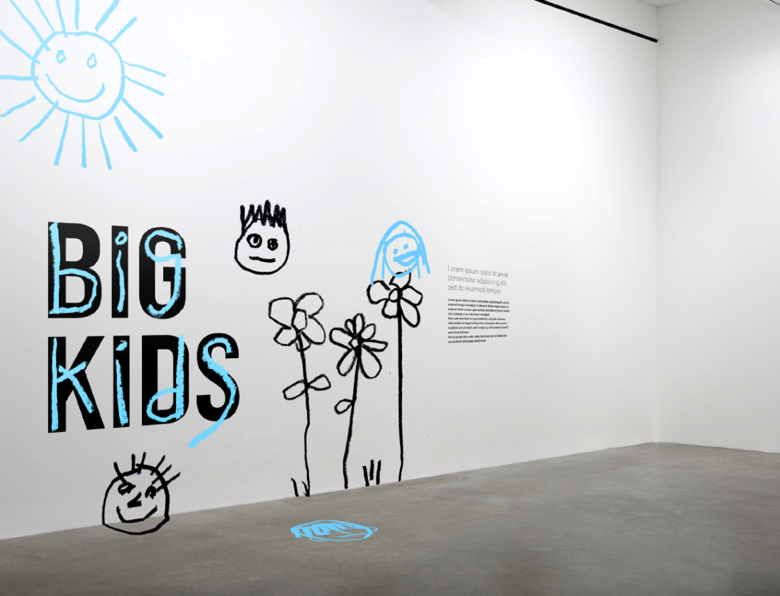
These are all aspects that can be incorporated in to posts for social media and other digital platforms, with the addition of simple motion to bring the identity to life. Hand-lettering drawn in real time and simple three frame face animations step up the identity to be even more lively and playful. This same sense of playfulness inspired the gallery decals that satisfy your inner child’s need to drawn on the walls!


You can see the Big Kids identity in action in our Grad Show Virtual Gallery as part of The University of Newcastle's Festival X this year.
