
What were the intentions for the website?
The website as a whole acts as an answer and showcase to the research question of “what are brutalist websites?”. The website investigates the aesthetic signifiers of brutalist website design through the creation of an educational and interactive experience as practice based research. The website aims to be acts as a showcase of various brutalist website design elements, commonly used patterns, and frequent aesthetic signifiers.

What was the inspiration for the website?
The main inspiration for this interactive educational website were already established brutalist websites. These sites include: brutalistwebsites.com, hoverstat.es, hallointer.net. As far back as 2014, a very niche trend known as “Brutalist Websites” began to emerge on the world wide web, one after the other. These websites design aesthetics, which deliberately rejected the widely accepted norm of modern and contemporary design standards, favoured a more raw experimental design approach, taking us back to the age of early 90’s website designs. The harkening back to what would today be classed as “poorly executed” website designs, attempts to showcase the very “brutal” nature of this era of UX design. The extremely “in your face” design elements and aesthetic signifiers make you question the widely accepted norm of comforting to a modern and welcoming stylistic approach when it comes to the current times UX design scene.
What typeface/s were used?
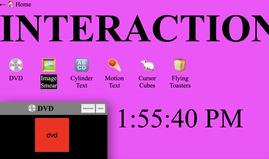
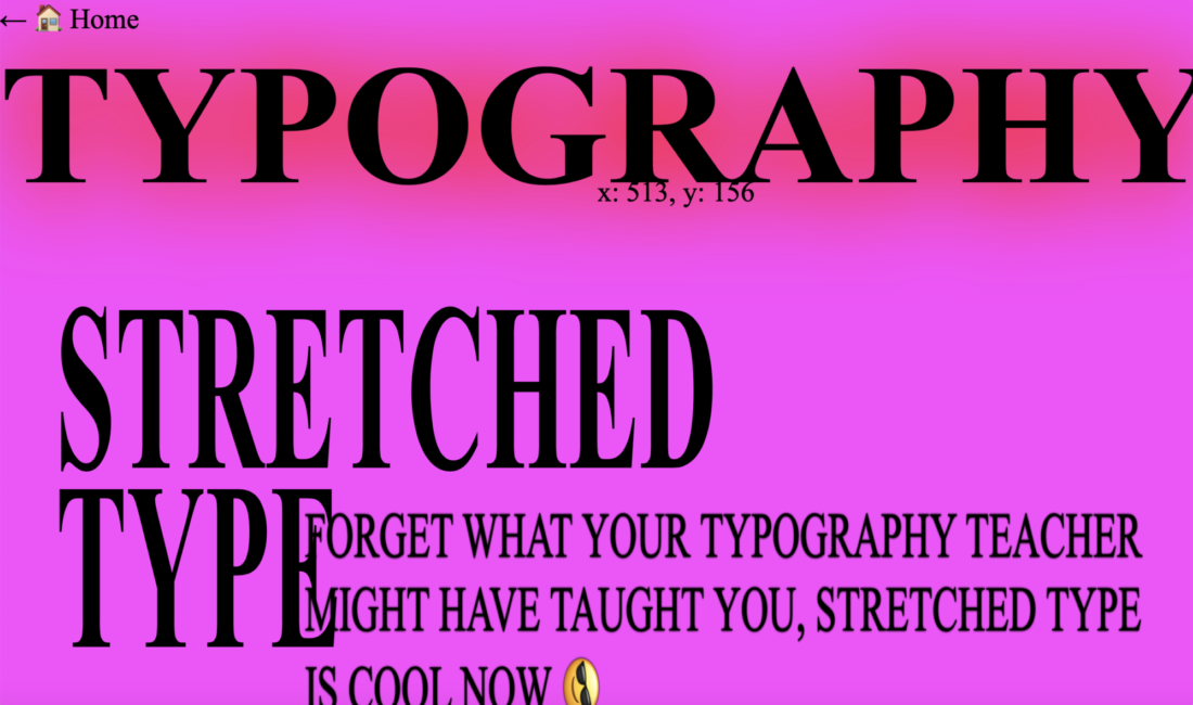
Unlike other non-interactive brutalist websites out there, this particular website offers the ability to view it in four different typefaces, adding another layer of depth to the overall design. The available typefaces are Helvetica in both Serif and San Serif format, blackletter, and very basic Comic Sans. The nature of brutalist websites being bold and in-your-face, they often utilise a variety of variable typefaces including: Times Roman, Helvetica, Arial, GT America, Apoc, Bagnard, Space Mono, Chomsky, etc. These fonts will often be manipulated with kinetic type techniques including warp/distort where fonts are stretched and/or squeezed, as has been done on this website.
How does this website differ?
The brutalist website differs from other sites in the fact that it is interactive as an educational piece while simultaneously being a “brutalist” website. Where other brutalist websites would be just a brutalist layout for the particular service/s the site offers, this site is in fact a brutalist website about brutalist websites.

Who is the target audience?
The target audience for such a site would be students and upcoming designers who enjoy and/or study UX/UI Design. A designers that does not know the past does not make a good designer. History is of great importance within the design industry, whether it be UX/UI, graphic design, character design, etc, in order for design to continue its evolution we must recognise how it started. Brutalist websites being a design child of the early 90’s, like all things from that era of 70-90’s making a return to modern day, brutalist website design will continue its re-emergence.

What are the outstanding elements of the design?
The outstanding elements of the websites design is all that the websites encompasses in its design. The fact it is a brutalist website makes it stand out to majority of current websites out there. While in comparison to other brutalist websites, its design offers further complexity from incorporating the interactive factor. The interactive side offers such depth to the site that you are able to change the background colour, typefaces, draw on the home page, etc. Of course the implementation of kinetic type throughout the site, whether it be distortion through squeeze and stretch or cut and crop with images imbedded, it offers a flare other sites don’t. An intriguing design element is the homepages ability to reconfigure its own layout every-time it is reloaded.
