Buono
Case study
RAND KARAYOUSEF
ROZE KARAYOUSEF
Packaging designs play an important role in communicating valuable information to consumers. They not only convey the brand attributes and benefits of the product, but also have the power to captivate and attract potential customers.
"I really like to create good packaging designs in an exciting and attractive way" -
Rand Karayousef
THE BRAND
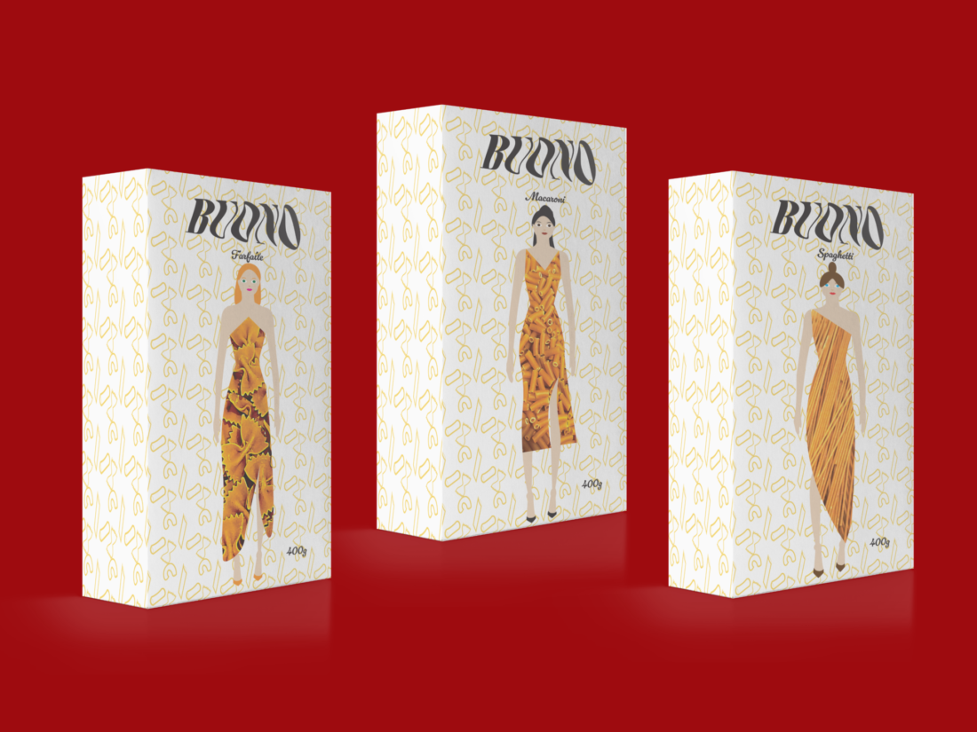
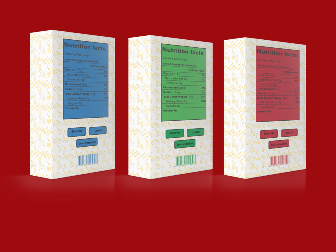
Buono is an amazing pasta brand specifically designed for health-conscious individuals. What sets Buono apart is its clear and attractive packaging that showcases the high-quality pasta. Buono offers three classic shapes of pasta: farfalle, macaroni, and spaghetti. These pastas are made in the traditional Italian way with healthy ingredients to provide a natural and nutritious flavor for everyone. The Buono brand aims to offer highly nutritious ingredient options with less fat and gluten-free choices, making it extremely easy and quick to cook.
The creator Rand Kara Yousef has aimed for the Buono brand to have healthy ingredients, simple and unique packaging in order to draw attention and be recognized by everyone. With her passion for food packaging and graphic design, she combined these elements to craft visually appealing packaging.

TYPOGRAPHY
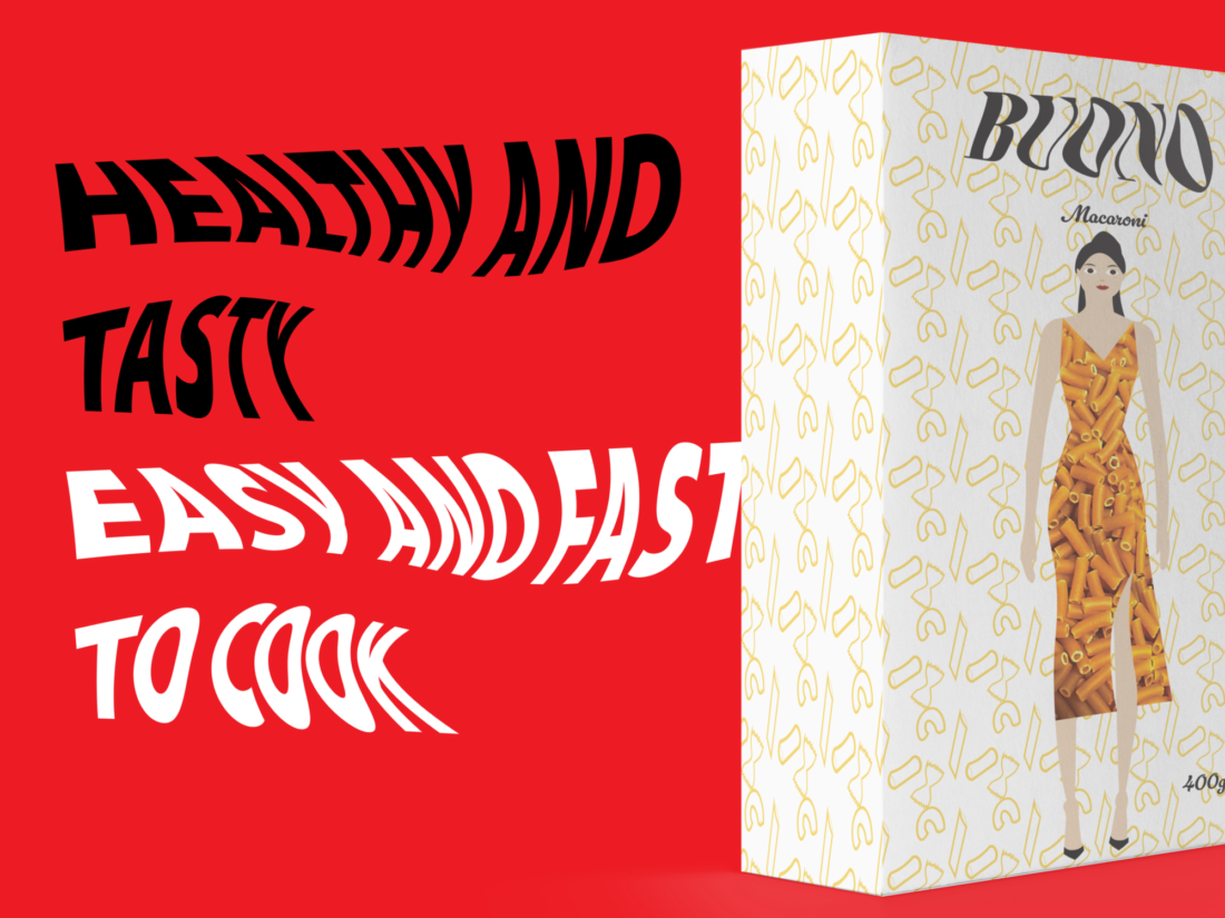
The Buono brand has used a bold font to create an attractive and simple typeface that enhances the understanding of the logo. The brand has specifically selected a bold and highly recognizable kinetic type for the design. In particular, the brand has used a distortion kinetic type to align with the design concept. Additionally, the designer aims to use this kinetic type method with a bold font as it easily captures attention and is visually appealing, enabling effective communication with the brand's message. This brand wants to use a simple and easy-to-read font so that people can easily understand the logo name and recognize it more easily.

Packaging
The Buono brand has successfully designed the pasta packaging in an incredibly attractive and exciting way. By incorporating female dresses in the window element, which have been created in a contemporary and unique representation of the pasta packaging. Inspired by the world's largest pasta producer brand, Barilla, Buono has ensured that the colors used in their packaging are cool and elegant, perfectly complementing their design concept. The creator, Rand Kara Yousef, has carefully curated visual elements such as the color palette, kinetic typography, and logo to align with the overall design strategy. Moreover, Buono has taken a step towards environmental consciousness by crafting their packaging material using 100% recycled materials. This helps the environment and fosters strong engagement with consumers who appreciate eco-friendly products.
I really think using patterns is a great way to make your packaging designs stand out easily. -
Rand Karayousef
PATTERNING/DESIGN
Using patterns in packaging designs is an effortless and effective way to highlight the key elements of your design. Patterns also help show what the designer wants the consumers to focus on. The Buono brand has come up with a clever pattern that showcases three distinct pasta types, making it convenient for consumers to understand the design concept.