Can Cocktails
A bright, fun branding for a unique and unmissable cocktail experience!
Charlie Donald
Lydia Coady

Cocktails are a very popular drink, but many people run into the problem of accessibility when wanting to enjoy one. Either you have to mix it yourself, which takes a lot of effort (and never turns out quite right), or you have to pay an arm and leg at a bar somewhere! Even if you were willing to cough up the price of the drink, you’re still limited to drinking them at the bar itself, which might not be the vibe you’re going for at that moment. Lydia Coady’s brand Can Cocktails solves this problem by supplying a portable and affordable cocktail that looks fun and bright too!
"When one buys our cocktails it's more than just a drink it's an entire experience!" - Lydia Coady
THE BRAND
Coady is designing for a canned cocktail range, and the branding behind it. Can Cocktails sells delicious, conveniently canned cocktails that can be enjoyed at any location of choice. Her company hopes to bring people together, over fun fruity drinks, through the portability of the range, which allows anyone to enjoy it at any time and place.
PACKAGING
The conceptual idea for the design is that the non-specific packaging will be inclusive to all people, since her target audience is anyone interested in premixed drinks, more specifically 18-25. It’s bright and busy, to give off the impression of fun, which I think does a great job appealing to this specific demographic. Young people tend to be attracted to bright, interesting, and clear visuals, so this is a very observant design choice to make. Additionally, most young people are looking for convenient canned drinks to take to gatherings, house parties, and other social drinking events, so putting the cocktails in that form of packaging will also attract the 18-25 demographic.
TYPOGRAPHY
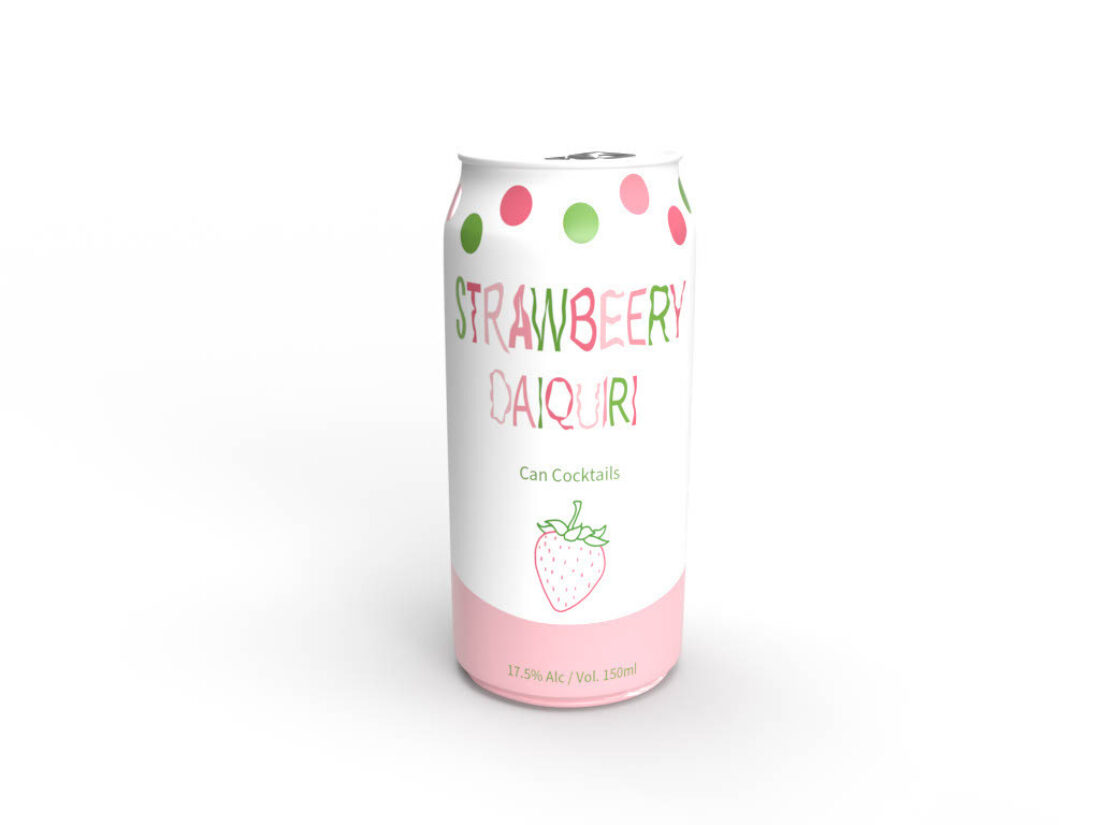
The kinetic type Coady has chosen is distortion. It’s seen in each flavour title on the cans, which she says is utilised to represent the uniqueness of her audience. She picked distortion over some other early prototypes because she felt it had a fruitier, more tropical feel, which is more aligned to the aesthetic of the brand. Coady also notes that other similar brands have big bold types that make it easy for consumers to identify the drink, which was a good choice to emulate. The combination of bright and bold, with distortion is a good place to meet in the middle. The bright and bold type is familiar to her audience, it’s what consumers are used to, but the distortion adds an element of uniqueness, and makes her design stand out on the shelves.


"I really liked playing around with the kinetic type as I love how it's not perfect which allows it to have more of a personalised and organic feel." - Lydia Coady
DESIGN DETAILS
The design itself is simplistic, colourful, and bright, which communicates the fun, fruity taste of the cocktails really well. These overarching design choices also tie in well to what she hopes her audience feels when they see the packaging. She hopes to create “...a feeling of fun and happiness as my whole brand is about bringing people together to have conversation and make memories whilst enjoying a beverage!”.
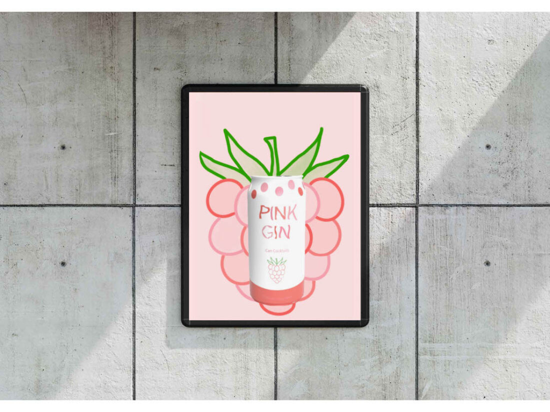
She also includes a dotted motif at the top of the can, which is a very useful choice. It doesn’t detract at all from the design on the can itself, and can be utilised as part of the brands identity, like how she already gives one example in some advertisement mockups here.
The simplistic fruit detail on the centre of the can is great for instant recognition of general flavour. It catches the eye, and will interest anyone who likes that flavour to consider the product in more depth.
Lydia Coady’s design choices - from typography to colours - work harmoniously together to create a product image that is bright and fun. A match made in heaven to attract the attention of bright and fun young people, looking to enjoy a cocktail on the go, anywhere they go.