The Ori - Digital Poster Series
Animated Poster Series - Brayden Maybury
Chris McCulloch
Brayden Maybury

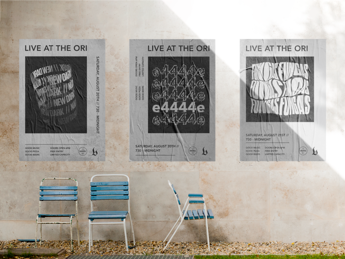
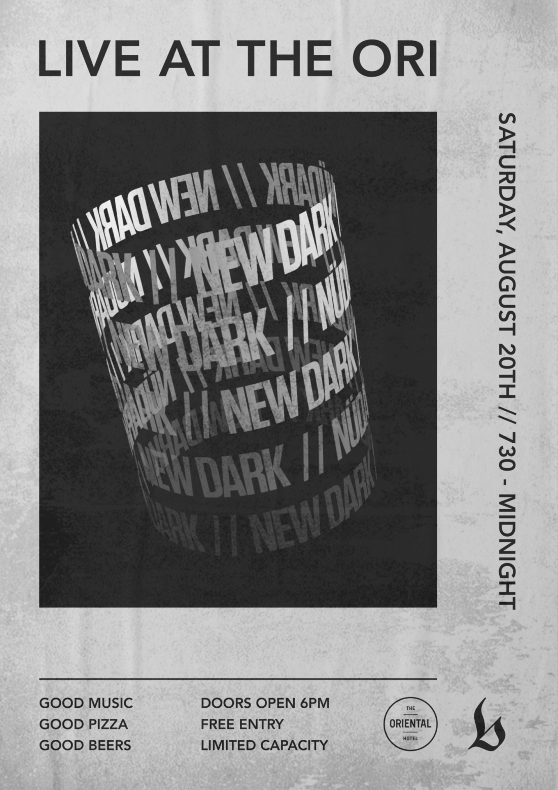
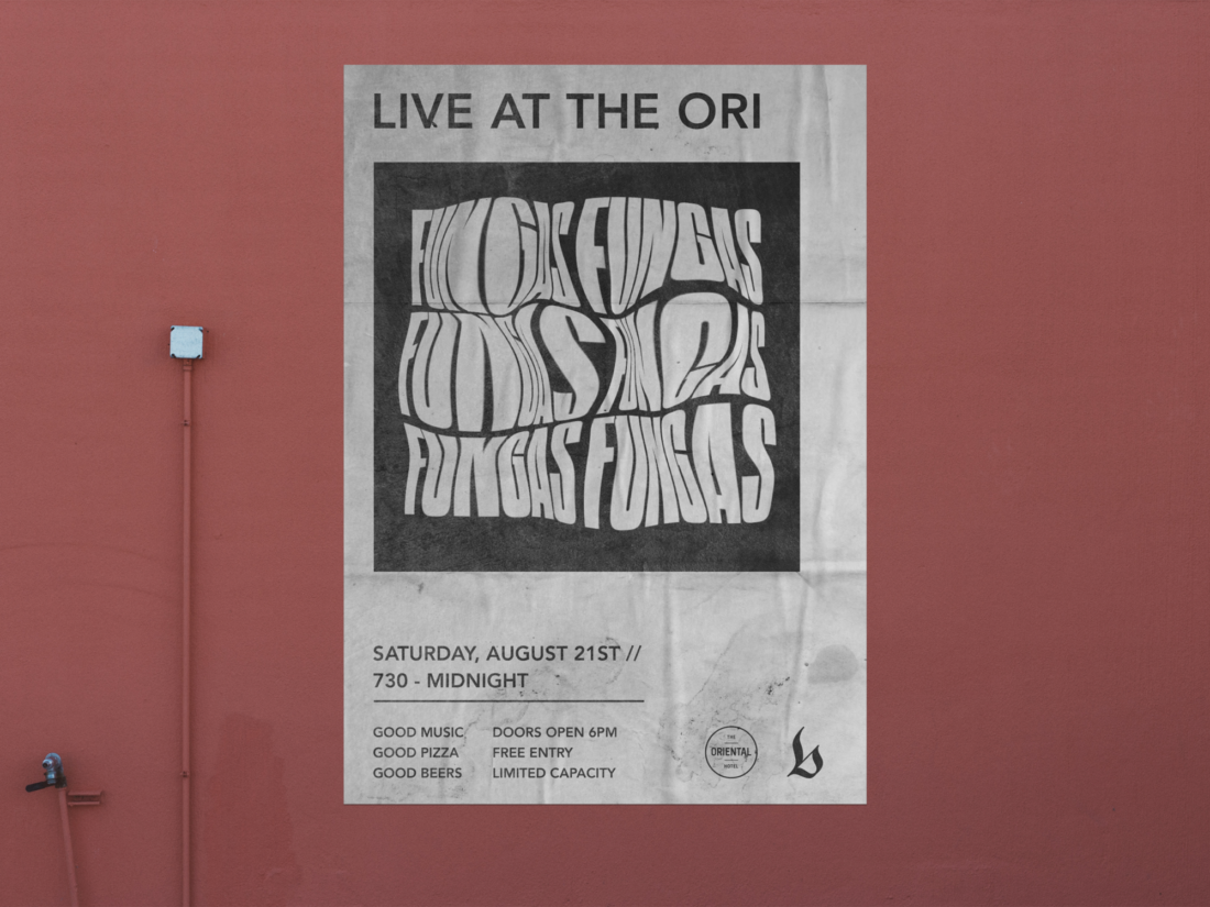
When Brayden designed this series of posters, the initial idea behind it was to promote bands and artists performing at his local pub, where he also works. I think he has designed these flawlessly, they all flow and portray the bands’ identity and message while all still being unique to one another and attracting attention. Especially interesting is the animated version of each poster, used primarily for social media, these easily attract a lot of attention and look amazing. This is where it differentiates itself from the crowd, static posters are all well and good, but everyone has/uses them, the animated posters really allow for it to stand out and this allows for them to gain more traction and whichever band uses them will more than likely be better off by utilising the unique style of them.


"I was very excited as I love experimental design and pushing the limits of what works."
1. Do you believe that your work accurately represents your personal style and vision as a designer?
I don't think I have a style yet. That type of animated typography was all new to me, but I do like to focus on typography in my work. I'd say it does represent my vision in that way and my goals are to get better at the digital aspect of design, so I guess so.
2. What kind of visual experience do you think viewers would have when seeing your work?
I'm hoping for engagement. Viewers noticing the traditional printed poster mixed with the digital animation and linking the two.
3. Was there any specific design or external inspiration that influenced your work? Or was it purely from your own innate feeling and imagination?
The influence would have been from just posters in general as I really like print design and feel like the poster is a benchmark for traditional graphic design. I wanted to do something different with a traditional poster and kind of bring it into the modern, digital world. But it was really all about blurring the lines of traditional and digital design.
4. Describe what this project meant to you as a developing designer, and how enjoyable was it?
I saw kinetic typography in the brief and it was something I was just looking into. I was very excited as I love experimental design and pushing the limits of what works. Its opened up so much for me and allowed me to experiment and explore typography and motion. I'm just now starting to feel like more of a designer and stopped feeling like I would never make it. Not everything I experiment with works, but it's the exploration of it that helps you grow.
5. Has this project inspired you to continue identity design for other events / projects in the similar field?
I haven't done any more event posters, but it did inspire me to create something every day. I've been doing a daily poster series on Instagram and trying to keep it typography focused. In relation to the last question about my design style, this daily project has allowed me to learn a lot more the style of posters is changing all the time.
Check out Brayden's Instagram here https://www.instagram.com/braydsgns/


I'm hoping for engagement. Viewers noticing the traditional printed poster mixed with the digital animation and linking the two.
Design Industry
The concept of these posters was to be a series of promotional posters for bands playing at the Oriental Hotel. This premise works extremely well as the posters can be designed in any way in terms of the designer’s context.
Brayden’s typographic treatment, across all three posters works exceptionally well and flows together in both static and animated form. His distortion of posters one and two create a flowing movement, in which the text is distorted but still legible. Utilising this within social media is a huge positive to the design, as it is unconventional and rarely seen, it sticks out and easily draws in an audience. The circular design of the third poster changes it up and adds a new motion to the poster, this change is in a positive direction, giving the poster a loop on the animation.
Utilising the high contrast colours along with the distortion of the type has allowed for the type to stand out on the background, even in its most distorted stage of animation.
Target Audience
Brayden’s target audience is mainly comprised of young, pub goers, people in touch with social media and some design sense. Utilising his unique mix of traditional and Animated design, Brayden has targeted the viewers engagement with his designs rather than any actual thought provoking from them. Working purely on pulling the audience to his design rather than the thought behind it allows for him to design for the sake of his own style and what the posters represent to him rather than for societal reasons.
This aiming at the 18-30 demographic, allows for Brayden’s reach to extend, as these are the most likely parties to attend and be informed about such bands and pub promotions. Even those of this group not in line with the social media side, can see and react to the static physical posters that are around the pub leading up to the event. The physical posters also lead the way for the animated posters to be seen, as viewers often chase further details of the shows on social media or at least the website, garnering further online views for Brayden’s works.