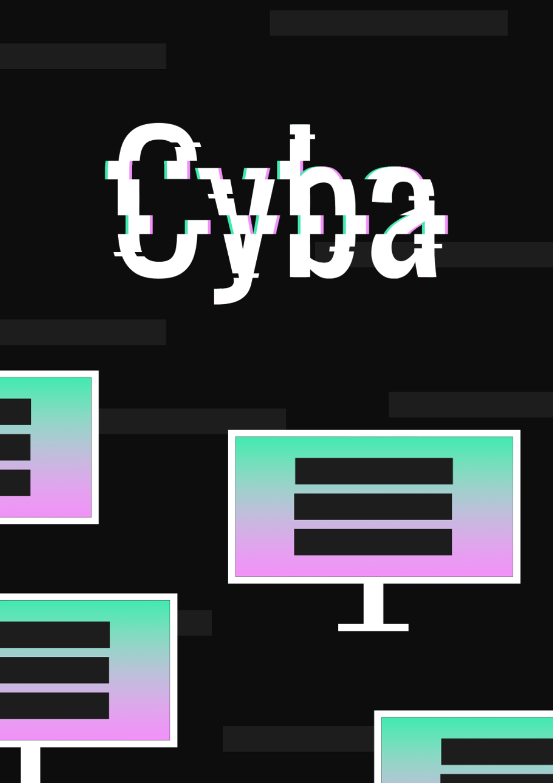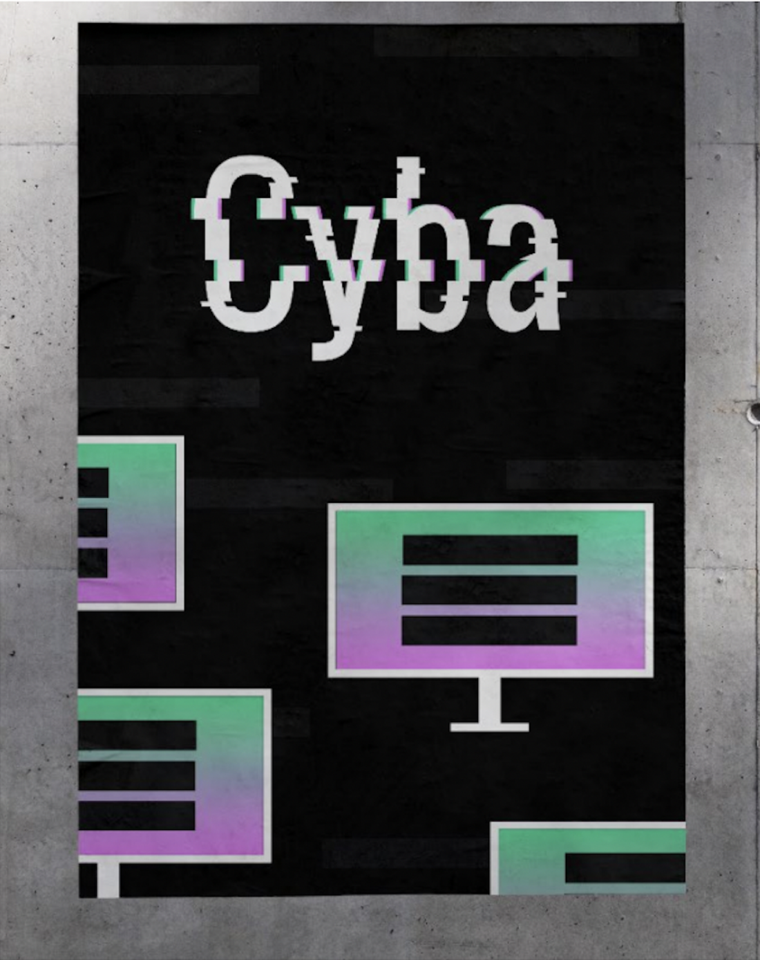
Cyber bullying is a very much evident problem in todays society, it causes depression, anxiety and often worse in many young people across the globe.Aden Currys print design Intends to draw attention to the prominent issue of cyber bullying as well as potentially turning Cyba into a website with support for the issue.
What is Cyba?
Cyba is an all new campaign addressing the problem of cyber bullying in young people in this day and age.
Aden Curry (designer)-
“I feel it can draw attention to the fact that cyber bullying happens and is still an issue, as well as Cyba maybe being a website with support for the issue.”
With his retro aesthetic approach, Aden successfully attracts people from all ages to view his design.With his personal love for digital media and video games the designer has achieved the perfect tone of voice for his anti-cyber bullying campaign.


The designer, Aden Curry has expressed his campaign against cyber bullying through the subject of print.This particular campaign fits perfectly into the field of print by presenting his design in the form of a poster.Aden Curry uses the cyber aesthetic of the typeface ‘Oswald’ to grab the attention of viewers and portrays the retro/glitch vibe perfectly.Posters are also an easy and cheap way to reach your target audience, in this case one could assume that these posters will be put up in sections of the city that have a high traffic of youth. This can include areas around schools universities and local places that are popular
Typography
Typography I such an important part of the design process as it can set the tone for the entire design. Aden Curry does this perfectly with his carefully contracted typographic logo.
The designer has used the font ‘Oswald’ to achieve the ‘cyber’ effect.
“The design was always supposed to include the glitch effect and have a digital and cyber feel to it, during the design process I thought it could also help spread a message against cyber bullying”
-Aden Curry

The brand
Aden Currys design centred around anti- cyber bullying, successfully targets the right audience for its topic. He incorporates the retro style into his designs with a glitch affect and a colour palate of white, black, blue, green and pink to match.
When asked about whether or Aden curry believes this design represents his personal brand this was his response.
'It is similar to my personal brand in that it uses black heavily as a contrast and a low amount of colours to draw the eye, in my works that is something I do often, however I more often use characters in my designs, but this work did not call for the use of them”
This shows how Aden incoperated his own personal creative flare into the design to create a bigger impact on the audiences.
When asked how he thinks cya could help people who are victims of cyber bullying Aden said that he also plans to move forward in his campaign from posters to a functioning Website
“I feel it can draw attention to the fact that cyber bullying happens and is still an issue, as well as Cyba maybe being a website with support for the issue”
Aden Currys design, Cyba is a carefully curated design. He has used his skill in typography and graphic design to create a design that could further push his anti-bullying campaign.The impact of the design in the community of young people could be life changing as cyber bullying is such a huge issue and Aden Currys design understands the importance of the topic successfully.

