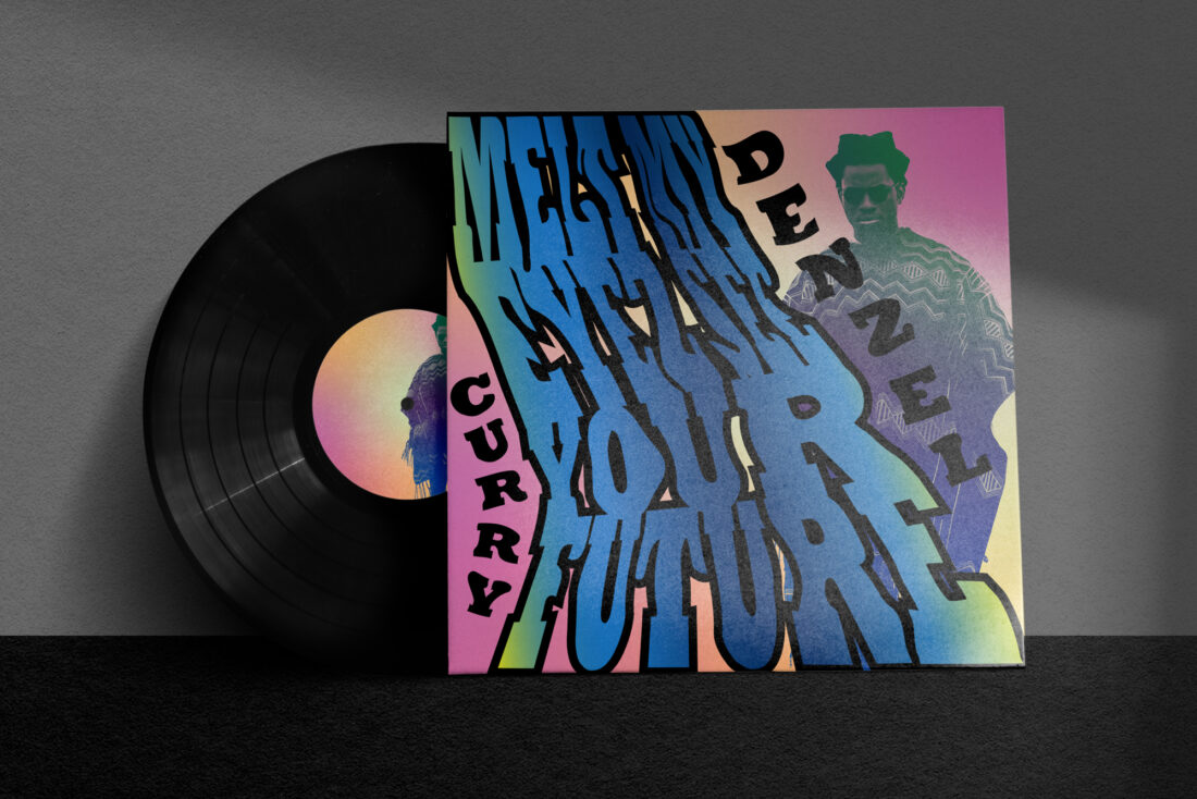
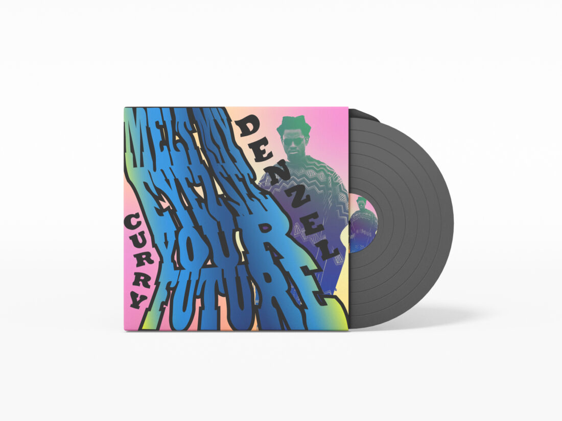
Denzel Curry's Album cover
SASA MALANCUK
JACKSON MACNEVIN


Sasa Malancuk curated an album cover for Denzel Curry’s 2022 ‘Melt My Eyez See Your Future’, using kinetic type she curated a visual representation of the “meditative vibe” of the album as a whole. Visually this cover has an acid inspired mesmerising visual energy. Through the use of the flow and the melting of the liquid font and the connecting of the colours, Sasa succeeds in creating a visual representation of the rappers music. To get a better understanding of Sasa’s project, I asked her 5 questions.
Through the questions I managed to prevail a better understanding on her design chose for this album cover. Denzel’s music has a lot of energy and tone, however in this album there is a different and a more relaxed energy being presented from Curry. When listening to the album you can hear the lucid sounds, the design chose to use this liquid kinectic type connects with the overall sound.

The aspect of ‘Melt’ of this album concludes to why Sasa has blended the colours and to be connected within each other, this album circulates various emotions, thoughts and feelings. Connecting these colours as one supports this design choice to have them as one being. Sasa indicates that the original cover art didn’t connect with the album, Denzel’s team used a lot of cowboy, kill bill inspiration and didn’t really connect with the actual music.
Creating a whole visual representation for a whole album that has diverse music is a difficult task. Sasa has taken the colours and emotions of Denzel’s feelings to be physical seen on her interpretation of this album cover. With any album cover the listeners want the visual component to add another addition to the auditory sound it’s self, adding another element further pushes the audiences listening experience. Sasa wants the fans of Denzel to feel intrigued when seeing her cover, similarly to how they should act when listening to his music.

Once you listen to an album of your favourite artist you make your own interpretation to if the visual identity and the music goes hand in hand. When a designer curates an excellent visual representation of an artist’s music, it elevates the whole listening experience for the fans.
When asking Sasa if she could change anything about her project and why, she added that further fine tuning the colours filled in the font could have been further added. Also adding more attention, the gradient to further push the emotions. Using distortion could have been extended to enhance the ‘melt’ of Denzel's album.
Sasa’s project is successful in her intentions in designing a visual representation of Denzel Curry’s latest album. Through the use of her chosen liquid kinetic type, she has taken the thoughts, emotions and overall energy of Curry’s art and has visualised it as an emotional journal through the addition of the gradient, colours and typography.