Blurred Vision Magazine
DESN2011 - Case Study
Florence Searle

Colour blindness is becoming a more common disease in many individuals, both young and old. Its something unique to the individual depending on their type of colour blindness and other surrounding issues with their eyes. The occurrence of colour blindness and eye diseases are often well hidden and not advertised or spoken about often, however Blind Vision has worked towards solving this problem by successfully advertising the conditions and their effects through a multiple page magazine spread.

THE BRAND
Blind Vision is a successful way of advertising and promoting eye conditions and specifically colour blindness. Effective use of colour and shape has ensured a striking design that catches the reader’s eye. The blurred motion of many elements paired with the image of an eyeball and a traditional reading chart not only allows for further education on the multitude of eye conditions but also is a creative way of promotion. Eye conditions have never been so interesting with bright vibrant, bright and unique design.
The creator Phoebe McMillan Has achieved to make her Blind Vision Magazine Spread as eye-catching and fun by her use of publication design. With her personal experience as a rather blind individual requiring glasses to do everyday tasks, she found herself gravitating towards a design based on personal experience, as many designers do.

“As a rather blind person I think it was a no brainer (and a little funny) if I made a poster about types of blindness, or show what it’s like to see blind in a design type-based way” – Phoebe McMillan
PRINT MEDIA & MAGAZINE
Blind Vision is aimed at everyone, creating a design people would possibly be able to relate to or educate themselves further with. Inspired by her personal journey being a majority blind person, along with the lack of print media on the market exploring the eye conditions. With A range of playful yet professional colours and the blurred sections depicting the effects of specific eye conditions, the Blind Vision Magazine spread was designed with the intention of not only educating individuals but also with the possible use in other print media such as posters in optical shops such as Specsavers, or even coffee table magazines in specialist optometrists waiting rooms. The clear and concise design also ensures the professional aesthetic, ensuring the design could be transferred to many different platforms and media types
TYPOGRAPHY
Another design element and aspect of the magazine design is the typography used for the branding. Blind Vision is bold, and it makes a strong statement. It’s the first thing eyes see on the magazine. The type is simple however, by incorporating kinetic type elements into the type work like movement and blurring, this makes the brand identity clear and aesthetic shine through the design.
By using a bold minimalist typeface called Helvetica, the designer has distorted it in photoshop creating a blurred and motion effect. To suit the design and identity of the magazine spread. It is also fresh and unique to other advertising spread throughout magazines, making Blind Vision more inviting to readers.

PATTERN & DESIGN
The designs are bold, each page exploring a different eye condition incorporates the same design principals however has their own unique design. The simplistic colour range of muted greens, blues and reds along with black and white, not only make the design more interesting and unique but also do have purpose as to why those colours were chosen, Protanopia(red), Tritanopia(blue) and Deuteranopia (green) are all different types of colour blindness. The blurred stacked elements of design are also iterations of types of blindness. By incorporating these elements, all designs still look cohesive and easily identified.
A strong element of design is the strength between the Type/Branding and the patterns created on the spreads. Using the blurred effect on both the branding and design elements creates cohesivity, however the inclusion of shapes and colour in the design work has created a well-rounded and extremely effective design for the page spreads, with all elements relating to blindness, whether it be extremely clear of have hidden meaning. Parring the logo/branding and the patterns created together, Phoebe has also used a simple typeface for the text and information, all creating a professional yet modern finish.
Phoebe was originally focusing purely on the blurred kinetic type elements of her design, as this is the main effect of blindness on individuals having issues with reading. However, phoebe felt that by sticking with just typography, she was not staying true to herself as a designer if she didn’t add an element of design/image, and the design would be boring without this inclusion. So, phoebe came up with the brilliant idea of incorporating colour and design through the three main types of colour blindness and other visual iterations of blindness.
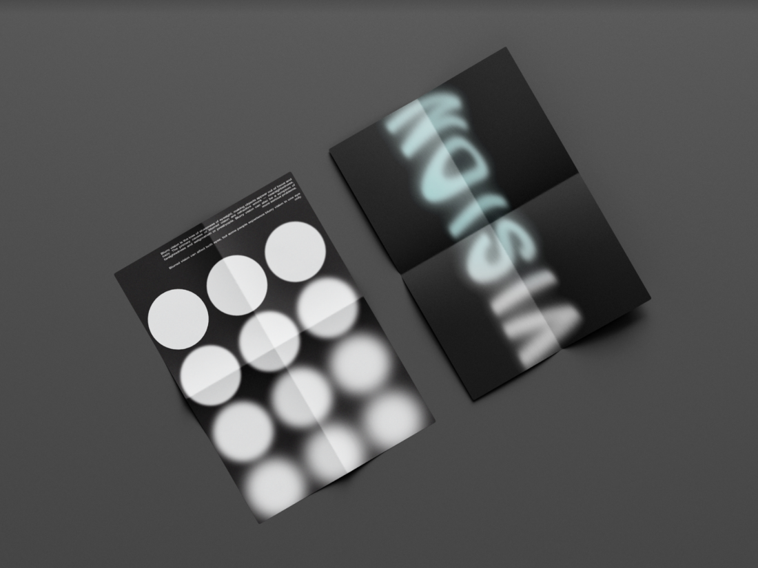
“I used the blur effect as a gradual thing like in my black circle poster, representing how blindness can get worse over time. And my eye chart I incorporated the words ‘Blurry’ In them. I thought that was a nice touch.” – Phoebe McMillan
These elements, bring the magazine design together, making Blind Vision a very effective promotion of blindness for readers. The designs aesthetic and mood shines through making it appeal to everyone and filling a gap in the market that has otherwise been left empty for quite some time, educating, and raising awareness for not only colour blindness but blindness and eye conditions as a whole.