DONDA - KANYE WEST
Designed by Rayan Eslami, Post written by Genevieve Gardner
4 years ago
Designer
Rayan Eslami
Writter
Genevieve Gardner
For Class DESN2011 Design Futures and professional practice we were to produce a case study on a peers work of kinetic type. For Rayan She redesigned a studio album for Kanye Wests Album Donda. Along with the images I asked Her a few questions to better understand her creative process.

Questions:
1. What was your intention?
1. What was your intention?
- "I was just experimenting with shapes and gradients to create Instagram tiles with quotes etc when I realised there was a letter-like character and legibility to some of the shapes and a shared DNA since they were a blend of squares and circles, some 90 degree angled corners and some rounded ones. It was like having a cubic block of wood that you could chipping away from and shave off the corners, and see a simplified version of a letter. The perfect balance in a square and circle creates a sense of stability that always draws me to it and allows you to build on it and create more, with different placements and sizes."

2. What typeface did you use?
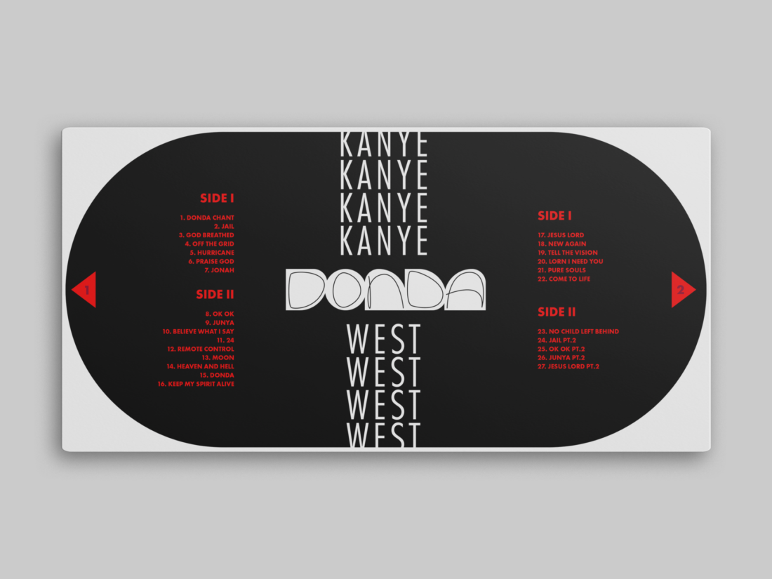
"I used different variations of Futura. It was a typeface that seemed to bring a more defined identity to the abstract and shape based cover type."
3. What inspired you?
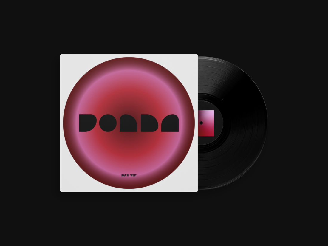
- "The album is a tribute to his mother who passed away in 2008. The original cover art is all black, due to its association with mourning and the empty feeling of loss, with no type or writing. However I received a lot of inspirations and positive reflection from the songs which led me to see the light in his story. I used a circle with radial gradient to show a timeline of her life in a non linear way with colours. The red in the center of the circle shows the love he had for his mother (vice versa) but also the sign of his mother’s sufferings in raising him alone in such difficult times and conditions. The pink is him blooming in the music industry as his name is placed there too and the dark read is the end of her life which stops at the very edge and the white background takes over representing her entering the next world, spirituality and her saint like character. The hand writing like type added to the shapes on the inside spread of the cover adds balance, humanity and character to the rather cold and geometric type."
4. How is this product/ branding different...who did you have in mind when you designed it?
- "This goes with my inspiration and target demographic. At the time of designing this work I personally was going through a dark time, seeking light and redemption and this project was an excuse to through myself into creating something better, more meaningful and positive to allow me to move on and that’s why the vibe is much more vibrant and hopeful than the original cover. It is meant to show our generations to take a lesson from every step and every hardship and be able to look at the world with hope again and be curious"
5. Finally, was as it difficult for you to undertake?
- "Initially it was hard to come up with new ideas but the it became hard to convince myself that it was enough and try to not complicate it too much. I don’t have much of a lead up work but the screenshot I included is where things kinda started..."


This rebranding design showcases some great techniques, the color gradient and simplified creation of her font is great, its basic structure really comes across. Its simple yet communicates.
Great work Rayan.