Dreamland
Glass animals vinyl cover
Ella Grierson
Avali Henderson

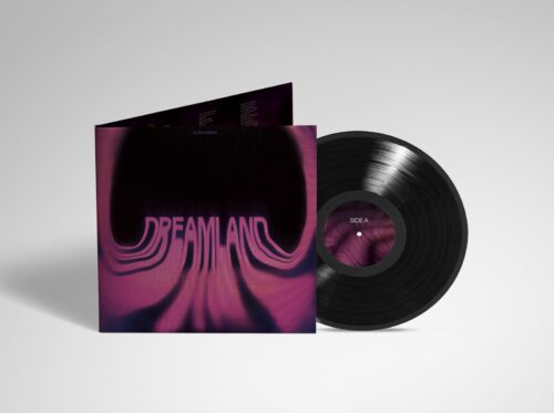
A new cover to celebrate Glass Animals latest album ‘DREAMLAND’.
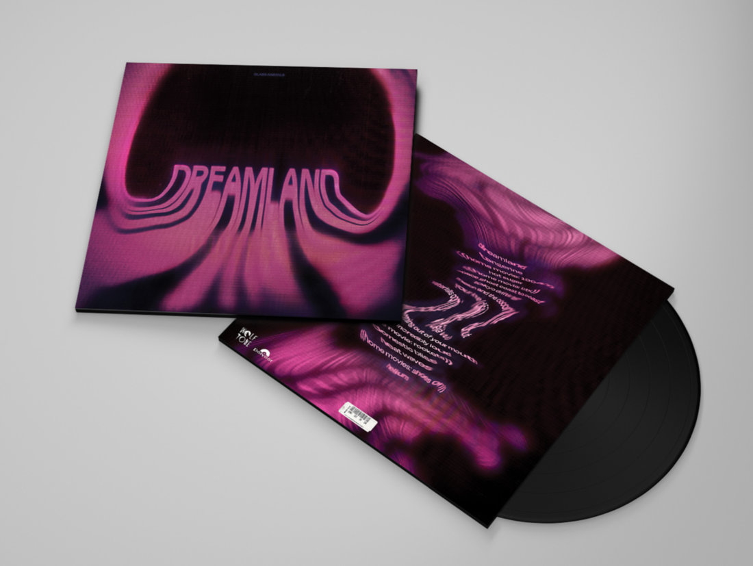
Lured in by vortex shapes and a dreamy colour palette of pinks, purples and black, we are greeted by ‘DREAMLAND’ written, obscured and centre stage of the packaging. The new vinyl cover was created for exploratory purposes and to celebrate the musical wonder of ‘DREAMLAND’ by Glass Animals.
In an interview with the designer, Ella Grierson, I wanted to learn about their process through designing this cover. Specifically, I wanted to know what inspired them, their designerly choices and how their revisions determined the final outcome of their design.
INSPIRE
What were your sources of inspiration?
I looked to Pinterest for inspiration. I watched a lot of tutorials on how to use more tools in Adobe Illustrator/Photoshop to develop my skills and possibly add more complicated elements to the design. I also spent a lot of time searching for the most effective way to present my design through mockups.
Did you listen to the music from this album when you were designing for it?
Yes, I did actually! I mostly listened to my favourite songs off the album. Listening to the album while designing helped me capture the mood/tone of the album which was a huge source of inspiration for my designs.

DESIGN
Did you previously have any/much experience with kinetic type?
I've had a little bit of experience with the kinetic type, mostly just experimenting and testing out tools on Illustrator/Photoshop. I really like working with and learning about typography so it helped a lot in the long run.
I noticed on your pitch deck that both territories you were looking at exploring were focused on distorted text. What was it that attracted you to this style?
It is definitely a style of design that I really like and there are so many ways it can be used to convey different messages. Given the possibilities with distorted type, you can make it do anything you want by warping or twisting it a certain way.
Did you find it challenging to draw a line between interesting distortion whilst remaining legible?
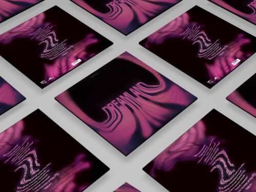
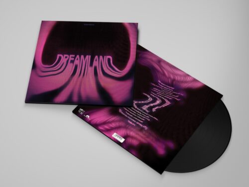
For the front cover, it wasn't difficult to make it legible as it was the biggest/main element and the majority of the text is not distorted. But for the back cover which has the tracklist, I did struggle with ensuring it stayed legible. I ended up having a more abstract approach, so it was a little challenging to read but still legible.


REVISE
Did you have an idea of the colour palette or typeface you wanted to use before you began executing it? What lead you to your chosen palette and font?
In terms of colour palette, I was initially going to have a dark blueish colour palette. However, I didn't take into consideration what album/artist I would be choosing. So after choosing the 'Dreamland' album, I changed it to mostly pinks to keep some similarities to the actual album cover. For typography, I only knew that I wanted a sans serif bold typeface. Keeping the colours similar to the colours of the existing album allowed for the intended audience to stay quite consistent. My main audience was anyone listening to the album as well as anyone that is also interested in album cover design/typography
Did you change your concept much during your design process?
Yes, I designed multiple album covers for other albums as well as 'Dreamland'. Whilst I always had the concept of distorted type in mind, my previous designs had a different approach to the final design. I wanted to test out all my options before going ahead with something I liked.
Will continue to use kinetic type for your future designs? If so why, if not why not?
Definitely! It was so fun to do and something I am really interested in. The possibilities are endless with kinetic type as there is so much freedom to create unique designs.


Dreamland cover front and back

Dreamland cascading mockup

Dreamland vinyl inside

Dreamland full mockup