FLUID PSYCHO
An album cover by Cecilia Lu
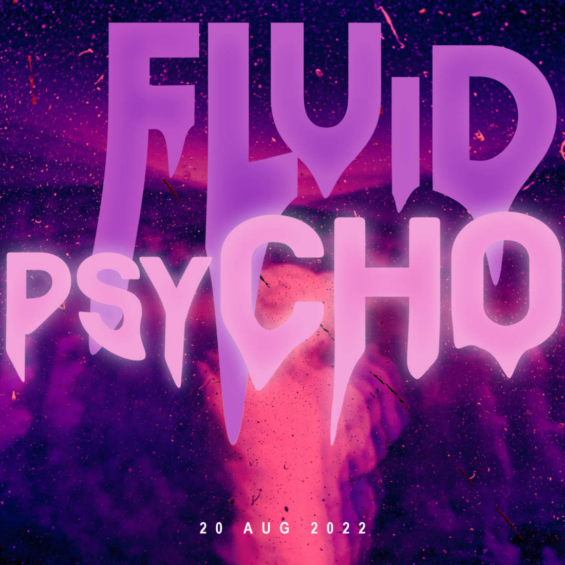
Aspiring to have her own album one day, music lover, Cecilia Lu designed the ‘Fluid Psycho' album cover with a youthful and edgy eye.
The title ‘Fluid Psycho’ was developed to mimic the fluid nature of art and music, and perhaps even the erratic ups and downs of creativity. For Cecilia, the title is also representative of individuals who push the boundaries of societal norms - those who are viewed warily or unkindly because they are different.

“Unusual, independent, dizzy and strange” - Cecilia on the tone of voice she was developing.
The design is directed at a young demographic “passionate about independent music”. Cecilia's design concept is largely focussed on a niche market, sticking away from a clean and professional identity. Cecilia’s aim was to create a safe space for the quirky, and to encourage people to embrace others for their differences.

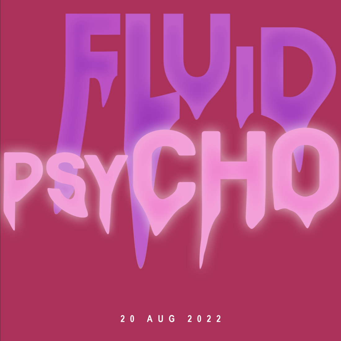
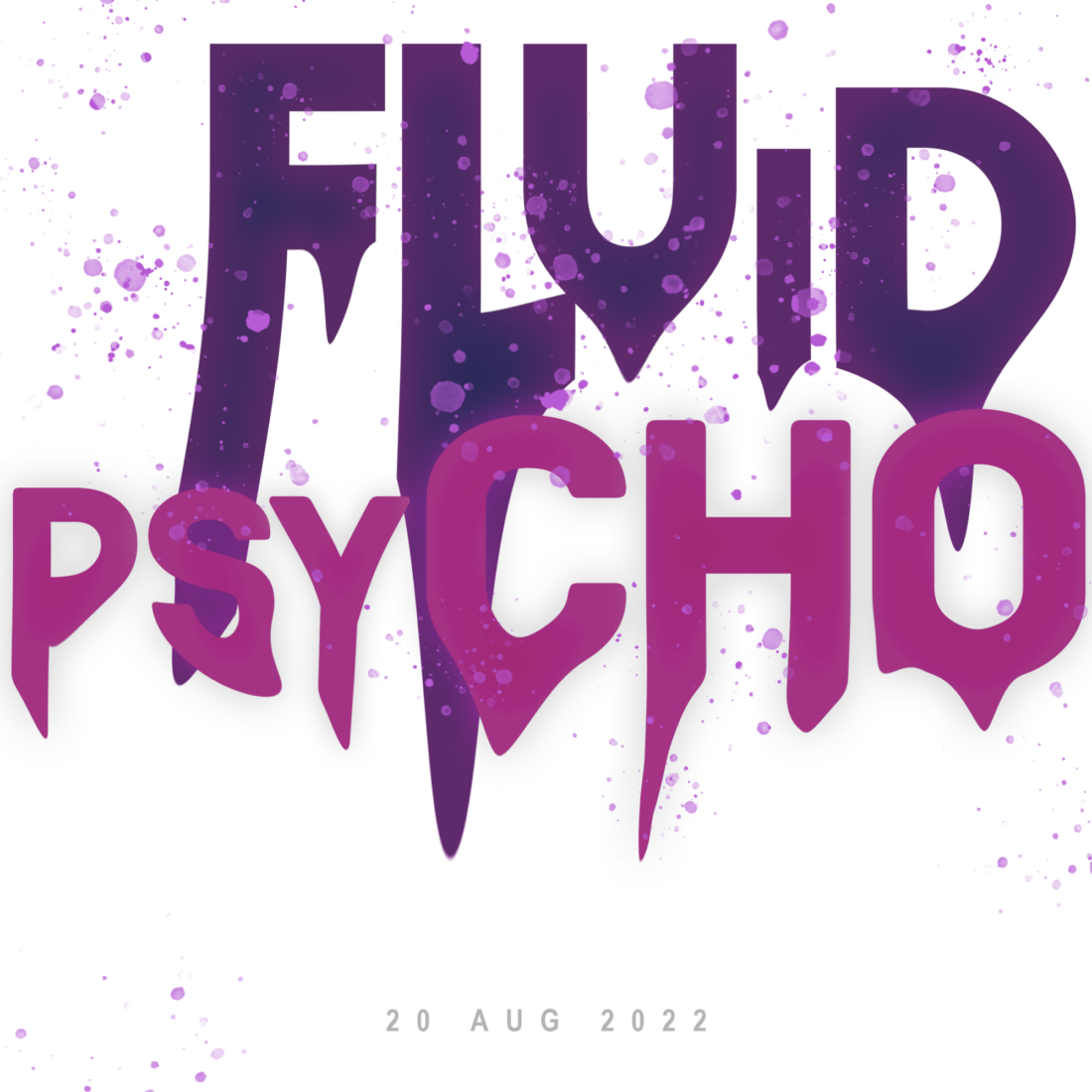
Cecelia contemplated using numerous colour schemes however, landed on pink and purple because for her, these colours have a toxic or psychological tone when combined. She chose to add some warmer colour elements in order to make the design feel more inclusive and inviting.
Cecilia was drawn to distorted type because it gave her flexibility and allowed her to convey many different meanings. Distortion for Cecilia means “not in the safe zone” which speaks volumes to her overall message. While working on the design one particular day, it was raining. This inspired Cecilia to try a rain drop like aesthetic. She found that the overall shape also resembled tears, perhaps pointing towards feeling of loneliness or a melting/sinking feeling that many who are different and misunderstood may feel.
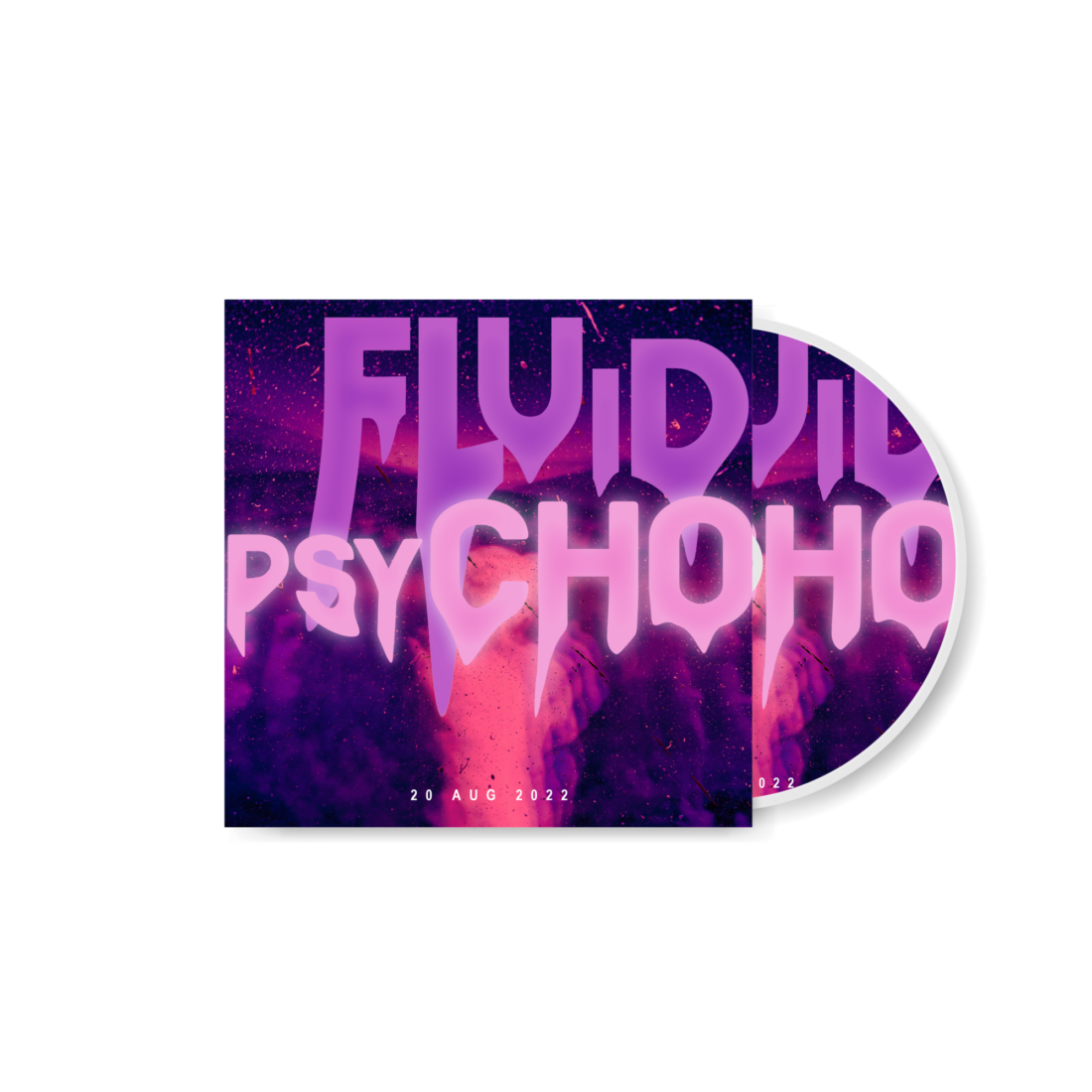
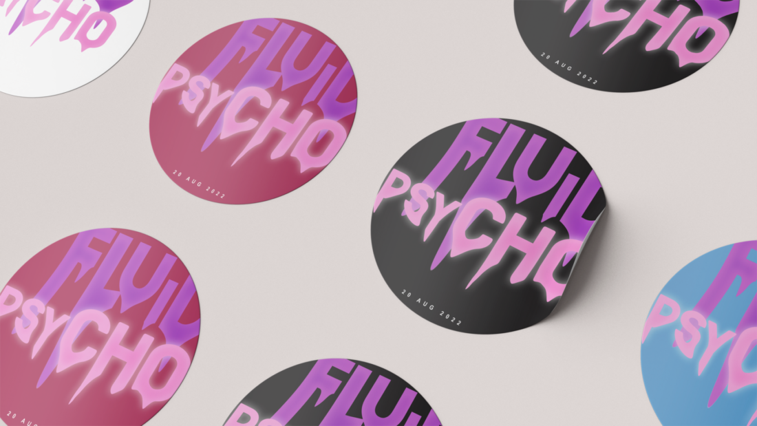
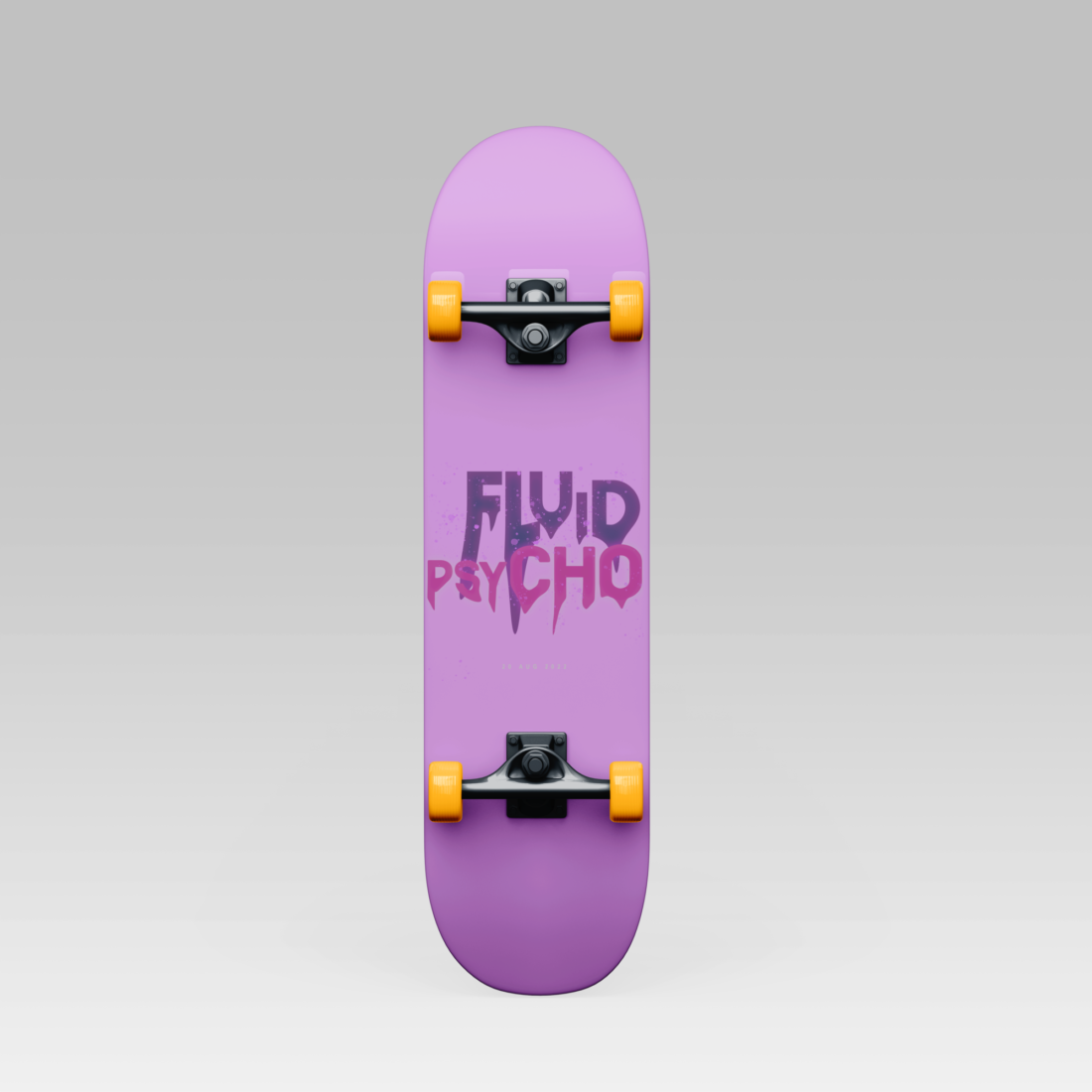
Cecelia implemented her design across merchandise, in the form of stickers and skateboards. For Cecilia stickers are an easy and versatile way to convey branding as they can be used across multiple materials i.e. T-shirts, bags, bottle etc. She chose to create skateboards to appeal to her target audience of young people.
This design has a very deep and complex message targeted at a very specific audience. It does a good job of visually representing state of mind. A state of mind, in particular, I think everyone at some point in their life has experienced or can relate to, especially youths - making this a very engaging design.