Fragmented Design
Student Case Study
Mitch Rosenbaum
Jordan Ritter

'Fragmented Design' is a logo/brand identity for a hypothetical residential architecture firm. The designer, Mitch Rosenbaum, is a student of architecture at the University of Newcastle. The need for a logo that is easily recognised and remembered by potential customers is a must, and in the day and age of web based marketing and social media this is even more important.
"Fragmented Design was designed around creating a simplistic yet effective logo that would be recognized by all audience types."
- Mitch Rosenbaum
THE BRAND
Fragmented Design is a residential architecture firm. The logo is made up of the simple geometry of a house wall and roof. It has been abstracted and repeated to create a clean and simple logo that 'houses' the business name. The pared back look is complimented by a soft colour palette of pastel blue, orange and grey.
Being a residential design firm, Mitch has kept the 'look' softer in colour and expression to make it approachable for clients, as opposed to a firm that might be trying to be brighter and louder for more public or commercial clients/works.
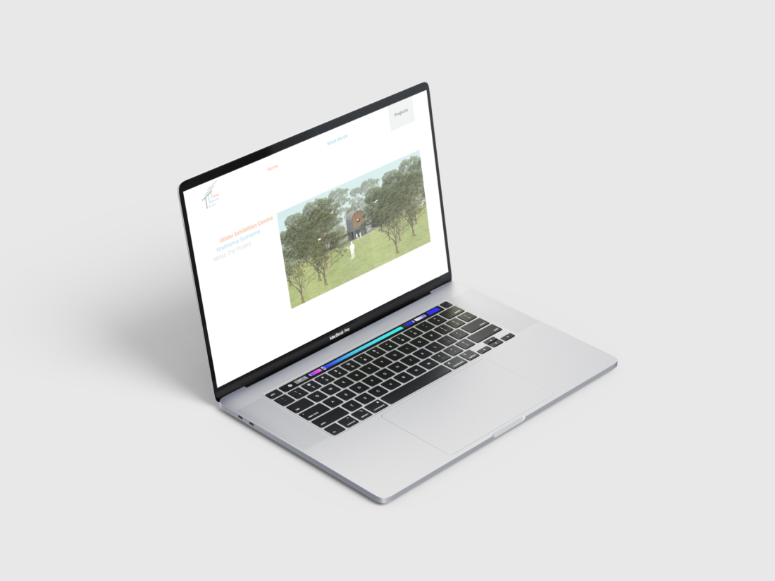
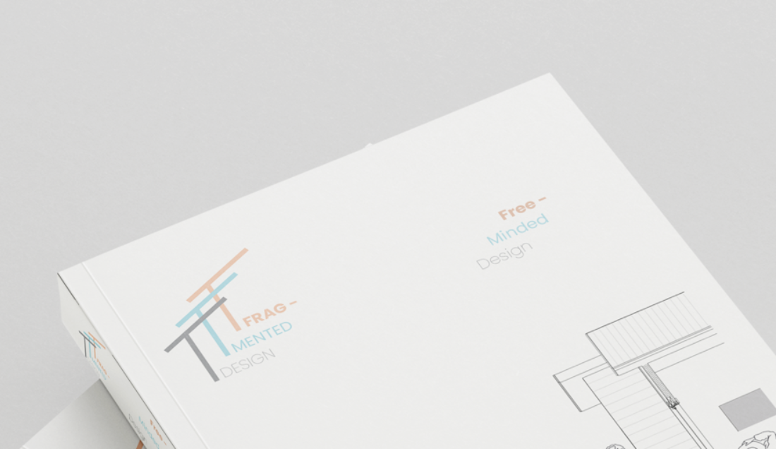
The logo, name and colour palette provide the building blocks for a refined aesthetic that is easily repeatable across different platforms. It can be used in print and digital media scenarios as shown, and would also lend itself to social media.


MARKETING BITS AND BOBS
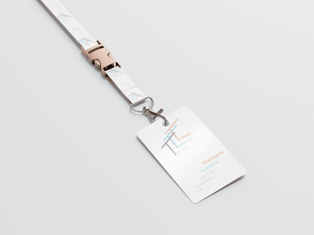
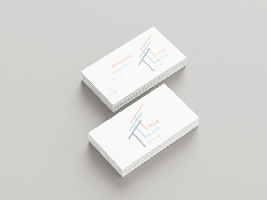
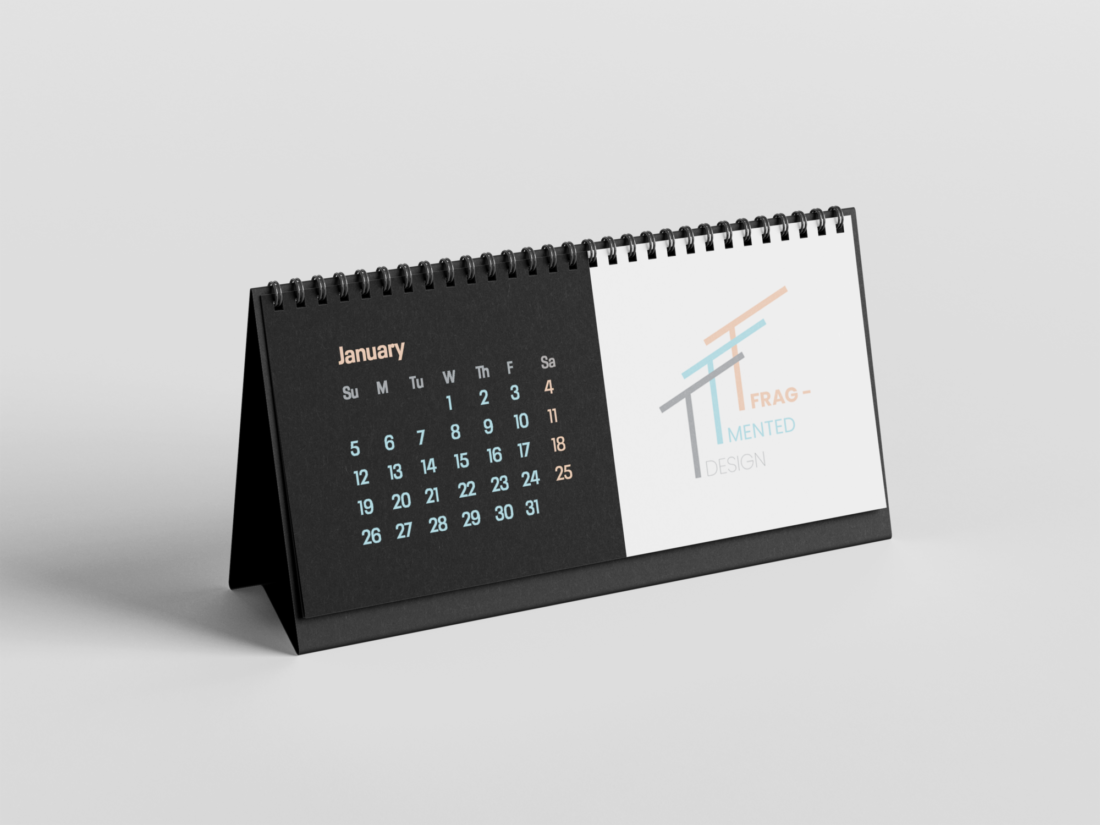
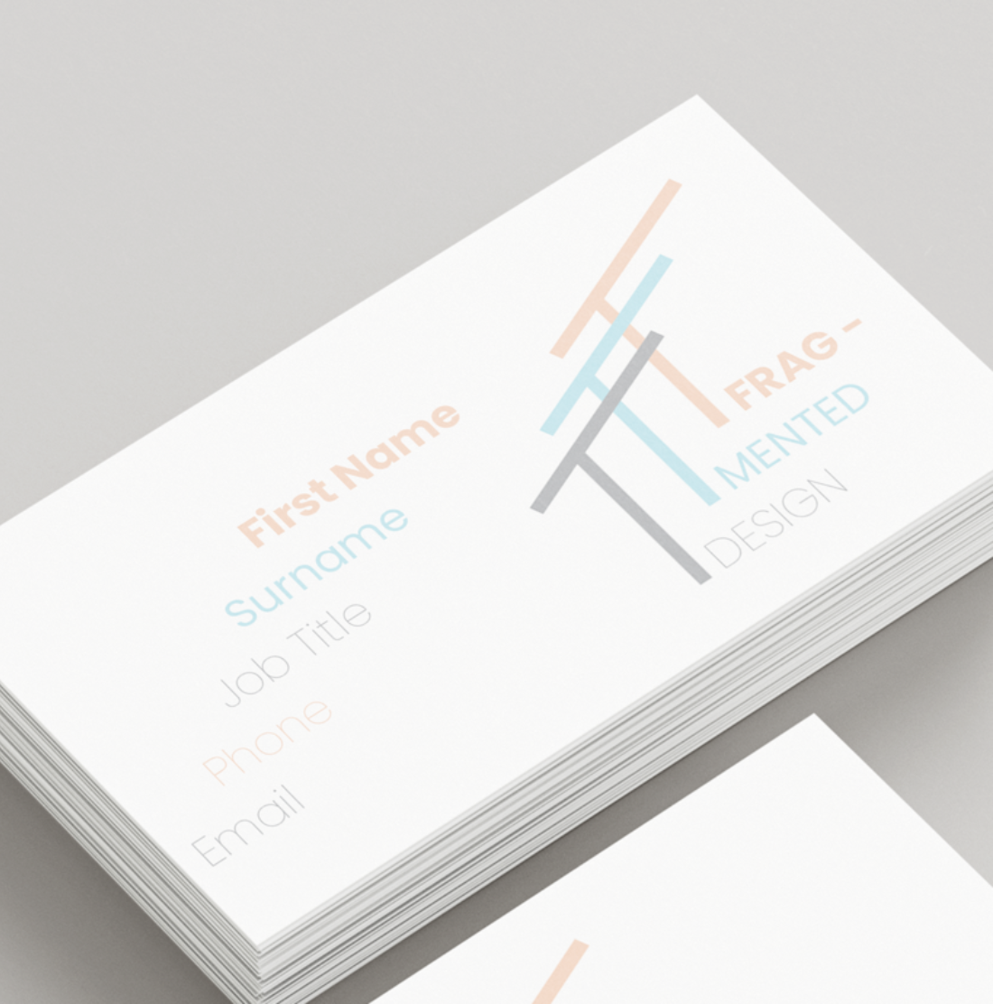
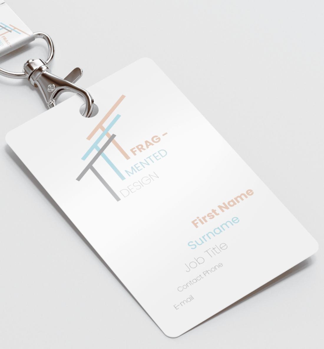
Beyond the constraints of traditional print media and digital/social media, Mitch has experimented with various physical objects such as lanyard, business cards and a calendar. And you could imagine other architecture related paraphernalia like hard hats or pencils etc.
One thing that is noticeable is that whilst most of these mock up iterations have been on a white background, the calendar showcases how the scheme works just as well with a black backdrop. Making the overall aesthetic/identity more versatile.
“The staggered effect of the logo was used to both create depth to the logo, but also to essentially ‘fragment’ the logo, much like the name. This idea of breaking up the text in a linear manner in the logo could then also be explored consistently throughout different mediums"
- Mitch Rosenbaum
KINETIC TYPOGRAPHY
Mitch has used 'fragmentation' and cut and crop' method to create interest but also maintain legibility. The treatment of the text also cleverly adds 'floors' to the abstracted logo that is based on a architectural wall and roof cross section, creating a clear connection to the product/service that is offered without been to literal.
This staggered effect at play in the company name and logo is a simple yet effective technique that has been used across the rest of the mock up examples where titles, lists and written details appear in the same formation and colour scheme. It means that across various media, print and packaging there is a constant reinforcement of the logo and name, even when it isn't present.
The choice of a sans-serif typeface works well for the overall aesthetic of being refined and simple. It is a free typeface called 'poppins' that is fun and playful whilst also having a clinical geometric feel, which is probably the correct approach for this business.

LOTS OF POTENTIAL
This brand identity and logo has a great set of core ideas. The abstraction of the logo works well with the kinetic type treatment, and provides a technique to be repeated across the brand's content.
The trio of colours lend themselves well to use on a white or black backdrop, which is beneficial for different scenarios. This creates a versatility, the simple palette comes to the rescue when the need to subtly import the brand identity into areas or instances where the logo/staggered text may not be appropriate.
If Mitch was to take this concept further, it would be great to see how he might make GIFs or animations of the logo, where some more kinetic 'energy' could be at play. Perhaps the logo icon and text could be 'constructed' to give reference to the architectural practices of the business.
This brand identity mock up has been a successful concept. It definitely has all the building blocks in place to be iterated into a fully fledged set of web pages, social media posts, packaging etc. that would be needed for a real life architectural firm.