Freemantle Octopus
removing the stigma around lowbrow tinned fish.
Holly Valentic
Gidgette Pratten
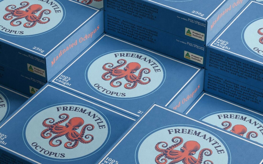
When was the last time you were stopped by tinned octopus? Never? Well, that’s about to change. Designer, Gidgette Pratten, revives tinned seafood in her own brand design of ‘Freemantle Octopus.’ Her modern, simple, and clean take on seafood packaging aims to reinvent consumers’ perceptions of the product.
In the beginning stages of designing, Pratten’s motivation was to transform this unusual product into something that attracts a new target audience. By creating an appealing and fun concept, this seafood product aims to discard its association with cheap and poor-quality production. In turn, she puts a spin on traditional seafood packaging design, whilst also maintaining a classic marine look.
Her inspiration was old matchbox covers, which is evident in the implementation of the cardboard packaging, and nautical themes, shown through the colour palette and wavy, organic lines. In a conversation with her roommates, she discussed the associations people had with seafood and, more specifically, the associations with less common examples such as mussels and, of course, octopus.
“Traditionally seen as a lowbrow product, my bright and fun packaging hopes to bring new customers and interest to the product.”
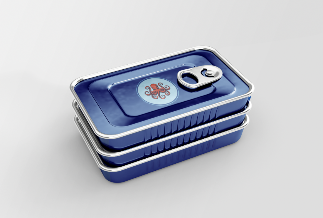
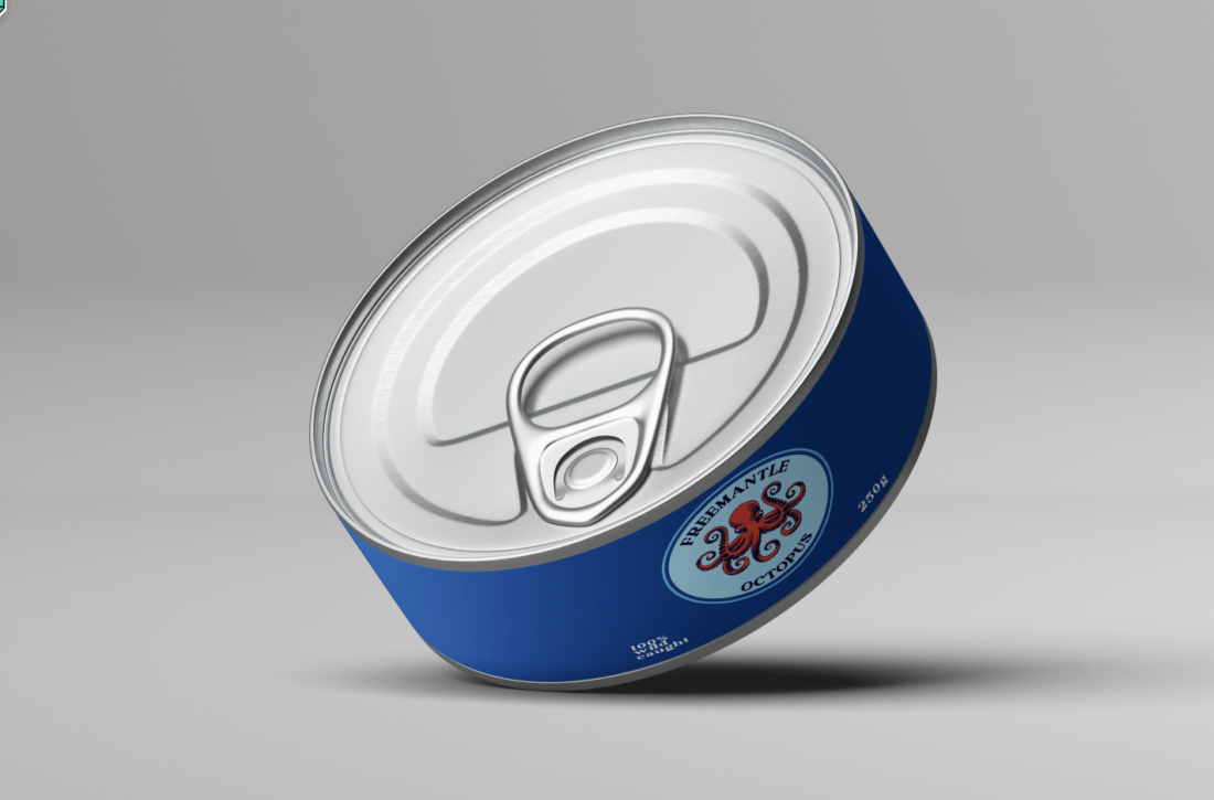
This product stands out from the rest through it’s use of modern design and colour. The employment of illustration creates an individual and undiscovered face of this product. The packaging in itself creates a higher quality look and feel, as Pratten says herself.
“The octopus is very different to the usual images seen on tinned fish packaging and the boxes make for a refined and more upscale product.”
When deciding on the target demographic of this brand identity, Pratten considered what would be successful within her own age group. In the modern world, aesthetics is valued more than most other aspects, and with the younger generations loving the opportunity to take a photo, this packaging aimed to be pleasing to the eye. With the newer, more refined design comes expense, however. Pratten also intends to appeal to an older demographic with higher incomes, as this is more high-class than other brands.
“…specifically younger customers and older customers with higher incomes.”
When it comes to the design process, Pratten took an entirely different approach to her usual “messy and chaotic” poster designs. Being her first time designing packaging, she opted for branching out of her comfort zone by creating a more minimalistic and sophisticated product.
“This is far more simple and clean than most stuff I make.”
In terms of typography, Pratten has used kinetics to strengthen her ocean motif. Using the typeface ‘Gesture,’ she utilised the type on path tool in Adobe Illustrator to create a wavy line, imitating the nature of an octopus tentacle on the side of the box. She also used arced text to fit inside the circular logo, creating a seamless motion. The use of kinetic type is creative and is complimentary with the theme of the product.

During the process, there were many other elements that needed to be considered. Pratten’s most enjoyable aspect of this design was illustrating the octopus, and her least favourite was deciding on a colour palette. The simplistic colour scheme is successful in its relevance to the aquatic product, whilst steering clear of dull. The experimentation with other packaging colour ways is also impressive and add variety within the product. In the end, despite being a first go at this type of design, I think she hit the nail on the head. The product demonstrates a new way of looking at seafood and proves that it can be classy and refined in its simplicity, breaking the precedent around tinned fish brand designs.
“Tinned fish is such a weird product that people associate with cheap and poor quality products so I wanted something to attract a different base of customers and put a spin on traditional packaging for tinned foods.”
Gidgette has revolutionised the face of tinned seafood. With her modernised and sleek packaging design, it creates a twist on the current market. The design she has created is one that I know would stand the test of time. I think this design is successful in what it was set out to do and has definitely changed my own perception of tinned seafood. Maybe it isn’t so bad after all!