FRUITE Visual Identity
Visual Identity Branding Case Study
Micah Djordjevic
Makayla Ditton
INTRODUCTION
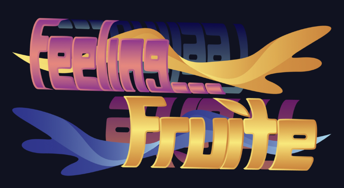
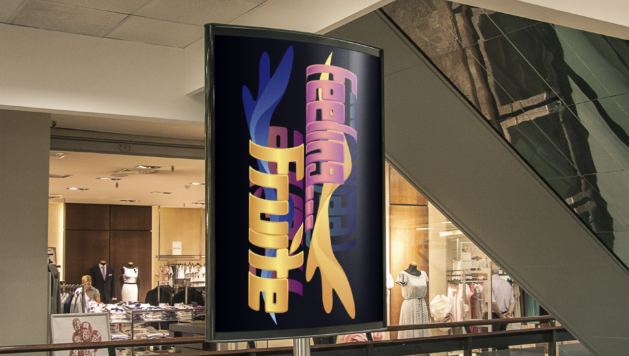
Colourful, playful, fluid and retro are four words used by the emerging designer, Micah Djordjevic, to describe their recently created branding & packaging design, known as ‘FRUITE’. Inspired by the 80's neon strip mall aesthetic, and from a CMYK colour palette, Djordjevic has attempted to depict and portray a fluid, liquid, almost melting motif to emulate the movement motion of fruit smoothies & juices; the beverage aspect of the newly created company, by utilising colour, and distortion as a kinetic type treatment.

TYPE TREATMENT
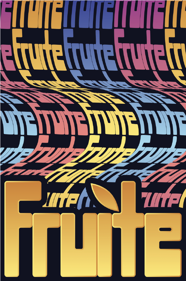
In an interview with the emerging designer, it was mentioned that in order to incorporate and maintain a playful, colourful, inviting aesthetic, and motion frozen like font, a brand new typeface was created by Djordjevic. Constructed in Adobe Illustrator, Djordjevic used a grid as a foundation guide, before making use of the builder tool. In order to achieve that malleable, retro aesthetic, the designer rounded the edges of the typeface, offering a smoother, more friendly and inviting aesthetic. As can be seen in Djordjevic’s project 2 of DESN2011, it is clear an iterative design process was employed to reach that final design of distorted type. Warped text that seems to wrap 360 degrees around an invisible cylindrical shape was experimented with, along with a type that seems to emulate a ribbon’s movement. Djordjevic’s final design consists of both repetitive and non-repetitive types that seem to follow in almost vertical wave motion. The utilisation of bright colours with a slight gradient, also reflects that ribbon movement sensation, and contributes to the overall design appeal, as it makes the design more cohesive with the typographic elements.
COLOUR PALETTE & TARGET MARKET
According to Djordjevic, the most successful aspect of the ‘FRUIT’ design is the colour palette. Djordjevic articulated that an alternate route was taken, to the typically simplified, often minimalist designs & colour palettes that food and beverage companies often take in today’s society. Djordjevic’s intention behind the chosen colour palette of bright yellow-gold, yale blue, rouge pink, and black, was to reflect that bright, energetic, colourful nature of fruity drinks, and draw in the attention of the target market. Similar to Boost Juice, Fruite’s target market would be for those of practically any age, who frequent shopping malls & ‘eat out’, or for those who take interest in healthy juice & smoothie beverages.
BRANDING & EXECUTION
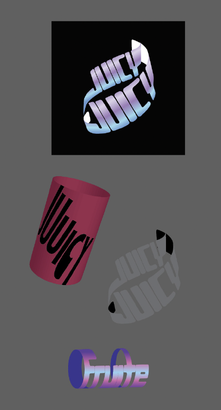
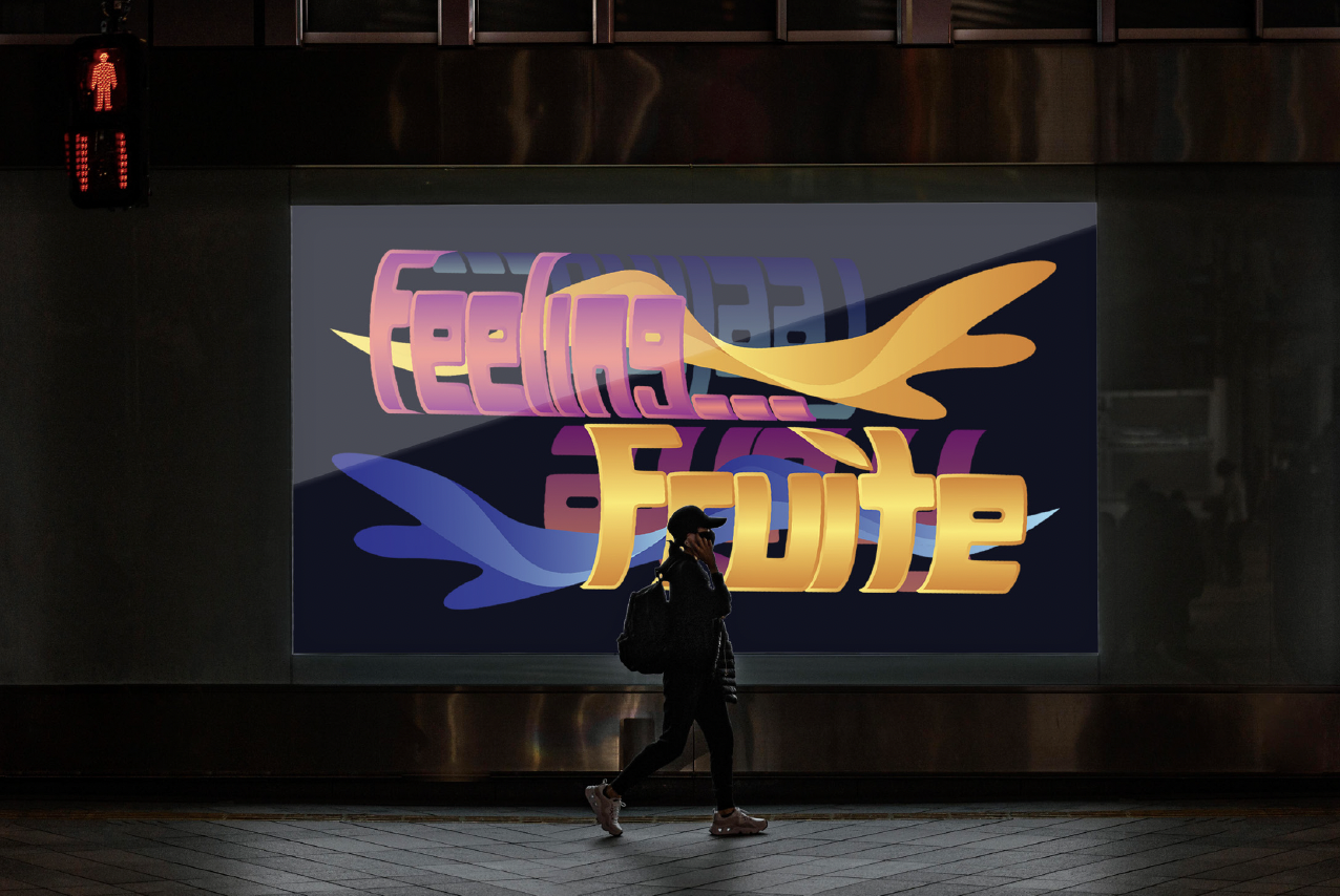
In regards to branding, FRUITE would make a successful business, as it not only portrays a retro aesthetic, but simultaneously offers a fresher, almost futuristic, while somehow modern look. Intended for the branding category, and hence partially packaging, Djordjevic’s design concept could successfully be deconstructed to pull relevant elements to print on logo & signage, posters, menus, beverage cups, and the like. For example, Djordjevic has skillfully rendered mockups of beverage cups, and posters signs.

As supported by Djordjevic, the strongest part of the design execution is the beverage (juice/smoothie) cups. The designer has also quite creatively utilised optical illusions as an illustrative element, which has been incorporated by the designer to once again illustrate that retro aspect, and draw in the attention of the target market.
Although it was mentioned that the designer may have felt rushed, the execution of the final design is actually quite successful, both aesthetically and in regards to relevancy of the design brief, and design goals. Each element of the design piece compliments the other elements, ultimately working in cohesion to portray a design that has the potential for real world use & success.