Glitch
The poster series exploring our distorted perceptions of reality.
Lucy Jones
Caitlin Houston

I think everyone can agree that Covid-19 has dramatically and abruptly changed all of our lives in one way or another. The reality for many of us is that our lives evolve around technology and staring at screens has become our life, whether that be for school, university, work or even just for our personal lives. With our lifestyles and much of our interactions happening on screens, our reality can easily become distorted.

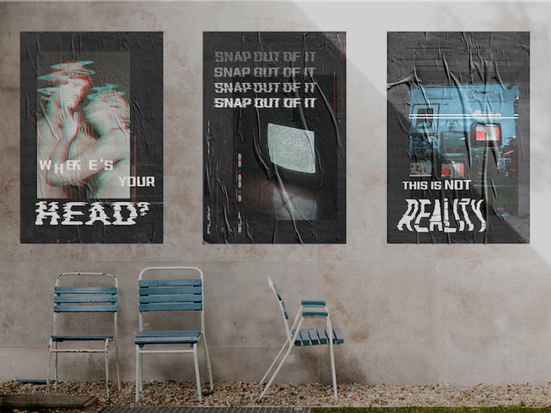
Designer, Caitlin Houston, explores this concept of distorted perceptions of reality in her poster series entitled Glitch. The poster series, comprised of three posters, "aims to be a sort of 'wake-up' call to remind us that the world we view through our screens is a distorted perception.". Houston's posters all have a uniqueness to them, with what she describes as a, "'glitchy', digital aesthetic" which she pairs with kinetic typography that resembles and stays within this particular aesthetic.
The poster series aims to be a sort of ‘wake-up’ call to remind us that the world we view through our screens is a distorted perception.
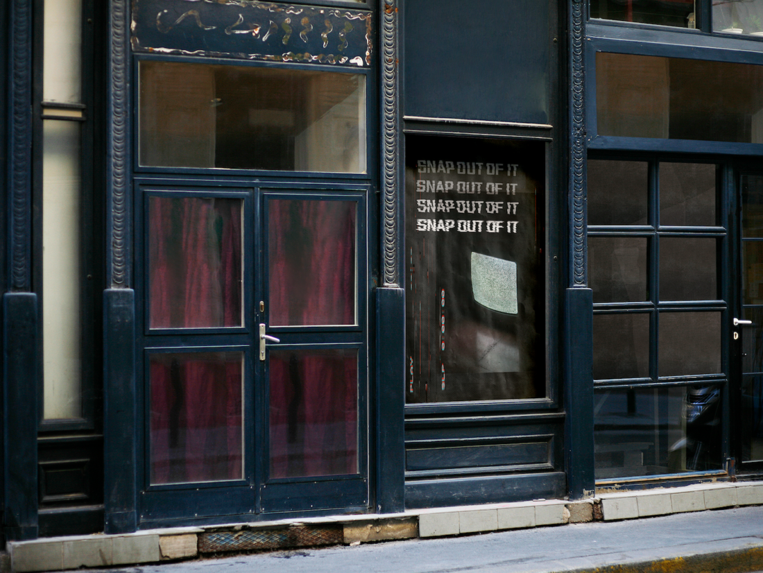
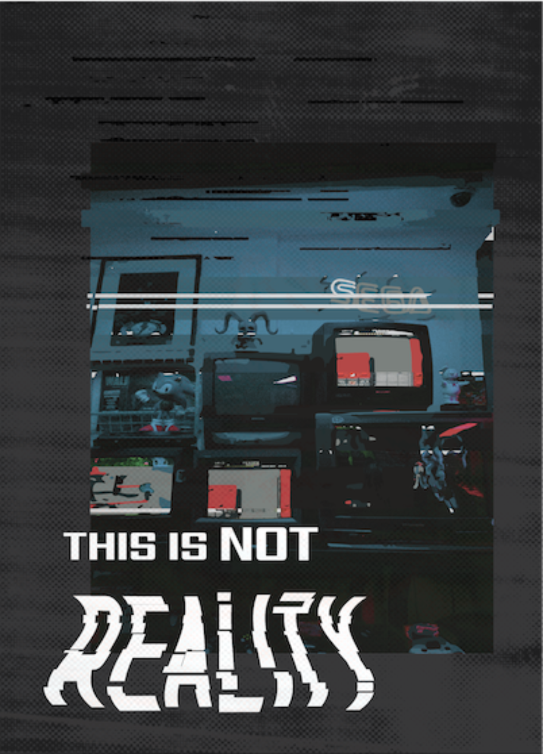
Each of her posters projects a message to her audience. Her first poster includes the words, "Where's your head?", while the second poster in the series says, "Snap Out of It" and her last poster reads "This is Not Reality.". Houston says, "I wanted to portray a message through the type treatment" and I think she was able to achieve this, especially as the words and their individual treatment allow them to be the focal point of each poster.
Her first poster in the series, Where's Your Head? directly talks to her audience and forces them to think about their response and truly be impacted by this artwork. The kinetic typography used in this poster creates a distorted, vibrated and almost wave, motion like feeling. I think this treatment allows the message and power of her question to have full affect as it creates this distorted vibe that imitates the confused and muddled way that someones head can get, especially when their confused or feeling distorted.

The second poster in this series, Snap Out of It, combines the same charcoal coloured background as the other posters which effectively ties the posters together. Where the first poster was a question and allowed the audience to think about what was being said, this poster is a statement and really puts the audience in a position where they are being talked to. The kinetic type and the repetition used really emphasises the importance of this statement and creates a hierarchy. Houston has repeated this statement four times with the first line being a faint grey colour which gradually becomes a strong white colour that projects the message even more. This is a strong poster with a strong message.

The final poster in the series, This is Not Reality, is also a statement similarly to the second poster in this series, however it doesn't come across quite as forceful. The cut and crop, distorted and geometric kinetic typography used allows this statement to follow through with the 'glitchy' and digital aesthetic that Houston previously mentioned. The way Houston makes the word 'Reality' seem like it is moving really allows her audience to question what reality truly is and to think about how distorted their own perceptions of reality really are.

Distorted perceptions of reality, I believe, is something we all experience in current times, especially given the circumstances we are under where such a large portion of our lives seems to be lived staring at a screen.
Caitlin Houston's designs and use of kinetic typography truly do make a powerful poster series that forces her audience to consider distorted perceptions of reality. Houston says, "I was inspired by current trends I have seen from designers on Instagram and Pinterest feeds." and that "the typographic treatment involved a lot of trial and error". Caitlin Houston is a designer pushing boundaries and challenging audiences with inspiration from creatives all around her and creating powerful designs through her own experimentation. Her series Glitch is an amazing series exploring a relevant topic within today's society and culture.