Glo-Go Skin Care
Case Study
Matilda Murphy
Jade Palmer

Skin care routines are becoming more popular and common amongst people of all ages. It’s something unique to the individual depending on skin types and goals they have for their skin, and it can get tricky finding the right products for your needs. Glo-Go has solved this problem making it easier for people to find the right products while making the experience fun
"I really love skincare brands who do playful & contemporary" -Matilda Murphy
THE BRAND
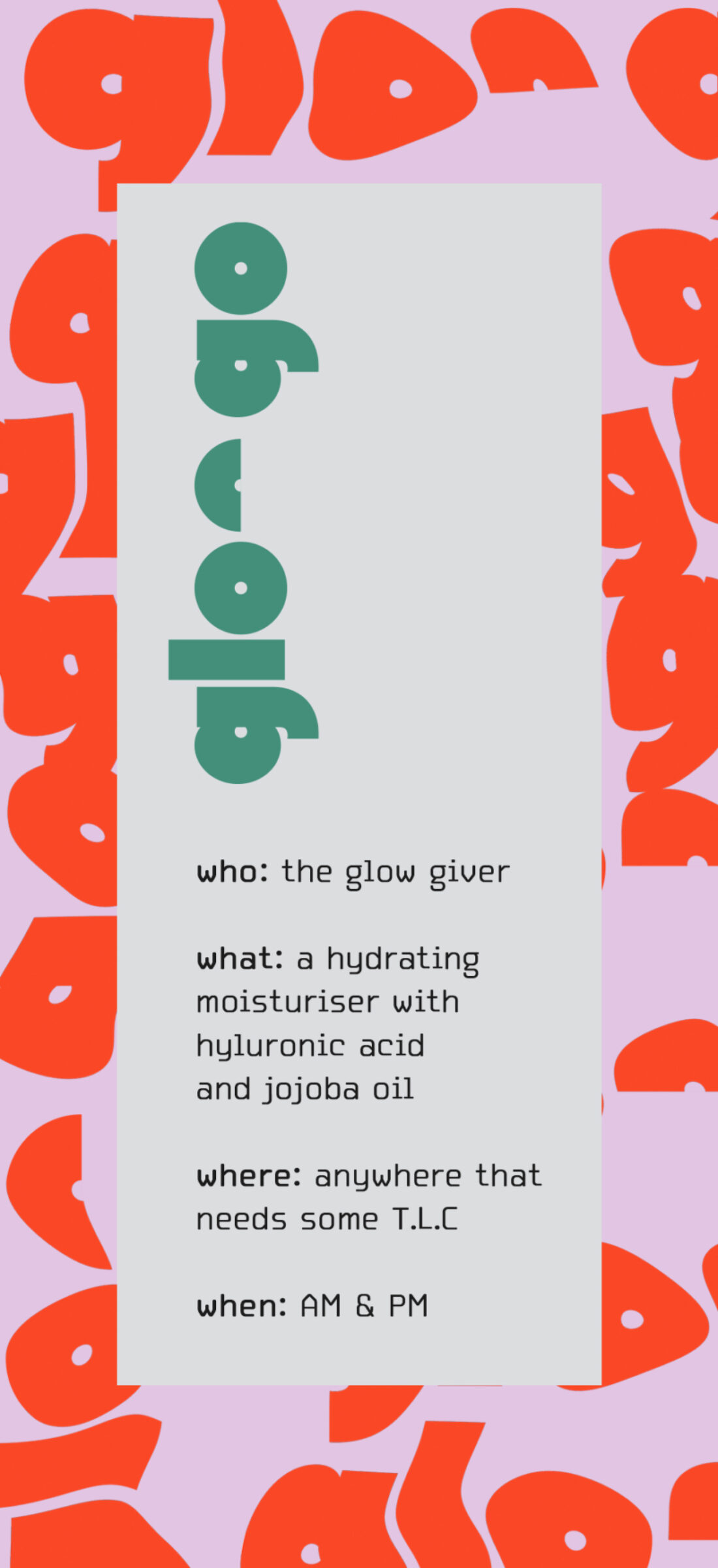
Glo-Go is the newest skin care brand suited for everyone and their needs. Easy to use with clear labelled products to help with everyone and all skin types. Created for all skin care newbies and skin care pros they can all enjoy their skin care routines following the simple “who, what, where, when” instructions of each product. Skin care has never been so easy and fun with the bright, vibrant, and playful packaging created.
The creator Matilda Murphy has achieved to make her Brand Glo-Go as eye catching and fun by her use of packaging design. With her personal love and interest in skin care and graphic design she finds herself gravitating towards products with fun and good-looking packaging like many people do.

PACKAGING
Glo-Go is aimed at every one creating packaging people would appreciate and designs in which designers would also appreciate and love. Inspired by the contemporary skin care packaging of brands such as Glossier, Drunk Elephant and many Korean brands. Freely using bright and fun colours to create a playful eye-catching design while ensuring the designs stayed clear and concise. The clear and concise packaging also helps make it easier for consumers to identify the product and read the best way on how to apply the product.
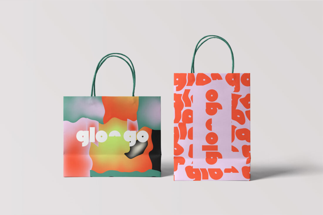


The designs are bold and bright. Each package for different products incorporates the same colours of lilac pink, cherry red and a bright emerald green. These colours have been used on different elements on each product. By doing this the designs still all look cohesive and easily identified by consumers.

Mud Mask

Water Mask

Quick Fix
TYPOGRAPHY
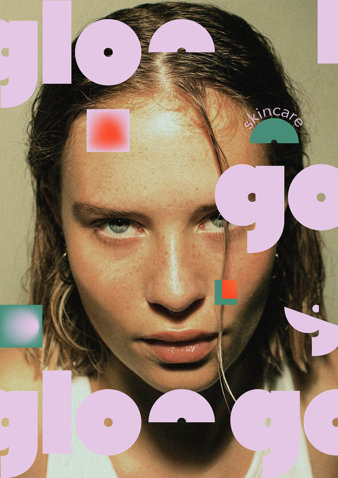
Another design element and aspect of the packaging design in the typography used for the Brand logo. Glo-Go is bold, and it makes a strong statement. It’s the first thing eyes see on the packaging. The Type is simple however, by using kinetic type elements it makes the brand identity and aesthetic shine through.
By using a bold minimalistic typeface called Mostra Nuova, the designer has distorted it in photoshop creating a liquifying effect. To better suit the brand and identity of the skin care line. It is also fresh and unique to other products found on the shelf making Glo-Go more inviting to consumers.
"Patterns are good for packaging I think, it's a good way to fill space without looking overwhelming and complicated" -Matilda Murphy
PATTERNING/DESIGN
A strong element of design is the strength between the Type/Branding and the patterning of the packaging. Using the same type as the logo it has been manipulated and disported more to look even more liquefied. It has created a wavy effect which softens the harshness and impact of the design. Rather creating a soft, inviting looking design. Pairing the logo and patterning together Matilda has also paired it with a simple typeface for the label, product name and information on the design. This type face adds a modern element as it looks like a digital inspired typeface. It is clear to read and works well with all the design elements and aspects of Glo-Go.
These elements all together bright the product together, making Glo-Go the obvious choice for skin care and beauty users to choose. The brands, aesthetic and mood shines through making It appeal to everyone and it the most playful brand on the market. So come give it a try and you won’t be disappointed!