HYDRO PREMIUM VODKA
Case Study
DANIEL HOWARTH
TEGAN HOLME
Indulging should be a multisensory experience that combines both wonder and play. Hydro encourages its consumers to do so with its production of premium vodka. Drawing its influence from China’s Qin dynasty, the premium vodka allows its consumers a taste of luxury.
The creator behind this brand Daniel Howarth designs a premium vodka that alludes to the elegance and sophistication fit for an emperor. Playing with concepts of illusion, euphoria and Chinese history, Howarth creates a unique brand and packaging.
"It's based after an emperor so it's going to be made high quality, so you feel like royalty when you drink it."
CONCEPT AND BRANDING
Howarth drew inspiration from the first Emperor of China Qin Shi Huang, who famously experimented with Mercury in the hopes of finding eternal life.
“It's an odd one but I was inspired by the first emperor of China when creating this product. He wanted to live forever and thought he could by drinking mercury.”
This significant historical event appealed to Howarth when conceptualising and choosing the design and its symbolic elements. These features distinguish Hydro from other alcoholic brands, creating a unique experience for its consumers.
Hydro embraces this luxury lifestyle and feelings of euphoria while indulging. Simultaneously appealing to, and creating a niche within the beverage market.
"The target audience is a more mature market. People with a mature palette who will saviour the flavour and not just neck it."
Howarth combines these playful concepts of illusion and euphoria with a Chinese influence, creating a distinct brand that has conceptual understandings.
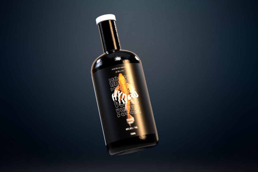
PACKAGING
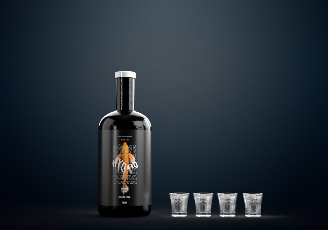
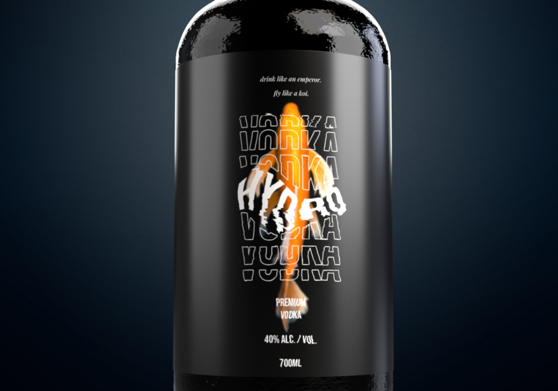
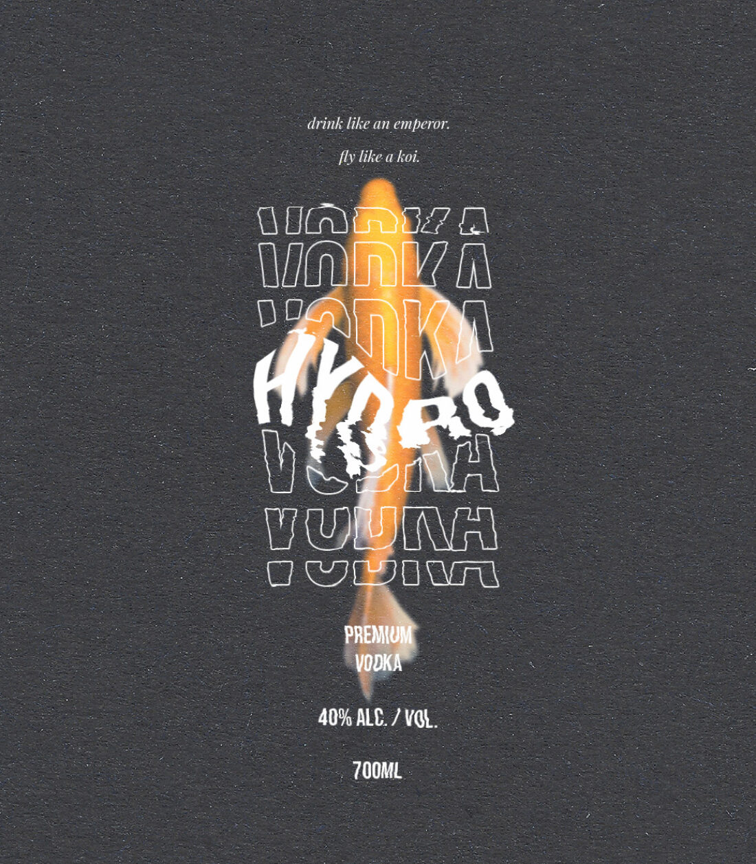
The packaging for these designs is multifaceted, creating an immersive experience for its consumer. Intended for a higher-end market, this premium vodka uses design elements in its packaging such as a limited colour pallet with contrasting features of Chinese symbolism to execute this.
“I chose black and white because it worked really well with that distortion effect. A black background with white type makes it so easy to read and just complimented the colours of the koi.”
Drawing influence from China’s first Emperor Qin, Hydro encourages its audience to "drink like an emperor, fly like a koi". This phrase included within the design of the packaging furthers the themes of illusion and Chinese influence.

TYPOGRAPHY
Another design aspect that is an essential part of Hydro is its typography. Choosing the typeface Helvetica Neue bold, Howarth creates a design that is both eye-catching and aesthetically pleasing.
"It's big and easy to read and thought it would capture the audience's attention".
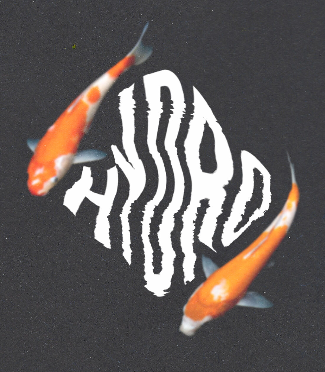
Applying distortion to the typography in order to create a kinetic type. This effect also paired with repetition, creates the element of detachment as though the typography is dripping, furthering the illusion of liquid.
"Using kinetic type I distorted the text to make the koi look like it was going through it and rippling the type like a pool of water".
In doing so, Howarth creates a brand that feels immersive and multi-sensory for its audience.

DESIGN ELEMENTS
Incorporating Chinese symbols that had meaning was key for Howarth when designing Hydro. Telling a story within the elements of a design allows its audience to have a multidimensional experience. Howarth does this by incorporating design elements that hold symbolic meaning.
Due to the side effects of consuming Mercury, it is known that hallucinations can occur. For Emperor Qin, this side effect would manifest in seeing koi fish fly.
“The idea of the koi fish came from this too because he would hallucinate them flying in the sky”.
Inspired by these events, Howarth incorporated this bright orange fish, elevating the designs to have symbolic, historic and conceptual meanings.

These components of design elements, typography, packaging, concept and branding to create Hydro, brings new meaning to top-shelf beverages. Howarth’s successful experimentation in playing with the concepts of illusion, euphoria and Chinese history makes for a unique design that is both beautiful and imaginative.