I AM OK
Case Study - Poster & Print Branding
APONI BRUIN
SUSANNA BEHNE-SMITH

Implementing ways to better mental health in society, has never been more necessary.
Today we are increasingly aware of the profound and devastating ramifications of poor mental health.
“Suicide is the fourth leading cause of death among 15-29-year-olds” (World Health Organization)


Branding & Identity
The breakdown of stigma saw an overwhelming advocation for programs and applications that support individual well-being. The meditation application; Headspace, provides guided mindful strategies and techniques inclusively and became the main source of inspiration for the I AM OK print and poster design, by Aponi Bruin.
Aponi touches on how her state of mental health was recent “not at the best place”, which inspired her to design a poster that promoted a brand that universally supported people's mental health. The targeted audience was “anyone struggling or trying to better their mental health.
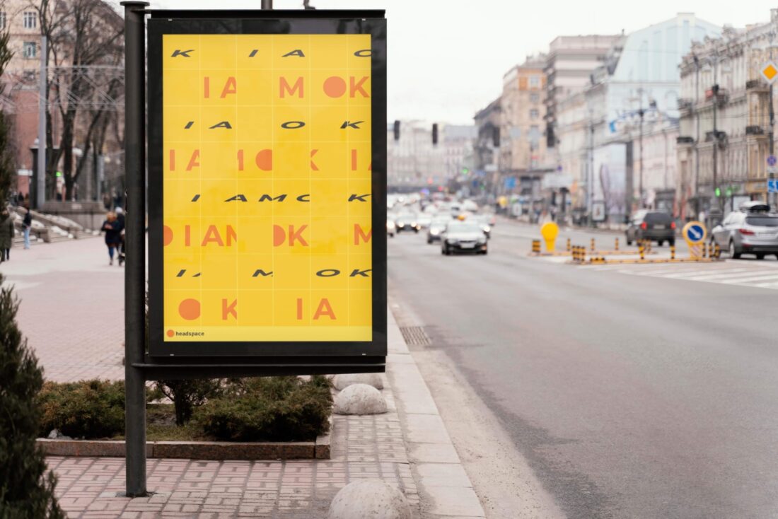
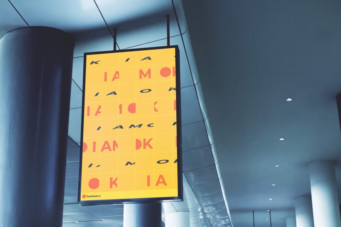
I AM OK uses distinct typography, palette, and kinetic type within the compositional layout that subtly alludes to an underlying message, that “being “OK” has a subjective meaning behind it” and highlights ”the struggle of finding contempt when going through challenges and background influences”.
“ I tried to create a representation of what my mental health was like at this state ”
Typography
Aponi incorporates shared traits of headspace branding to signify the correlation between the print and past brand aesthetic. This is seen through the use of palette and typography. Aponi notes how she ”used bold Montserrat for the ‘I AM OK’”, as it was the same typeface used all “through headspace logos and layout”.

Kinetic type
Aponi effectively employs the kinetic type of fragmentation, using it to shape the aesthetic, conceptual meaning, and how the audience engages with the design.
“I tried to resemble the sliding square puzzle where the solution is trying to connect the squares to make out the word. “
The kinetic type of fragmentation is utilized to achieve feelings of “confusion” and “dissociation”, of which can be a result of poor mental health. This was achieved by breaking and splitting up the typography “so that it isn’t as legible but can instead display or represent an alternate meaning’. Aponi, by fragmenting the words, "I AM OK”, was successfully able to create a depiction that ”resembled a sliding square puzzle”. This captures the viewers attention, as it requires more than a glance to understand and dismantle. This compels the audience to "solve” the puzzle, which lets them enter and then escape a state of confusion, once the message is discovered. This is a symbolic represenation of how applications such as headspace meditation can help people heal or feel supported.
“Meditation is a sense of trying to get in touch with your breathing and your mind, such as doing a puzzle.”
Colour
The use of colour in I AM OK is significant, as it represents the the branding, key emotions and enhances the kinetic typography of fragmentation.
Aponi’s selective choice in palette, allowed for a connection and shared aesthetic between the design and past Headspace branding. This is also noticed when Aponi uses yellow as the background colour and then depicts words or images using orange and black, similarly to headspace.
Aponi purposefully chose bright and intense colours of honey yellow, tangerine orange and pitch black to, not only match the headspace pallette, but also create an intense and vivid atmosphere. This palette and it's tones engage the audience and evoke feelings of optimism and hopefulness.
These colours are then juxtaposed with the words ”I AM OK” fragmented in a horizontal layout. This comparison allows the colours to overpower the fragmented words, consuming the “dissociation”, further suggesting that healing isn’t out of reach.
The thought out design techniques Aponi has fused together to create the I AM OK Headspace design, produced an emotional and thought provoking experience. Aponi’s use of elements, such as palette and fragmentation within the design, combined to successfully inspire viewers to acknowledge mental health, seek support and take steps for better wellbeing as an individual.
If you’re struggling with feelings of depression or confusion, you're not alone. Don’t wait to get help, reach out or try a support application, such as the meditation application by headspace.