KINETIC TYPE IN ZINE
Liam Mills' kinetic Typography project is a bleeding edge of AI and futures technology content zine. The aim of the zine is to display a typical futuristic feel but also leaning into the organic semblance that technology has with nature. The design falls under the category "Print/Book" in AGDA. Mills' inspiration was :
"I think around the time I made this I had just been looking at layouts and grids a lot more so I wanted to make the whole thing adhere to a grid system pretty strictly. In general I like work that adheres to rules strictly but has moments where it breaks that. I tried to do that with my title text treatment."
Who Did you have in mind designing this ?
Liam's goal is trying to make tech “cool”. A lot of tech mags are very unapproachable and aesthetically dated. He wanted to make something that was just more appealing to a wide audience and felt more modern given the context of AI as such a bleeding edge tech product.
Mills' Creative Process
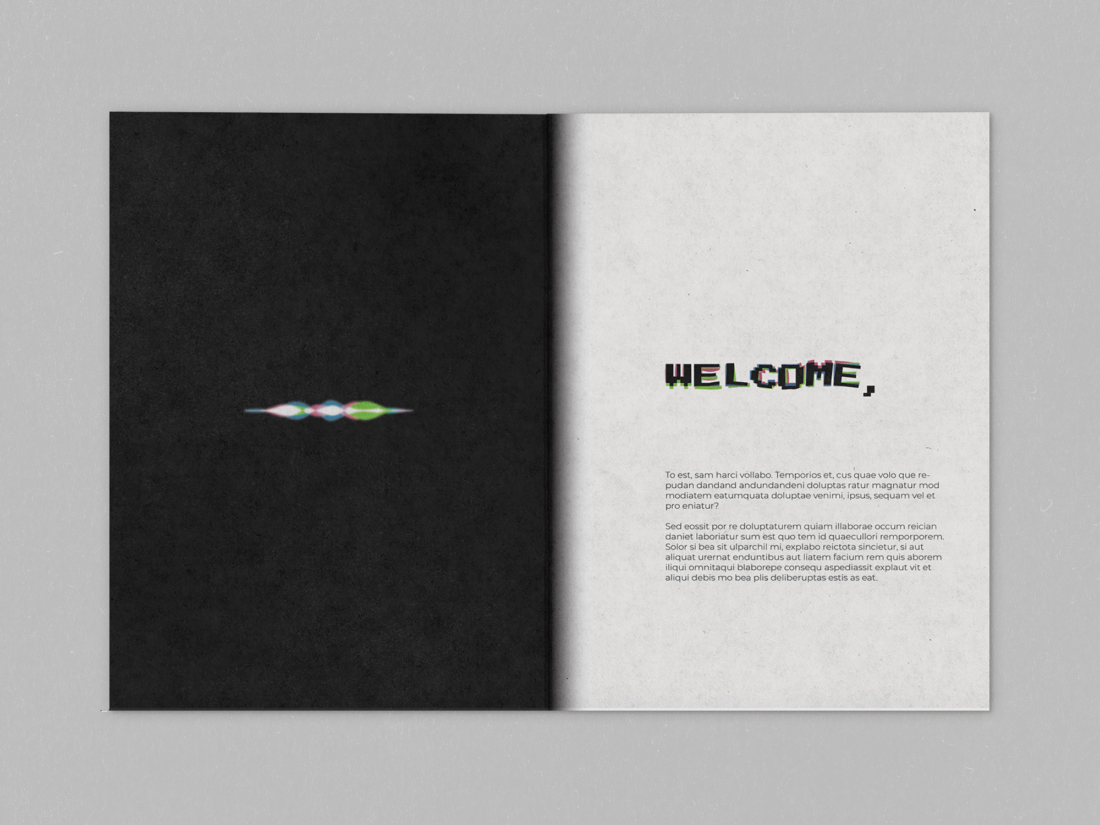
"Once I had a rough idea I spent ages just trying to figure out a treatment for the title text. The basic idea was in my head but I just experimented over and over to find a way that was recreatable and gave the effect I wanted. Once I did that I just played around in a sketchbook to make some grid layouts I felt were interesting and relevant. From there I just went page by page."
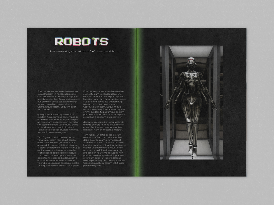

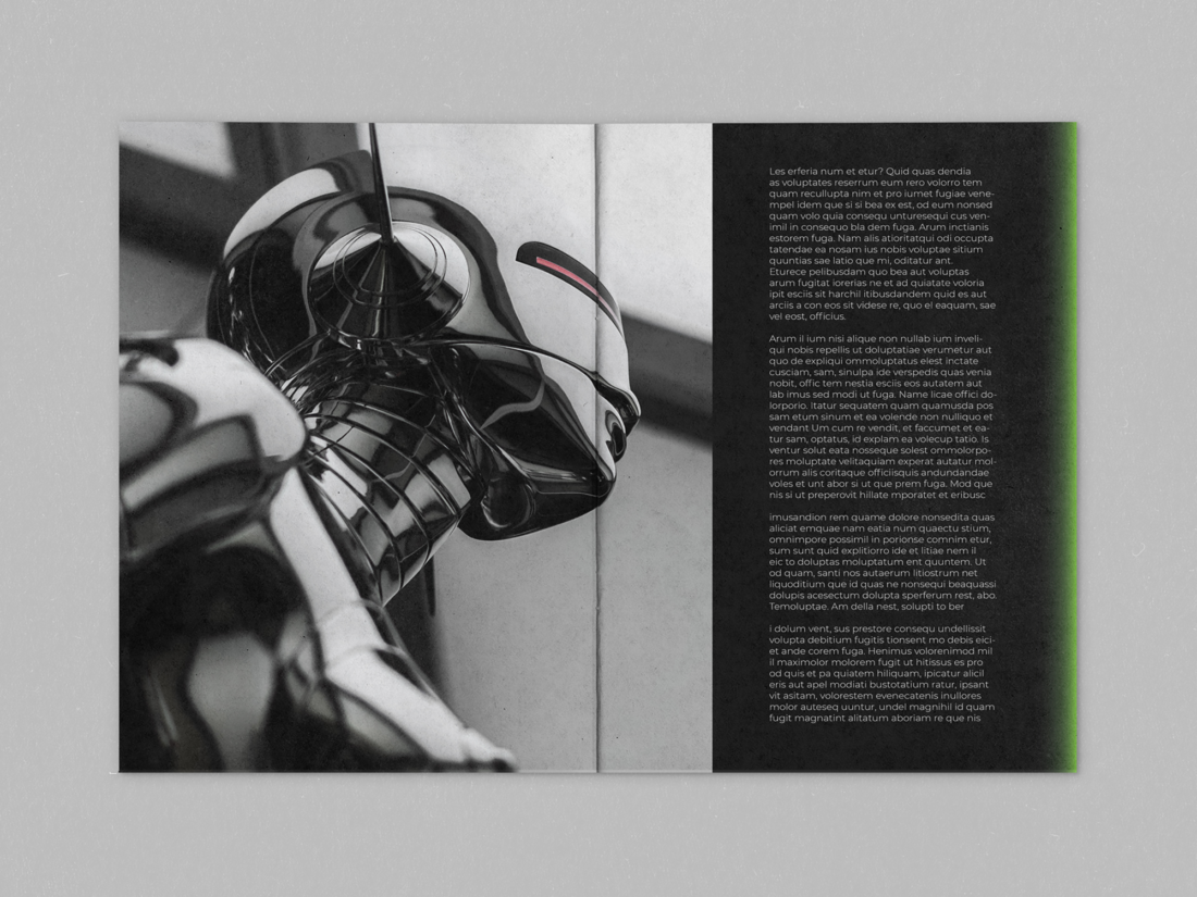
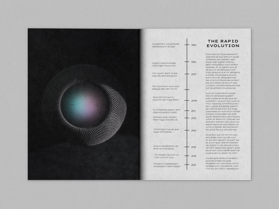
Mills was happy with the cover layout as well as the balance of colours and shapes on front. Inside he tried to balance between highlighting the photography and also using the text blocks as visual elements, he believes there a few nice moments of that such the “do computers dream in RGB” page. The typeface he implemented on the design is Tera variable, Montserrat and press start 2p,
"they aren’t strictly used in a system but just what made sense for each situation."
The Kinetic type falls under the Distortion type and Mills' said " it was as an interesting contrast to the rest of the zine given the context".
Did you struggle in anything design this zine and what didn't you like?
"Indesign! I have been consciously staying away from it for a while because Im not great with it but this project gave me insight into why its so useful. Also I didn’t excel in this at the beginning but I think I could probably do magazine spreads with pretty good efficiency now"
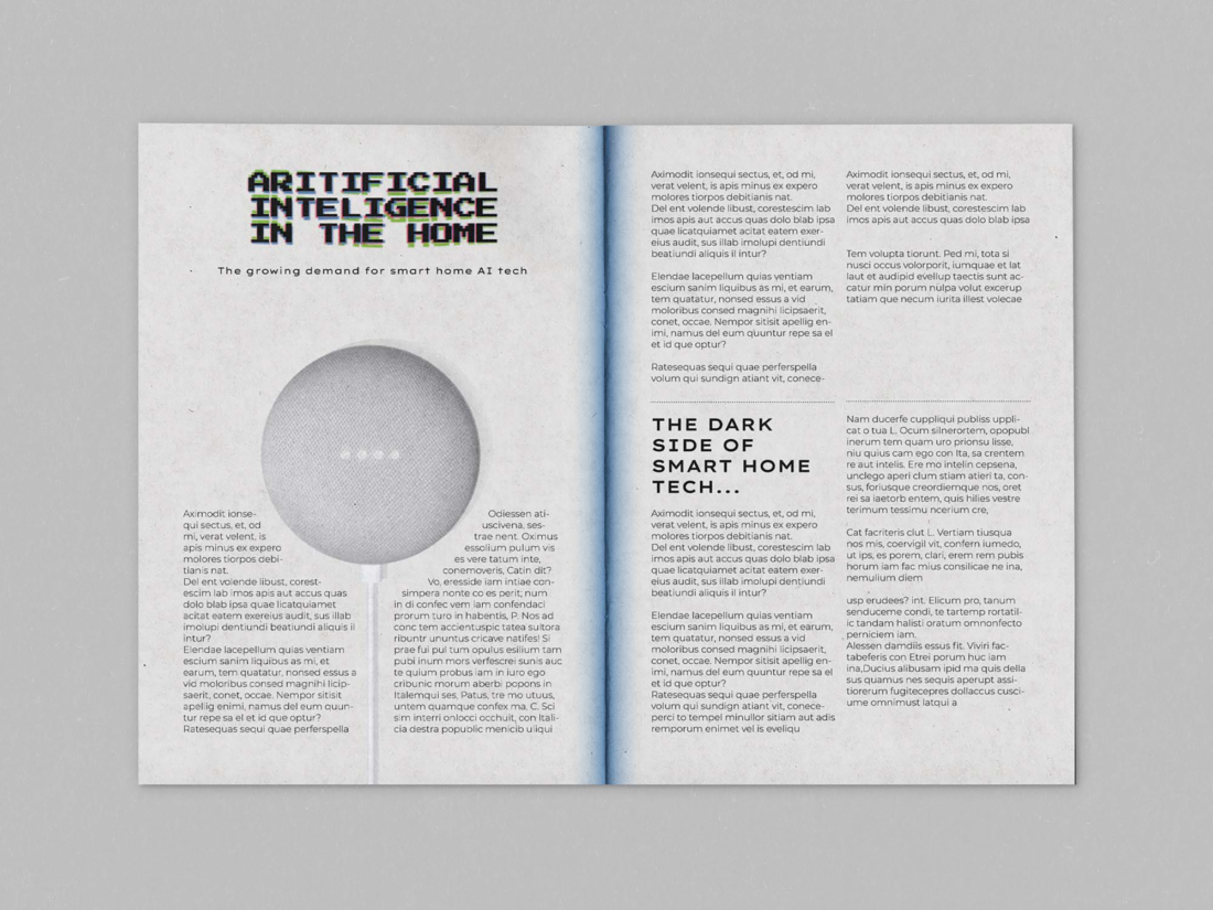
"Aside from maybe making a few more spreads… The title itself I don’t LOVE, I think if I just played around with it for a bit longer I could do better. Theres a few tiny adjustments id make on the spreads where things need some more room to breath. Lastly the spread with the google home just needs to be redone completely."
More of Liam's InOrganic Zine Pages -

Zine Mockup, InORGANIC (Liam Mills)