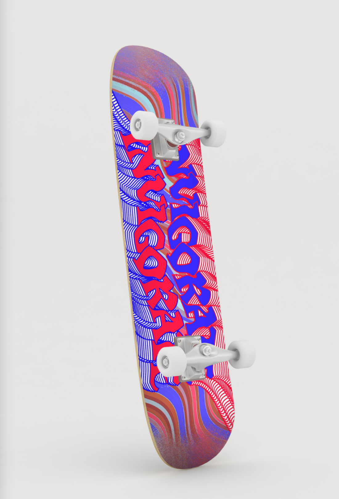
Invigorate
Skateboard Designs by Shawn Nieva
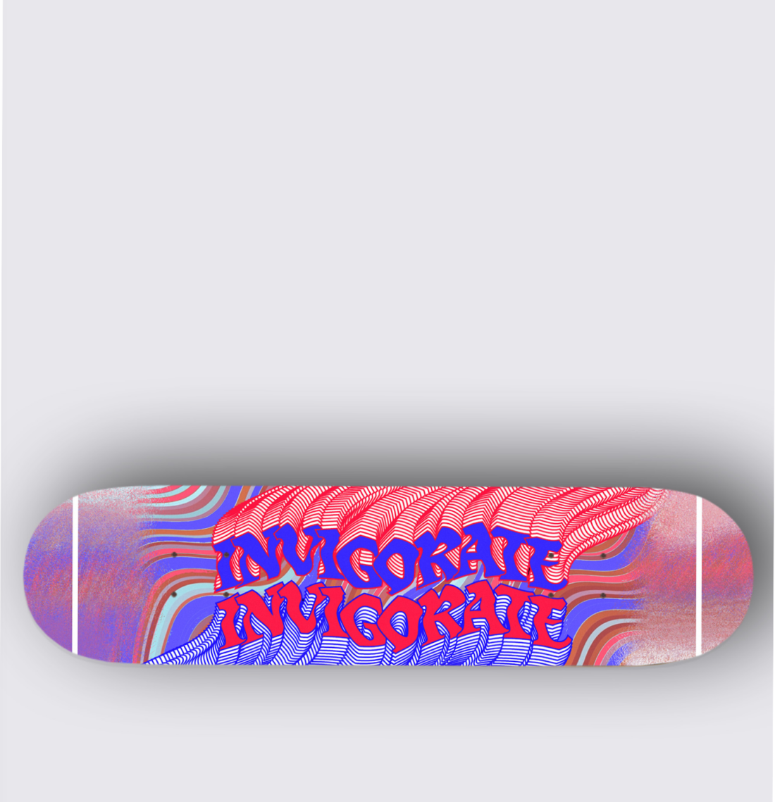
Hi Shawn! Thanks for chatting to me about your project today. Firstly, I love your design! I am loving the bold colour choices and kinetic type which definitely lend themselves to the theme of "Invigorate".
Tell me a little about you and your background in design.
A bit about me, I am majoring in Graphic Design and Illustration, but mainly illustrating in photoshop and creating characters, you could call it character designing along with trying to produce hyper realistic digital portraits of people.
Are you a skater/ have an association with skating?
I skate occasionally in my free time, however I still wouldn’t call myself a skater. I do like looking at skateboard decks because there are so many different styles of artwork and designs to see, and I’m quite interested in how artists express their work.

What inspired you with this project and who did you have in mind when you designed this?
The “yes” Optus campaign with 3D motion graphics, changing colours and animations. I was inspired to do a 2D design that communicated the idea that the word “Invigorate“ is moving from the top and bottom of the skateboard. I didn’t necessarily have anyone in mind as an audience, I was just following my main source of inspiration.
What kinetic type do you think this falls under and why do you like this type?
I believe it falls under the "Motion" and "Distortion" category. The word invigorate is stacked on top of itself to create a motion effect and the distortion type is seen through the letters being "jagged" and uneven.
"I like this kind of type because it is the most effective way to communicate something is moving without the animation in my opinion."
How is this skateboard design different from other skateboard designs?
Well, the main point is that it’s a kinetic typography design, most skateboard decks I’ve seen in stores are heavily detailed illustrations of pretty much any type of subject.
Would you be interested in furthering this project and doing a range of skateboards/ skate accessories?
Using a skateboard as your source of canvas is an excellent idea to express your art, in saying that I could try to further this type of project by using my style of design.
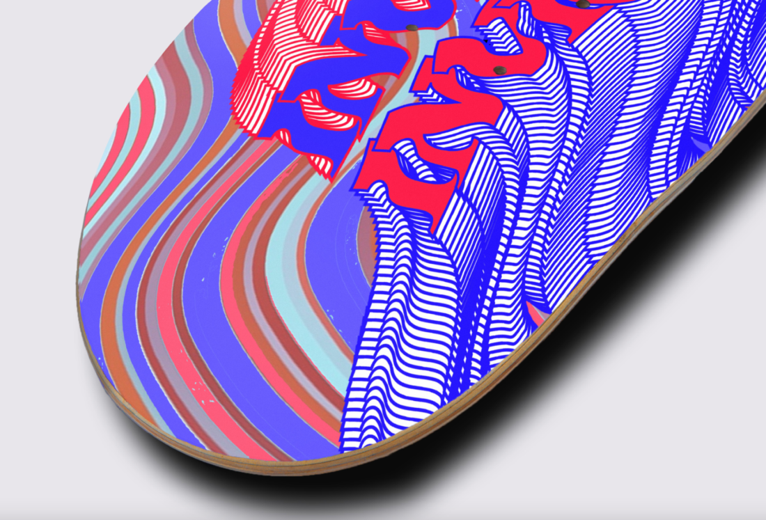
"This design is aimed to communicate the motion of the word "Invigorate" in static representation."
If you had to change something in this design, what would it be?
I could implement changes to the “motion effect” of the wordinvigorate by changing the colours of layers underneath the main text to represent a gradient outcome. There are many ways to experiment with the design but that’s what I thought of after submitting.
Are there any areas in this project that you struggled with?
Looking for a good mock-up was hard, it was hard to look for a good one which was free!
What AGDA award area did you submit this in and why were you drawn to this area?
Craft. I was drawn to the area because as I was looking at the AGDA awards in the past years, the works involved design being applied a physical canvas. For example, many of the winning designs were designs on tote bags.
Did you enjoy this project overall?
Yes, I liked it, it’s good to learn a bit about manipulating typography because I certainly didn’t know that I could produce that kind of type in Illustrator.

It's been a pleasure to chat, Shawn! I can't wait to see more of your designs in the future.
If you'd like to get in contact with Shawn or check out more of his work, go to his website here! (TBC)