JobFutureNow
"To empower the Youth and our Futures of today."
Lochlan Vardy
Gemma Workum

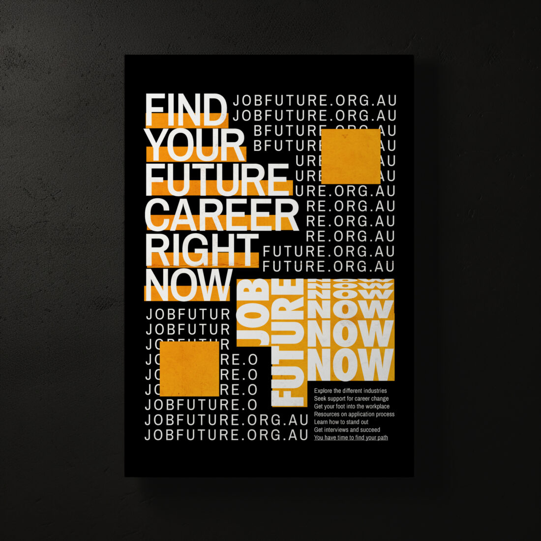
JobFuture is a career assistance provider and service that caters to teenagers, young adults and those looking for a career change. “JobFuture - NOW” is the current campaign that provides resume-building skills, industry experience and interview tips.
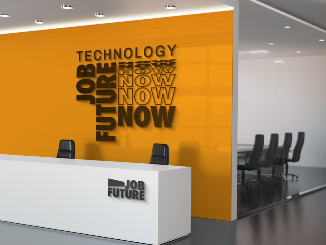
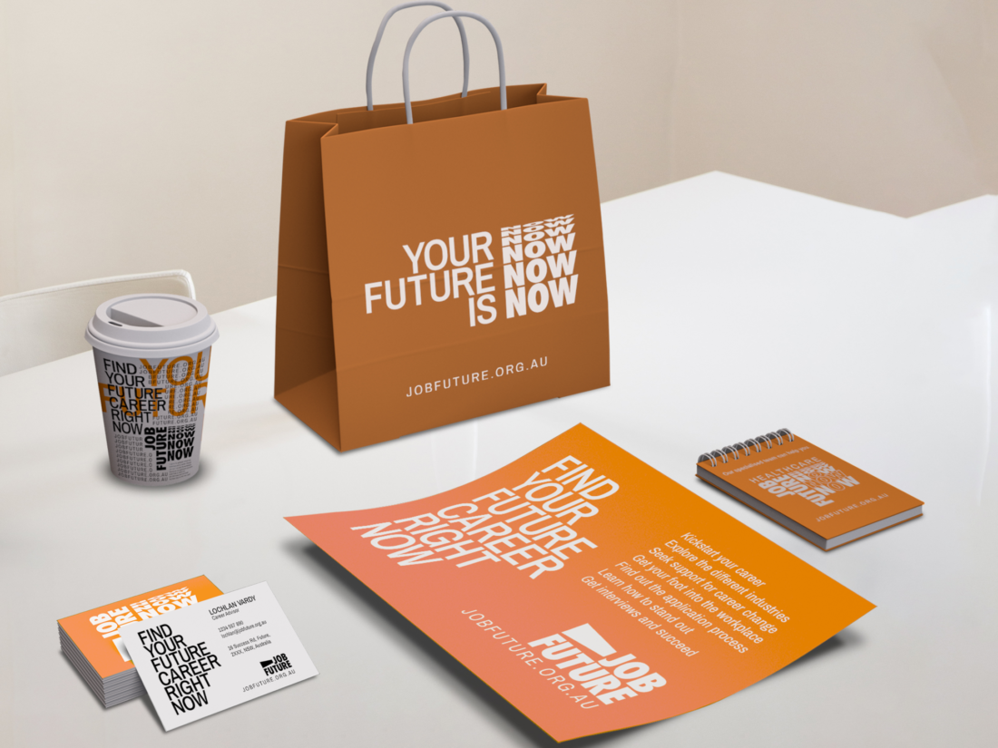
This kinetic-type branding was designed by 2nd year student at the University of Newcastle. Lochlan Vardy. Lochlan has experimented and established a bold and striking brand that stands out from the crowd. A revealing fragmentation effect is installed within his work, which compliments all design elements such as colour, type etc. This revealing fragmentation effect is applied within the current campaign’s type, allowing this text and effect to stand out within the design, creating a focal point and constructing a reading path for the audience. Lochlan's execution to apply kinetic type is exhibited within content such as its branding, digital content and posters, along with other strong elements of design that are applied within the organisation.
This design’s purpose is to fulfil its role in appealing to its target audience, which is the general youth; teenagers and young adults. A modern-day audience requires a modern style design, and this is achieved using a minimalistic style, as well as stylish type, displaying form/layout, fonts and establishing a strong relationship between shapes and playful colours.
‘You just have to make something that fits its purpose and expresses the right emotion to the right audience.’

Key inspirations towards the leadup work and final established design can be taken from the world around us, this is exhibited within the design's form and format, as well as bright, earthy colours and bold shapes. Lochlan has said to take inspiration from this revealing kinetic-type technique from kinetic-type posters; this almost revealing effect can be incoherent at first and embodies the uncertainty - this can link to career and job finding that users may experience, however as the kinetic type slowly reveals its true body an answer slowly comes together.

Lochlan has carefully selected a bright and endearing colour palette to fit right within the design brief - these blazing warm shades of orange and yellow allow the design to pop and catch the eyes of the viewer. Lochlan has also used Futura type within his work; a geometric san serif font for a clear and coherent finish with this type, in support with Archivon san serif as a supplementary font and typeface. These examples of type were kerned and tracked to allow these fonts to look aesthetic to the eyes, and these elements of type manipulation in contrast to the kinetic effects that were created, paint a neet finish to the design. Sizing and effects of type also allow form and text hierarchy, to establish a clear reading path as well as a general and overall idea as to what the text and message hopes to articulate to the audience.


Ultimately, Lochlan, as the designer has achieved a phenomenal execution to the brief and the brand - with the use of bold colours and type and the effectiveness of kinetic type, this design portrays and exhibits a modern and fresh finish for a modern and new audience. I believe this design can help attain trust in young adults who wish to find support in finding their path in life and future careers.