The Physics Of Star Wars
CASE STUDY
Tanaya Lahrs
April Linacre
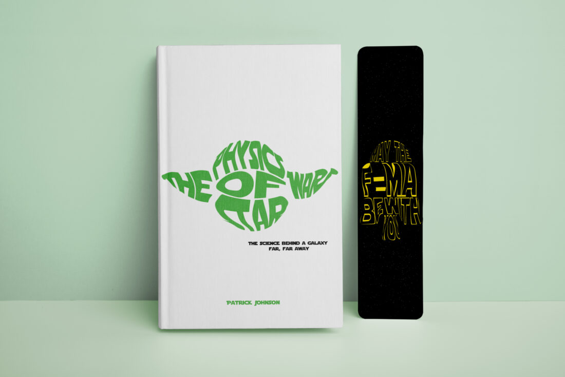
The Physics of Star Wars was derived from the phrase: “An image speaks a thousand words”. April wanted to push the boundaries of this by making text into the image itself. The use of visual image elements conveys more contextual information to the viewer while remaining simple and minimalistic. These images were created by distorting type to not only help provide further information instantaneously but to also create visual interest and stimulation, more so than just reading text.
INSPIRATION
"I'm very interested in designing for print and publication so I always wanted to design something in that area. I think book covers can be boring a lot of the time, so I decided to redesign a book cover that I felt was lacking in excitement.
I was very inspired by the phrase "an image speaks a thousand words" and I wanted to play with this idea using text as an image. I really like the idea of adding layers of meaning and context with images and text."
"The most challenging part for me was having to let go of my own personal preferences for the overall interpretability of the design."
-April Linacre
CREATING THE DESIGN
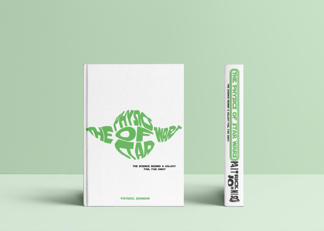
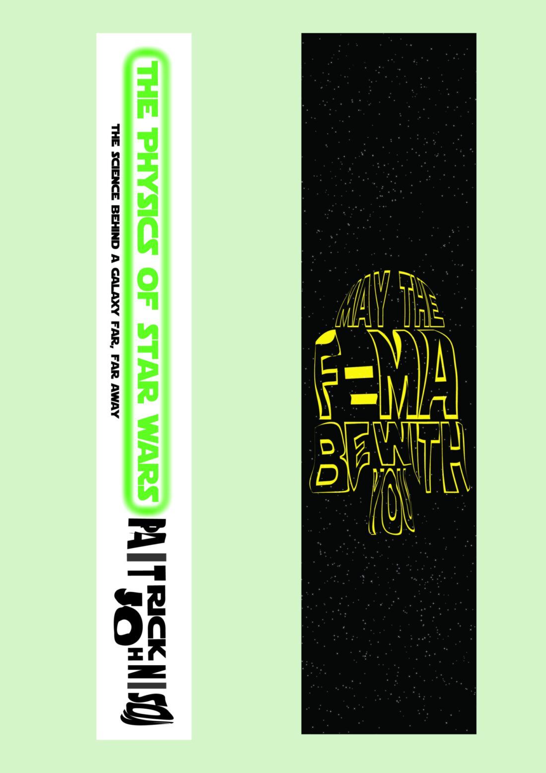
The Physics Of Star Wars was designed and created using the popular software adobe creative cloud. April used Illustrator with creative techniques such as the pen tool to illustrate a character named Yoda from the popular Star Wars franchise. She did this by using different techniques to distort and shape her typography into the head shape of the character.
After using Illustrator April moved into the software photoshop to import her publication design and accessories such as bookmarks to create quality mockups.
TYPOGRAPHY
The typeface used for April's publication design is 'Star Jedi' by Boba Fonts. This was chosen as it closely resembles the actual Star Wars franchise typeface to make the design accurately resonate with the movies. The use of Kinetic type techniques of distortion was used to shape the image of Yoda's head to form the title of the book into an illustrative type design.

"I think my design is different because it brings meaning on multiple levels, and it ties 2 different subjects (Star Wars Fiction and Actual Physics) together into one visual." -April Linacre
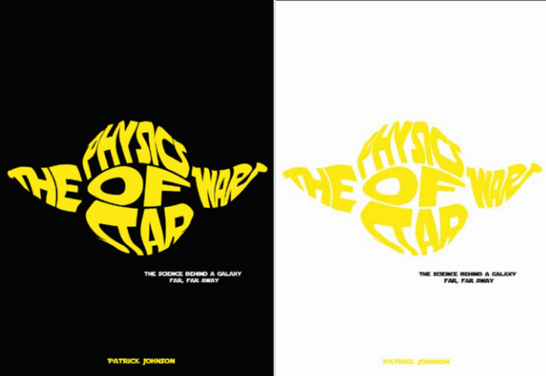
April changed the colour of her publication for the final submission after receiving feedback in class that the design wasn't as recognizable to the films as she intended. Her Initial design included a yellow, black, and white colour palette which was now changed to green, white, and black.

The initial design's colours were used to resemble the popular Star Wars colour palette but after further development and feedback, the design's main colour was changed to green to help resemble the illustrated character 'Yoda' as the main focus of the publication design.
"The most challenging part for me was having to let go of my own personal preferences for the overall interpretability of the design. So during presentations it was suggested that a colour change from yellow to green would probably be better for character association. So I tried it, and I did not like the green at all, I much preferred the yellow I'd originally chosen. However, I knew the feedback had been valuable and right, so I decided to sacrifice my colour preference in order to give the design a better chance of being understood. That was hard but in the end the right decision."
WHAT ARE YOU MOST PROUD OF?
"I'm most proud of the fact I even pulled it off! I actually didn't think that I'd be able to make the final product as clear as I did. Having looked at similar types of word images I thought I'd really struggle to make something that worked. But I'm actually very happy with the final result and I think it's clean and legible."