Kinetic Typography Poster
Connecting with people by combining digital motion graphics with traditional design.
Daisy Lindner
Brayden Maybury
Poster in Motion
Digital cross Traditional
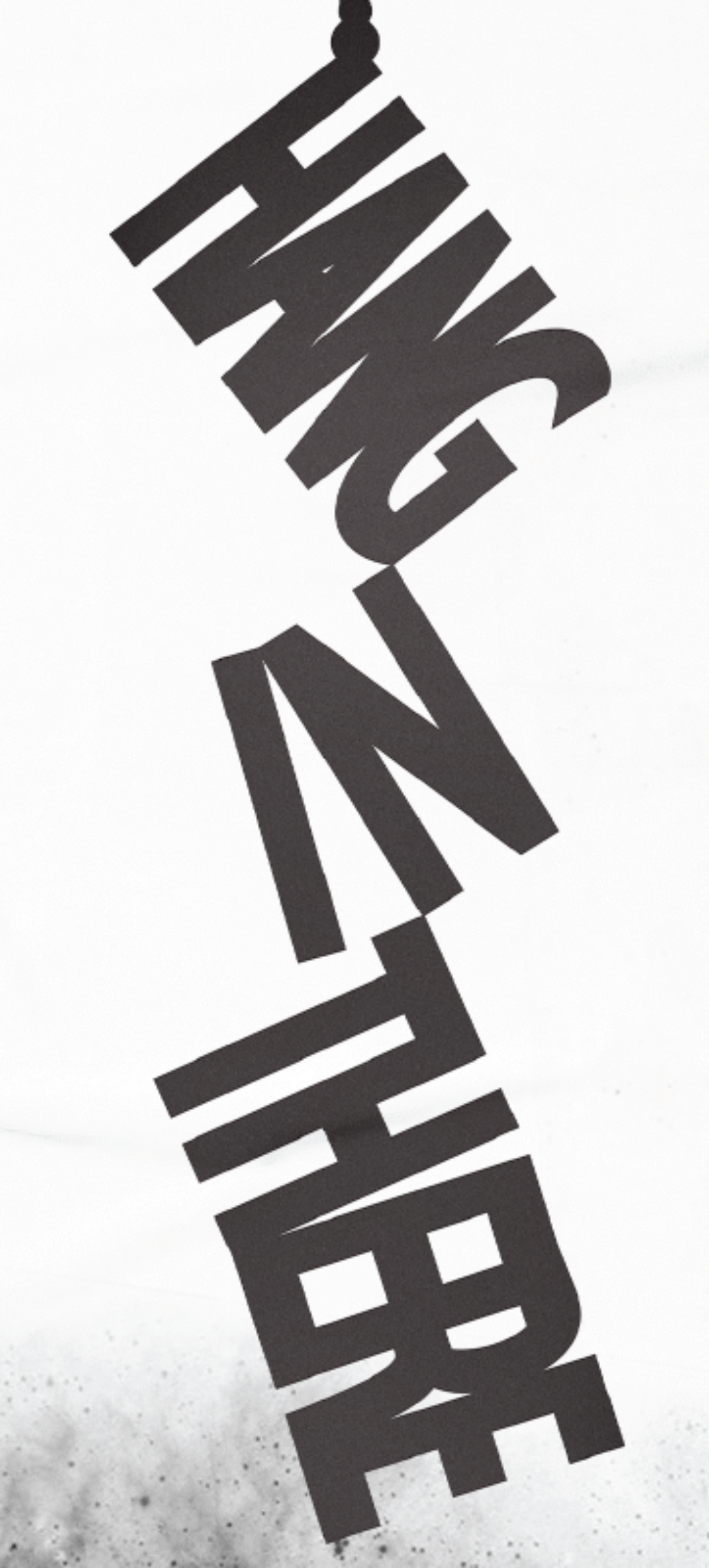
Daisy's kinetic typography project is an animated poster aiming at connecting with the audience and receiving a 'real' message in a visual way. Designed for AGDA under the category of 'Student Craft', the inspiration behind her project is the idiom Hang in There which means to never give up when in difficult circumstances. Her goal was to visualise the idiom and create a tone and feeling within the poster that represents the viewers current feeling and use the poster as an encouragement for the audience.
"I chose to make an animated poster as it draws more attention and creates a more kinetic energy within the type"
Daisy has achieved this in a number of ways. Her main goal was to create a visually specific mood of what the audience will be feeling. Using just black and white, she aimed to create a dark atmosphere within the poster to connect with the viewer and made a contrast to make all the elements stand out. The simple imagery of a rope visualises the message of holding on.
"There is always light at the end of the tunnel"
Daisy has used a clean, sans-serif typeface and made it in a way to further visualise the message. Each letter being tightly kerned and the words connected to show they are helping each other hang on. The message is clear statically but the animation adds extra kinetic energy and draws more attention to the poster.
"Hang in there is a saying that means to never give up when in difficult circumstances."
The fact that this poster is animated gives it more opportunity for a wider application and audience. The message is clear statically, printed with the opportunity to be framed, posted on walls but also animated for social media, screens, billboards and much more. The simple structure of the work gives an opportunity for a suite of posters also.
Daisy also explored a concept using photography to visualise the message. She said exploring these different ways to use typography is relevant to her as an emerging designer. It helped her understand how to use kinetic typography to reinforce messages and bring a brand new aspect to design and typography.
"It’s definitely made me become aware of the many possible uses for typography and it’s influence over a design"
See Daisy's mockups of her work below.

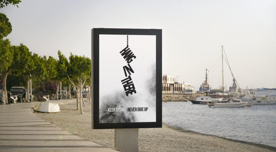
Billboard Mockup, Animated (Daisy Lindner)

Billboard Mockup, Animated (Daisy Lindner)

Poster Mockup, Static (Daisy Lindner)

Busstop Mockup, Animated or Static (Daisy Lindner)