Krem
A Case Study
Sunnita West
Matt Enrique
"I wanted it to feel luxurious & high end, but tasteful with its minimalism and earth inspired tones. Effortless-earthy-chic"
Kinetic Type meets Fashion
Fashion is undoubtedly an ever-evolving form of self-expression that has transcended time and culture. It extends beyond just mere attire; it is a reflection of social movements, societal trends and the self.
Whether through the daring and innovative creations of high fashion to the everyday practicality of streetwear, fashion allows a canvas for individuals to convey their identity and adapt to the current aesthetics of their era.
As a dynamic and ever-evolving domain that is constantly reinventing itself, fashion captivates us all, making it a fascinating and compelling aspect of our existence.
Moreover, as the fashion industry is ever evolving, kinetic type needs to evolve with fashion in a similar way in order to help brands communicate their brand identity more accurately and attract the appropriate demographics to their products.

"Krem is a clothing boutique that embraces rich colours and quality fabrics to give their customers a feeling of luxury"

∘ __ Chic • Minimal • Natural • Luxurious __∘
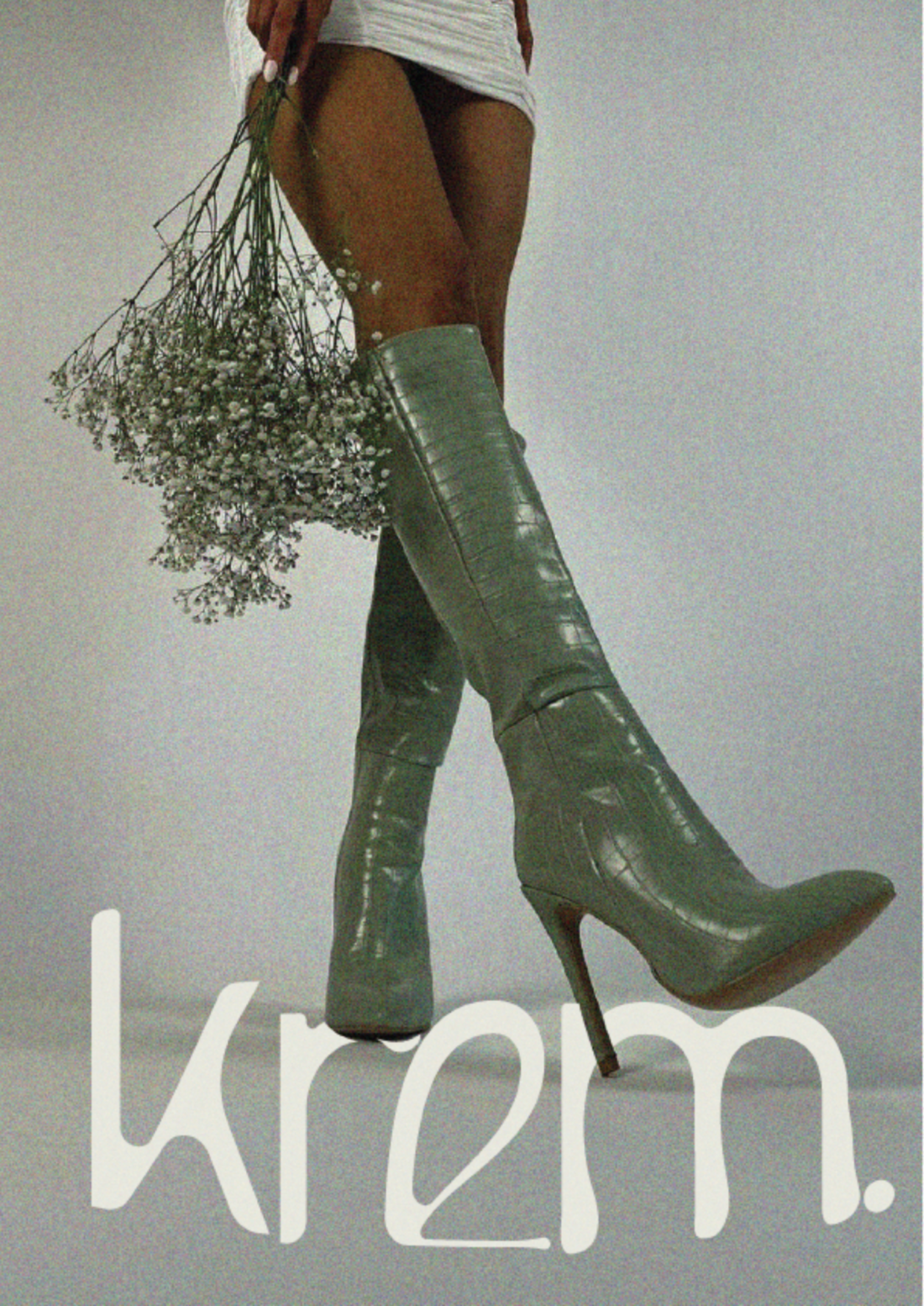
The creation of boutique clothing brand, Krem, serves as an exemplary example of how designer Sunnita West utilises kinetic type in the realm of fashion. Moreover the thoughtful and creative ways that kinetic type is used in Krem aids in communicating the brand's visual identity and aesthetics of minimalism, luxury and overall naturalistic feel to customers looking for exactly that.
Fundamentally, West wanted customers to have feeling of luxury when experiencing the branding of Krem. "I wanted it to feel luxurious and high end, but tasteful with its minimalism and earth inspired tones. Effortless-earthly-chic, if you will'
Naturally, West decided to use Brenly, a modern variable san serif front that has an elegant and luxurious look. Additionally, to further suit her intention for this brand, she manipulated the lettering by rounding the edges and adjusting the width and height of the typeface in order to create a compelling and unique logo type for her fashion brand Krem.

.
“By rounding the edges and adjusting width/height etc.. it made the brand identity more noticeable. I created mockups of the store-front and signage using this manipulated type”
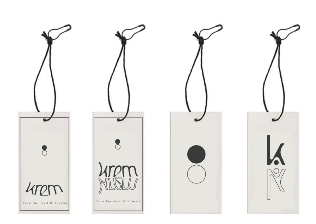
Furthermore, West has explored and exploited this customised kinetic type to its full potential by implementing it for different uses in four posters, being promotional material and a series of custom clothing tags that incorporate unique design elements.
Additionally, when working on the designs for the clothing tags, the designer experimented with techniques of blending, warping (including bulge, arch, shell), text on pathways, and such things as opacity changes to create different unique effects. And other techniques exhibited in one of the posters included erasing parts of the lettering in order to create an illusion that pieces of fabric were in front of the text making the design more dynamic.
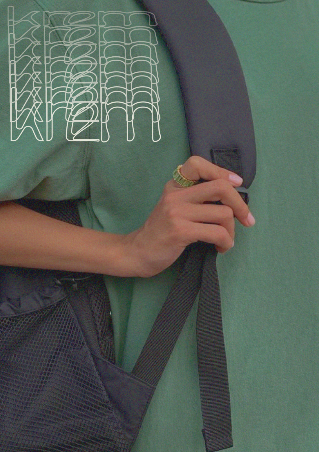
Its' here where the viewer can see how kinetic type can be flexible in a variety of different ways, yet still remaining cohesive to the brand's visual core identity.
"I believe that k e r n i n g really enhances the feeling of luxury"
As you can see here (pervious/above) the kinetic type uses repetition to create an abstract pattern and dynamic effect.
Moreover, depending ways in which kinetic type is used (even though the viewer may not notice the subtilties of kinetic type used in this application) can add an extra layer of meaning and feeling to the design.
"On the clothing tags, I experimented with more warp tools and outlined vs filled text. The subtext; 'from the heart of Croatia' is Optima regular with a kerning of 300pts... I believe that using kerning really enhances the feeling of luxury."
Fundamentally, fashion often relies on movement and fluidity to convey a message or evoke a feeling. Garments that flow gracefully or use innovative materials create a kinetic element, enhancing the wearer's experience and making a powerful fashion statement. Both kinetic typography and fashion harness the power of movement to captivate and engage, demonstrating how motion can be a compelling and communicative tool in the world of design and self-expression.

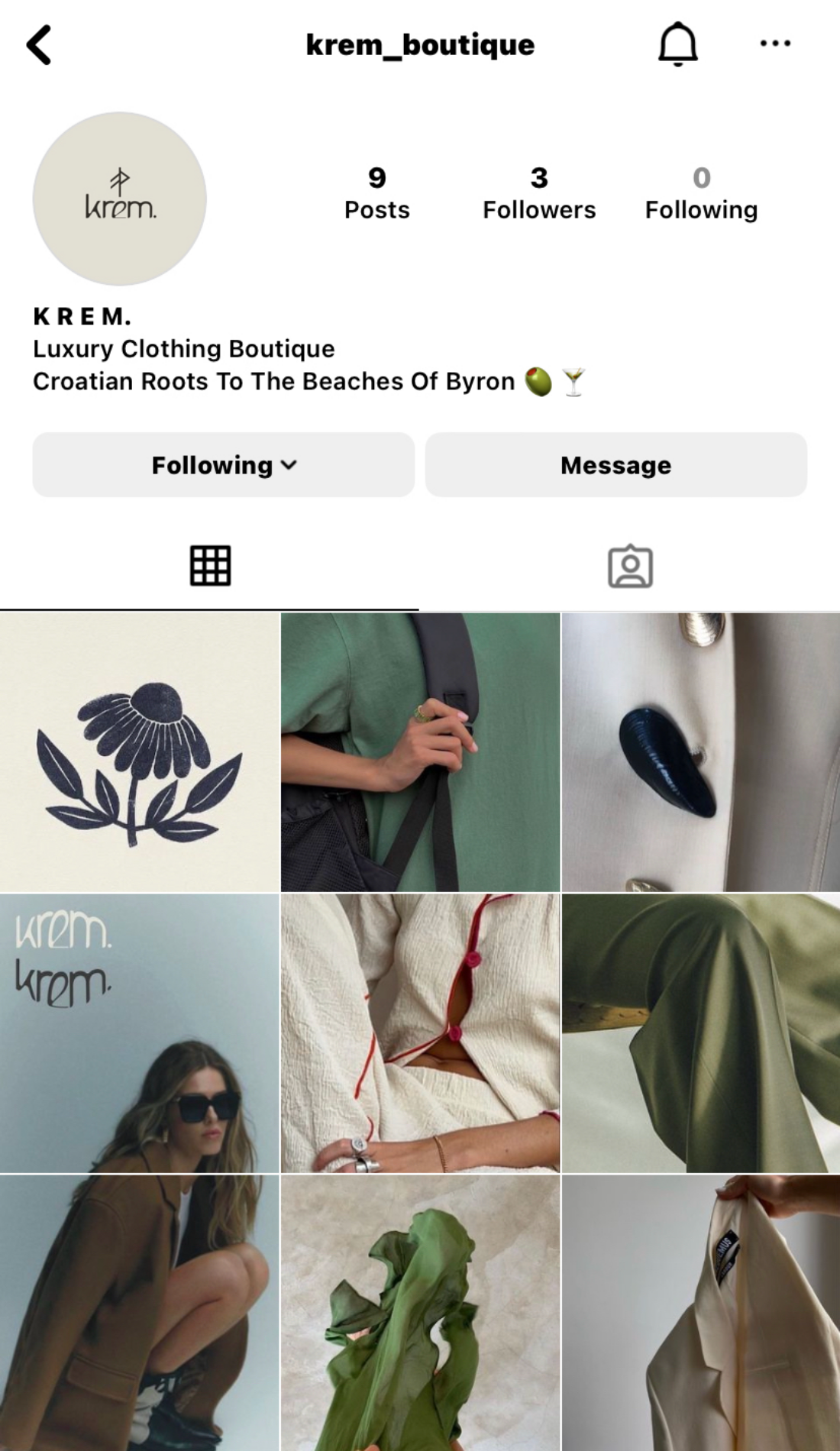
Instagram Visual Identity Mockup ~ Krem
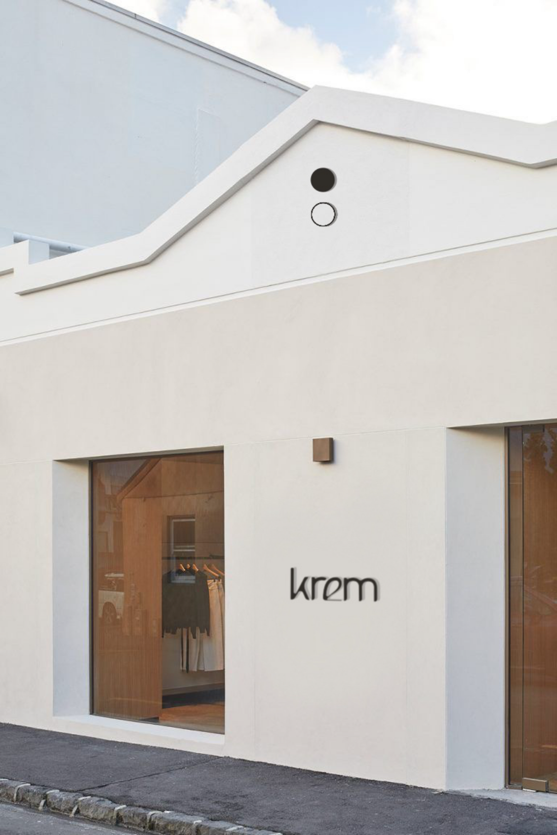
Clothing Boutique Store Front ~ Krem
Interview
‘Q1: What inspired you to create Krem and what does it mean to you? (Is there a bigger story behind the brand that could be personal?) Is it a redesign of an existing brand or did you create this as your own entirely new brand identity concept?
I love fashion so I really wanted to do something involving that. I strive to always do work based around interests as I know I will go that extra mile if it is something I am really passionate about.
I created Krem from scratch. I use Pinterest a lot, and saw that my ‘fashion’ board had a very cohesive, overall feel, so that is sport of where I started I guess, and what inspired me to make the brand.
I had the visual identity first, then had to find the name- which I did just through researching different languages and their words for things I found synonymous to the visuals.
“Krem” means cream in Croatian (amongst many others) and I found that it fit perfectly. It gave me a sense of decadence and luxury- while also represented a lot of the colour palette.
Q2: Did the brand identity for Krem come out as envisioned from the start ? ..or were you more experimental during the design process making you go in a totally different direction from the initial concept?
It did not start the way it ended! Originally, I had chosen images a bit more “girly’ for lack of a better word. They were still within the same colour palette, but had a lot more floral prints and youthful silhouettes. But after a few mockups, I decided I wanted to step it up little and make it more refined and luxurious.
Q3: What particular visual identity would Krem be defined as? (eg. would you define it as solely being ‘minimalist’? ‘Vivid minimalism’? ‘Sustainable Lux’? ‘Organic?’ etc… or is it an amalgamation of a few design aesthetics? ) What kind of visual experience do you intend the viewer to feel with this visual identity?
I would say Krem is minimal, earthy/natural and luxurious. But it is definelty an amalgamation of majority of those things you mentioned. I wanted it to feel luxurious and high end, but tasteful with its minimalism and earth inspired tones. Effortless-earthy-chić, if you will.
Q4: Does this work represent you as a designer and the direction you intend to pursue or are you just experimenting with a new style?
This definitely represents me as a designer. Although I do love colourful and playful designs, I haven’t really found how to execute that yet, I find minimal earthy aesthetics to be something that comes a lot more naturally to me and resonates with my creativity a lot.
I also really like it as there is so much advertising and stimulation constantly, that something a bit more toned-down and calming, is almost like a safe space for viewers.
Messages can also be really powerful in their simplicity.
I have extreme anxiety and I know creating or viewing other brands/campaigns that reflect a calm nature, is always something I am drawn to look at or delve further into.
Q5: Does a project like this inspire you to create similar projects to do with brand identity in the future or are you focused on pursuing other aspects of visual communication?
I am very interested in brand identity. I don’t have a concrete goal yet as design is spot broad. I love book illustrating/cover design, anything in fashion is a dream, social media, brand identity etc. the list goes on.
So to answer your question simply, yes. But I don’t want to be limited to. One thing.
