Support Newcastle Music
Support the Newcastle music scene! Grab a drink and dance the night away.

Music sounds better live
Live music is almost back! Since the beginning of the
COVID-19 pandemic, the live music scene has been shut down, but not for much longer.
With restrictions set to ease from the 11th of October, you can feel the excitement in the air as everyone is ready to get up and dance. With Newcastles bustling punk rock & alternative music scene, we can expect the emergence of some amazing talent coming from Newcastle very soon.
Designer Finn Redmond has had the pleasure to be involved in the resurgence of the music landscape post NSW lockdowns. These posters act as a reminder that local music matters, and act as a reminder of all the great creative work that is being born in Newcastle.

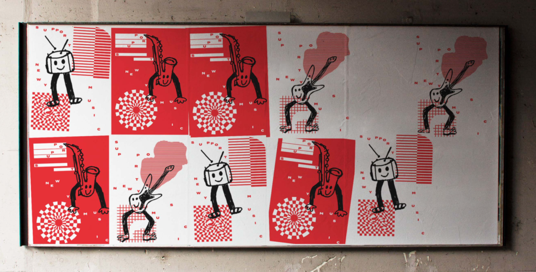
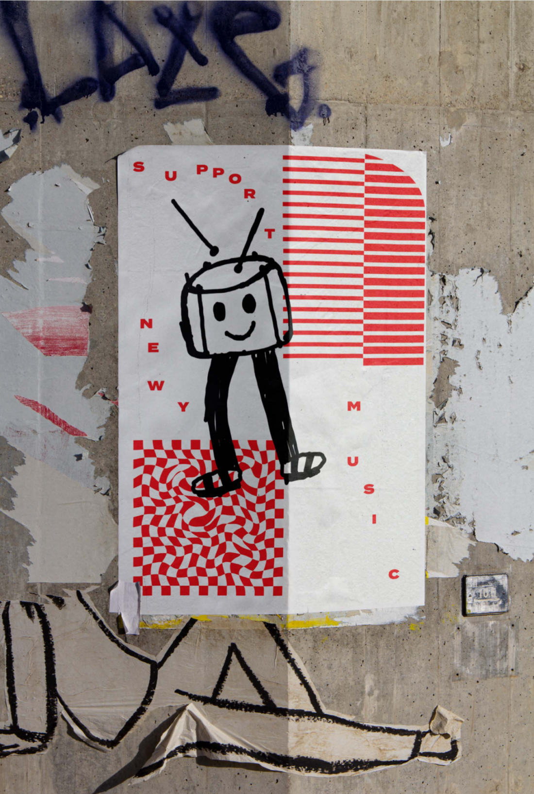
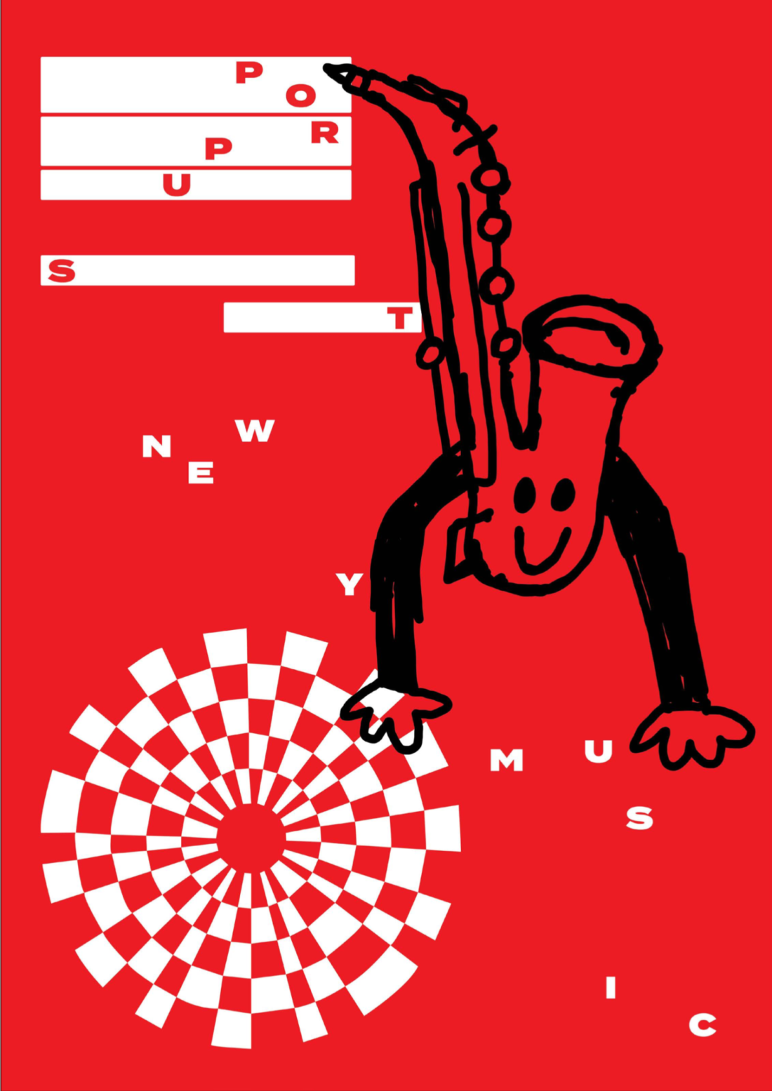
Finn had the challenge of conveying movement through his poster series. Finn was able to achieve this with use of kinetic typography. Having the letters flow all around the page to emulate the feel and emotion we get as we’re dancing. The creative use of this type treatment for a music poster is a perfect fit to help communicate the emotion to the viewer.
"with kinetic type scattered across the page in a rhythmic way, almost like music notes, this eludes to the nature of the series." - Finn Redmond
Through the medium of print design by using glued paper street posters to promote local music acts as perfect fit. The local punk rock and alternative music scene has always stuck to traditions by plastering venue walls with upcoming music shows and promotions. By applying the same medium of poster printing that's loved by musicians, Finns been able to communicate the the rise of local music directed to his target audience.

- Local music matters!

The contrasting tri tones of red, white and black are punchy and jump out and grab your attention. Using the repetition of three colours across the posters series ties them all together as a series, whilst still being strong on their own.
"Bright red and stark white to capture attention and evoke a sense of urgency for the arts sector that has been hit hard by Covid" - Finn Redmond
The personification of the hand drawn musical instruments are fun-loving and relatable to all ages groups. With the drawings being rough and hand drawn evoke the same emotion that most of these punk bands are trying to convey, somewhat of a "we don't care" attitude and don't follow the conventional rules.

Finn Redmond key inspiration for his hand drawn style comes from Kristina Micotti, an illustrator from San Francisco. She is mainly known for her colour and bright illustrations, usually of everyday object like a strawberry, but with eyes or a smily face. These fun drawings in combination to with the typeface Termina (bold), a wide san serif font, creates a punchy and engaging poster. Using a thick and wide san serif allows for easy legality even at the small point size and unconventionally text layout.
With forward thinking, Finn had designed all the elements inside Adobe Illustrator, so with it all being in vector, the possibility to print these larger for something like a festival banner is always an option. Obviously with designing for musicians in mind, having the possibility to blow up the images with no quality loss is a big benefit.

- “I aim to encourage people to support live music after the lockdown. Its’s mostly about getting people to those smaller gigs that are around Newy”, Finn Redmond
Overall, this poster series evokes excitement and creates a buzz for what the future of live music has in stall for us over the new upcoming months. With the combination of contracting colours, strong kinetic type and pleasing hand drawn elements, Finn’s work should achieve its goal of promoting local music.
