LEVELS
Student Brand Identity
Finn Merrick
Liam Mills

“It’s about that hustle and drive to achieve set goals and continuously pushing higher and higher, reaching new levels.”
Gym apparel/ active wear brands are often focused on the physical strength involved in working out. Brands often glorify the gruelling nature of pushing yourself physically with the desire to look a certain way. What is unique about LEVELS is the focus is shifted onto the glorification of this process rather than any particular end result. The change in perspective creates a brand that exudes positivity, clarity and optimism.
By removing unrealistic and unhealthy targets it allows the audience to change the way they both approach and feel about working out entirely. When the consumer is encouraged to be motivated to achieve rather than shamed for not being there, already the connection to the brand has potential to be stronger. The branding exemplifies these wholesome values whilst also drawing inspiration from modern streetwear and popular culture. It is the blending of these two unique perspectives that make LEVELS successful in their approach.

“The goal is to attract the overall fitness community” and to encourage them to reach their “desired goals of achievement they want to hit”
DESIGN CHOICES
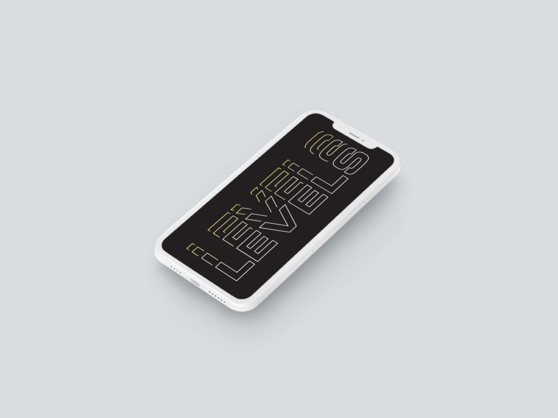
- Thematically the first large choice was the name itself. The name connects with the central ethos of the brand in setting goals over and over to keep improving.
- The type which is set in Eurostile Extended Black and has been distorted using fragmentation, both choices which lean into the modern aesthetic. The technique achieves its goal of conveying a sense of movement as it bounces the eye from the centre to the top and back again.
- “The colour palette choice of a vibrant yellow hue to convey the sense of positivity” works especially well when placed against the deep blacks used throughout. The design balances these colours by gradually shifting the tone towards neutral white for the main text element.
- Mockup/product choices have been made to seamlessly reflect the merging of modernity and personable consumer connection crucial to the brand.
- This aesthetic draws direct inspiration from New York based multidisciplinary designer, Roy Cranston who’s influence traces back when the designer first discovered him last year. The Instagram artist’s influence can be clearly seen in the creative use of typography.

THE CREATOR
It is clear this project has been driven by passion from the designer. Finn Merrick has designed this directly in line with values important to him. The strong connection between the brand and its creator has played a large part in the success of the identity. When a creator is engaged with the content it breaks down the walls between brand and consumer.
In speaking to Finn it was clear that this is just the beginning for him in this space. When asked if he enjoyed this process, he told me “I enjoyed this task immensely as I can correlate with it in my daily life. I enjoyed discovering the possibilities of kinetic type that you can’t see until you experiment with it.” It’s the passion in the project that will make future endeavours very exciting.
“As for LEVELS, like all of us, I have goals I work to reach. It is only when you reach set goals you realise the more goals you can set yourself.”