LIVE.EVIL - Lancey Foux
The redesign of Lancey Foux's album cover
Alex Seferovic
Mitchell Rosenbaum

About The Project
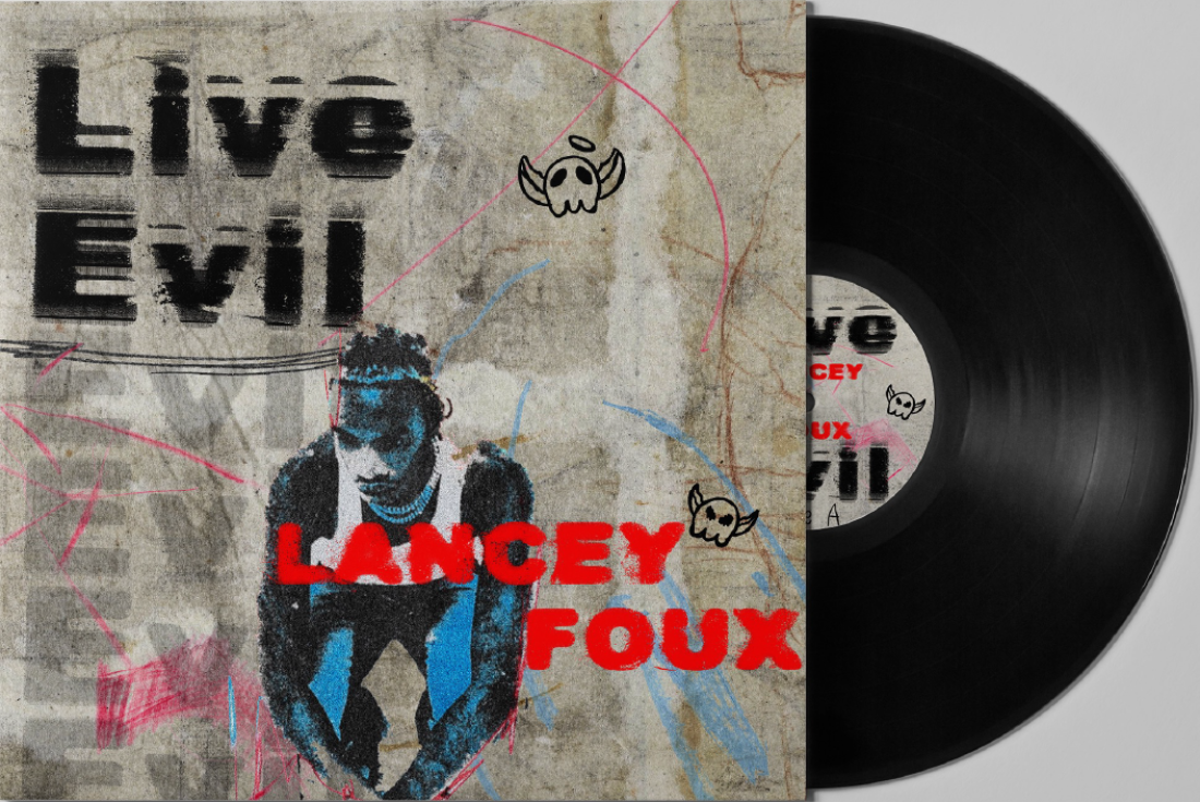
DESN2011 student Alex Seferovic completed the redesign of Lancey Foux’s 2021 Album ‘LIVE.EVIL’. In discussions with Seferovic, he believed that while the original nature of the album cover was reflective of Foux’s ‘typical’ album style, it doesn’t quite reflect the “gritty nature of the album.”
“The original album cover was fascinating, but I felt it didn’t fully capture the album. I wanted to create an album cover that reflected the gritty nature of the album.”
With Seferovic taking an interest in the album cover due to its ‘grunginess’, bringing out more of the grittiness within the cover was crucial to him, as this would create a closer relationship between how the album cover reflects the music.
As to the audience for this album cover, it was targeted at teenagers and above who have an interest in the music that Lancey Foux creates, for them to be able to appreciate both the music and the cover that reflects the music they are listening to.
The Process
“I wanted to make the type a strong point of focus in the design without taking away too much from the rest of the visuals.”
A big thing for Seferovic was that while he was redesigning the album cover to reflect the music within the album, he still wanted it to tie into the rest of Foux’s songs and album covers.
To do this, Seferovic began to take precedent to Foux’s previous album covers and looked into different styles in which all his album covers were completed before hitting the drawing board.
To reflect the grittiness of the album, Seferovic believed distortion would be a significant driver to create the final product;
“I liked the original direction of the cover being a sketched and grungy feeling. I decided that expanding and putting my own twist on that style would be a great opportunity to show my selected Kinetic Type method.”
The Result
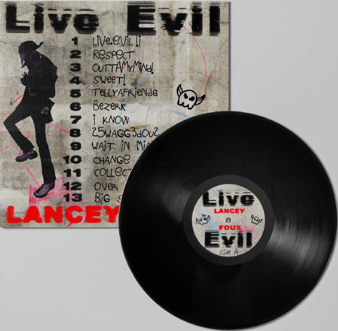
The result of Seferovic’s take on the ‘LIVE.EVIL’ album cover was effective in reflecting the grittiness of Lancey Foux’s album while tying the cover back to the style of Foux’s other covers.
Maintaining the primary colours of the original album cover, consisting of red and blue, Seferovic also kept the theme of randomized crayon-like lines across the front and back covers. To create the ‘grungy’ effect that Seferovic was aiming for, making the background a dirty-like finish begins to bring out this grunge in the end product.
To bring out the grittiness to the cover, Seferovic distorted the text in different ways, proving effective in tying the project back to the music within Foux’s album.
Regarding tying back the final product to fit in with Foux’s prior album covers, maintaining the theme of portraits of Foux himself on both the front and back cover in the same black-and-white medium doesn’t take the album cover out of scale from Foux’s prior album covers. The album cover then begins to follow the same themes of Foux’s previous two albums ‘FIRST DEGREE’ and ‘FRIEND OR FOUX’, hence showing Seferovic’s aim of maintaining the same overarching principles that Foux uses in his covers was effective within the final product.
