Lorde Poster Series
A quick look into VisComm designer Zac's rebrand for Lorde and her album 'Melodrama'!
Samara King
Zac Holmgreen

Given the challenge to design anything of our choice using kinetic typography, it comes as no surprise a lot of students’ first thought was to think of something they are passionate about that inspires them. Music is something that has inspired Zac - more specifically, Lorde and her album Melodrama.
“With this certain album, I was inspired by the feelings/vibe that the songs created. It was one of the first albums I ever really connected with,”
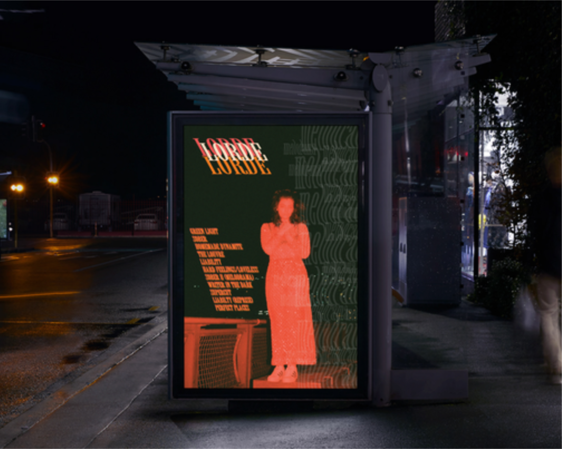
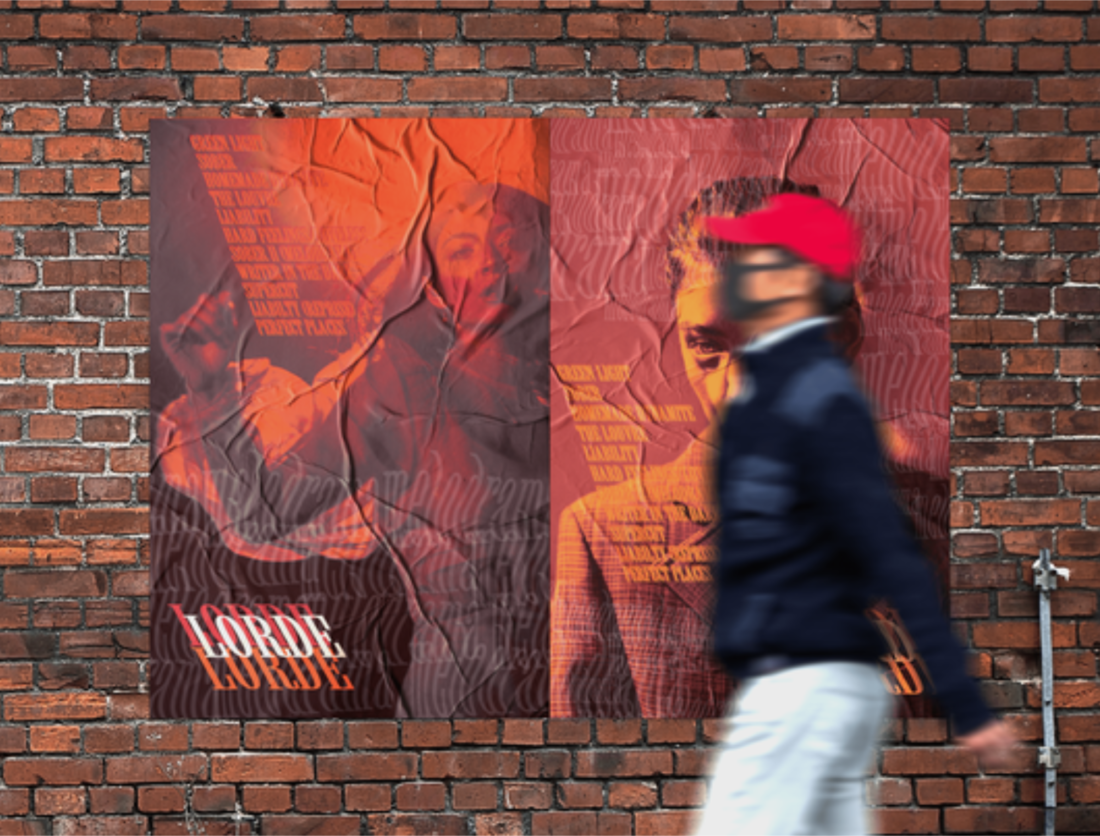
Zac has accepted the challenge to design a rebranding of identity, with a focus on the use of posters for promotion and decoration, with his target audience being fans of Lorde. Valuing the deep personal level people connect with music, Zac’s intentions were to design something that conveys the overall feeling and meaning the songs on the album represent - inner angst and deep emotion.

“It looks sort of glitchy/blurry at first glance but when you really look into it, you understand what it’s saying and I feel this is very representative of Lorde and this album. The warm tones also create a feeling of inner angst and deep emotion, also correlating to the songs.”
“I wanted to keep the info on the posters limited to just the song tracks so the audience is forced to experience the music themselves, creating a personal connection.”
As someone who knows of Lorde and the album but is not a regular listener, I think Zac’s designs have perfectly conveyed her public image and feel. Upon first impression, his designs give off a feeling of depth and intensity, evoking a certain type of emotion in the viewer. These all correlate with the way I as a listener have perceived the deep emotion conveyed in Lorde’s album Melodrama.
Zac has designed posters using kinetic type from multiple different categories; vibration, transparency and motion. Here we’ll have a look at some of our interview questions to reveal more about the design itself!

What font did you use & why?
“The font I used was called ‘Willow Std’ in the light version. I liked this font for these posters as it was a classic design that gave a sort of royal and romantic feeling. It also worked well with the stretching and the vibration technique, making it still readable while complimenting the images it was displayed on."
So I can see from the pitch deck you’ve chosen to use vibration as your kinetic type technique. Are there any other categories of kinetic type it fits into?
“After doing research on the different types of kinetic type, I really enjoyed the different types of vibrative text and how it could be used with colour. I felt it was a good technique to help enforce Lorde’s brand as it is both intriguing and flows well with the images. I think the text that says ‘Melodrama’ in each poster could fit into the category of transparency, as it overlaps. I also think the text used for the song tracks could also fit into motion, as it creates a flow for the eyes to follow.”
Who is the target audience & how have you designed for them?
"The main target audience I had in mind was fans of Lorde that want to purchase something that is very representative of her brand. The kinetic type is eye-catching, and makes people want to really see what it says and coerce them to feel what the songs are exuding."
What category/categories were you designing for? How did this impact your design choices?
"The main idea at first was identity, but as I started putting together the posters, I felt print was also a strong factor. I wanted to to design a piece that could work in other merchandise pieces easily, making it more accessible and useful."
What do you believe makes the design stand out from other posters?
"I think the design and overall concept is quite unique. The colouring of the images in each design enforces an emotive response, causing the reader to build a personal connection whether it be through anger, sadness or power. The vibrative text that sort of blends in with the colours also creates a uniqueness, as it makes the audience read what it says, grasping their eyes to understand what it is promoting, something that I think other posters lack."
Overall, a very well done to Zac for his great designs! Kinetic type has been used in a thoughtful and aesthetic way that perfectly reflects his intentions & concept.