Melted Record
Young music enthusiast designing his way into the industry.

A Case Study by Jacob Stoner-Hearne c3283900
Using a series of adobe programs, Australian designer David Ridgewell has created an original record label identity.
Ridgewell has a passion for music and has insights into the industry that have helped him shape this innovative new design.
“I really like music and record labels, so I wanted to design my own.”
Display:
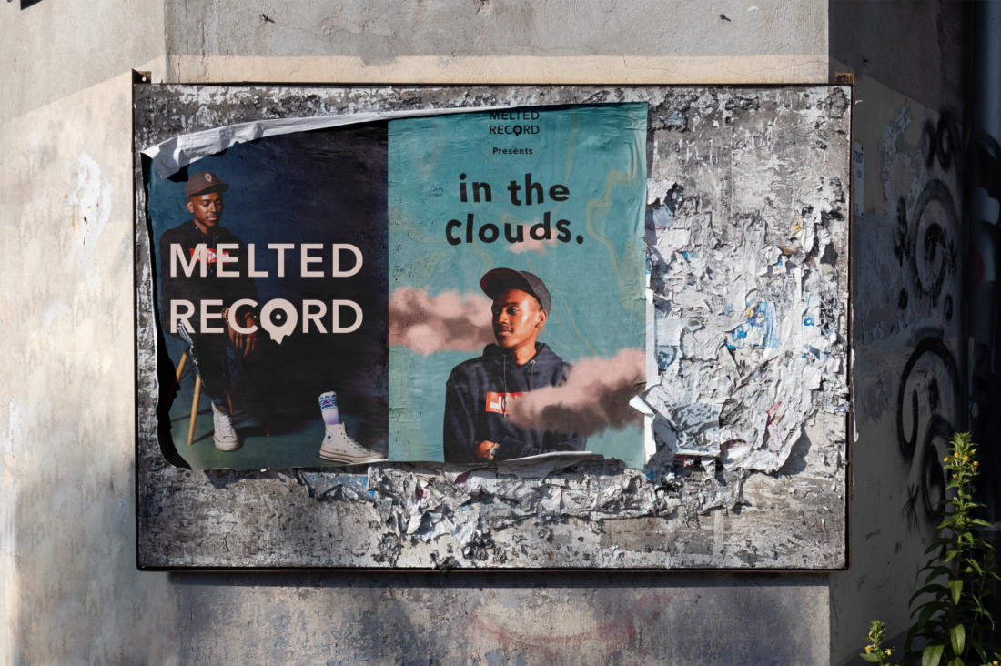
The overall design is bold and works well both when used with type and without.
“I am most proud of the way the two words look so squared off and even with each other.”
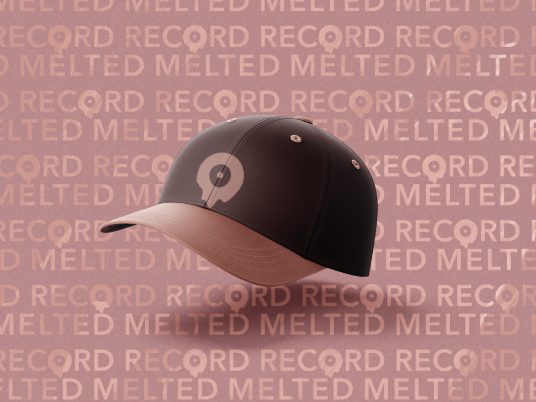
The vectored logo, when used without type boasts a simple yet memorable image that can clearly be used practically on items like a hat or pin.
“The ‘o’ is made to stand out and give the logo a bit more of a fun and energetic feeling, like the feeling I have when listening to music.”
The choice of colours tells another story where the artist has used,
“creams and blues to give the impression of a relaxed and laid-back feeling to the overall design".
When paired together it is clear that the designer has satisfied a range of younger music enthusiastic audiences.
“I wanted it to appeal to people in the music industry, like something a musician would want to sign to.”
Typographic treatment:
Ridgewell is confident the bold text gives the company a professional look.
He claims this is a high priority consideration in the music industry and has made sure to take it into consideration when designing Melted Record.
He explains the customer needs to trust that they are in good hands when selecting Melted records as their record label. Due to this, the design uses a confident and professional sans-serif typeface.
This bold typeface was heavily influenced by Blue Note Records, an evidently successful, bold record label.
“One (brand) that inspired my design the most it would be the Blue Note record labels logo”.
Using Avenir as the typeface for the logo, David then “manipulated the O in the word record” using a variety of design tools in adobe illustrator.

Overall execution:
Using a record label as his chosen identity, Ridgewell has identified that music is “already a kinetic medium” allowing him to sufficiently satisfy the kinetic brief.
As seen in Ridgewell’s process from works in his pitch deck, he has undergone a rigorous design process, with multiple variations of Melted Record.
Within this task are three total explored concepts, all equipped with kinetic elements to illustrate his idea.
He goes on to say that he combined and considered all options when designing his final work.
“Originally I wanted to make the whole logo resemble a record but towards the end, I took a step back from that and reimagined it with the more subtle elements.”
The element of the record itself has been downsised in order not to take away from the typography element of the logo.
Keeping the kinetic elements of the design within the O of the word ‘record’ creates a design that is clear and succinct.
Through the exploration of his work in this case study, Ridgewell has taken into consideration his target audience of 16 to 30 year olds through colour and font choice.
His intended category for the design is brand identity.
He has effectively explored this by offering 7 images showing logo, logo variations and mockups displaying the conceptual branding of melted record.
