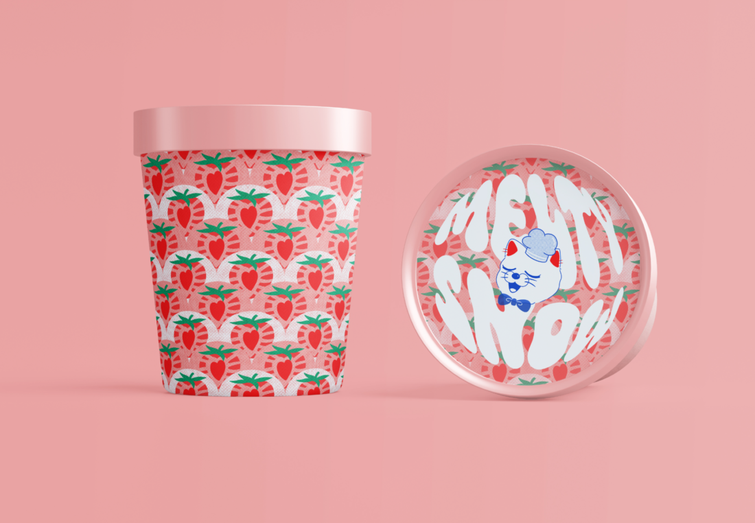
Melty Snow is a gelato/sorbet brand concept created by Yuka Hirota. The brand aims to be playful and stand out on the shelf. Melty Snow uses Distortion as its kinetic typography. The reason behind this design choice is to replicate melting gelato. In an interview about the design concept Yuka states,
“When I decided to design an ice cream package, I wanted the typography to be related to ice cream. Ice cream melts, so it would be nice to express that melting feeling by bending the letters, so I chose this typography design.”
The font choice and kinetic style suit the intended goal of creating a melting look.

As the brand is being created in the new age Yuka decided to cater to a younger audience with this concept,
“As you can see from the packaging, the target audience is the younger generation who use social media extensively.”
Melty Snow’s marketing strategy is social media which aligns great with a younger target audience.
“I wanted to make this design look great on Instagram.”
The reason why the concept would work well on Instagram is due to its minimalist mock-ups and eye-catching colours.
“Younger generations often post pictures looking good on their social media accounts. From there, things that look pretty go viral and become famous. I hoped that the ice cream packaging I designed would be like that, so it was created with an awareness of what the target audience was looking for.”

Melty Snow was designed to attract attention. Due to Melty Snow being a brand concept the main thought process behind the design process is, how is this product going to stand out in a store? When asked how the product would stand out in a store Yuka states,
“A customer would first notice the package itself. Geometric patterns inspired the design of the fruit pattern, and as I like to design with a limited range of colours, I tried to use as few colours as possible but in eye-catching colours. I also considered how I could instantly convey what the product was about.”

Melty Snow uses a complementary colour scheme to match each flavour. This helps the customer know what the product is without reading anything and gives the upper hand over other products. A simpler design can be an effective way of showing the customer what the product really is and with this product being new it’s important to not go too overboard with the design features so that customers don’t get overwhelmed and decide they don’t want to buy it.
The brand’s logo also includes a cute cat icon which is easily recognisable. This icon suits the target audience as well as provides a face for the brand. When people think of Melty Snow they would think of the cat with the chef’s hat, which is what makes this concept successful.
Each container has a pattern design of the flavour in which is provided, e.g. blueberry flavour has a blueberry pattern. This design strategy is effective due to the short attention of a customer inside of a store, people don’t want to be reading labels for long so if the design can provide immediate details that is a quick and easy way of making sure customers know what they’re buying.
This concept is successful due to its smart ways of thinking. The distorted text and icon work together well and the colour scheme is effective in its strategy.