Morphed Messages
Marius Mihailescu's Big Type for Big Change

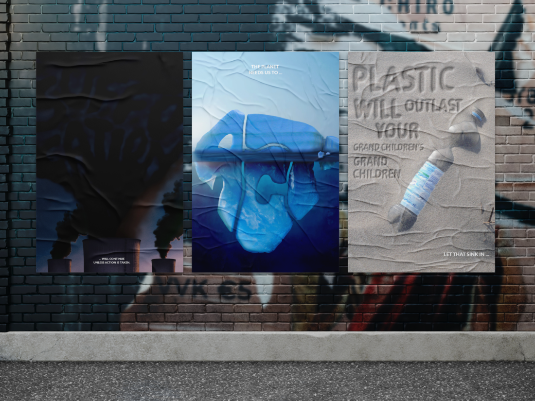
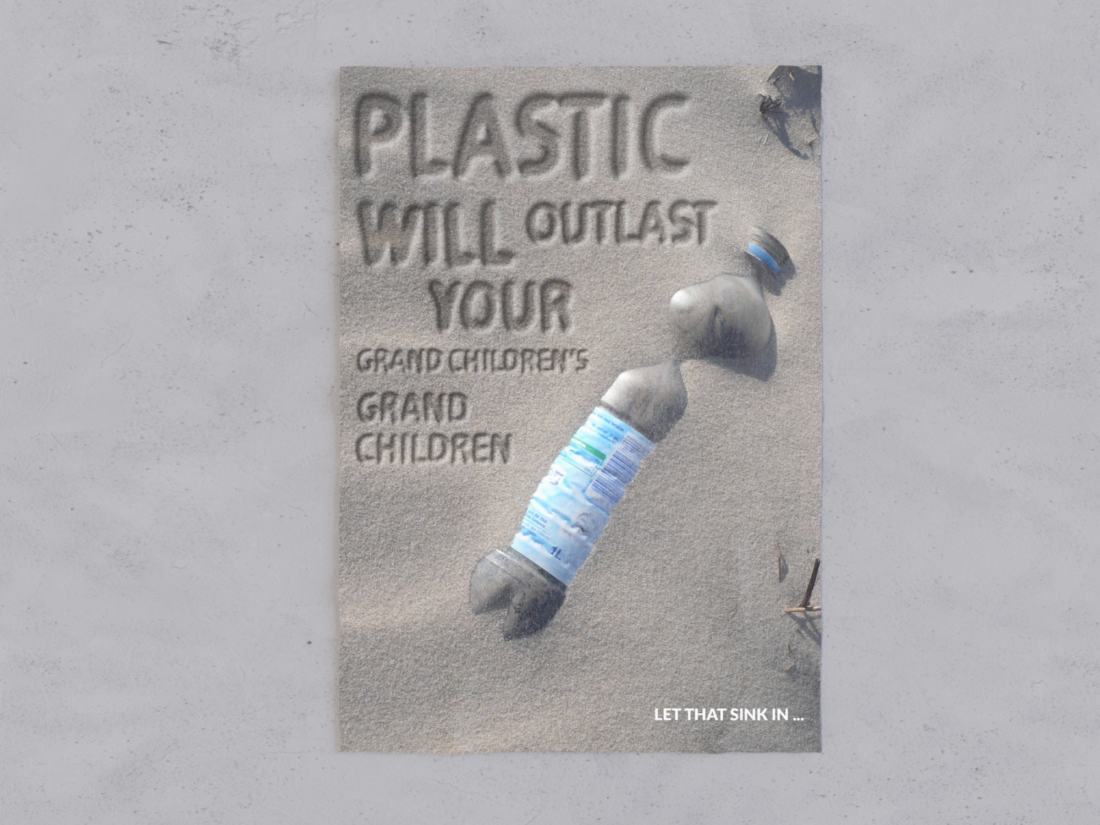
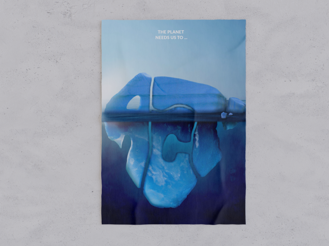
The weight of the pending issues of climate change is on everyones shoulders. As graphic designers, we are able to use our visual language to portray important environmental issues and visually depict the sense of urgency that such matters hold. I recently spoke to student designer Marius Mihailescu who has created a typographic poster series titled Morphed Messages in response to climate change and worldwide environmental issues. The series shows kinetic type being used as a ‘vessel’ to demonstrate the monstrosity and urgency of the climate crisis, with the typography taking up majority of the design leaving the message to have the most significance.

“This project signifies how creatives can lay small stepping stones to support the united path we must all take to reconcile a more harmonious relationship with the natural world.”
Do the current pending issues on our environment influence majority of your designs? Or were you inspired to raise these issues in this particular series because you believe typography can make a great impact on design?
My approach to this assignment was definitely influenced by my innate call to action for climate change, I knew from the beginning that I needed to best use my platform to stir conversations and provoke meaningful thought which extends beyond graphic design aesthetics. I do believe strong and succinct typography works, it helps to push campaigns as typography is essentially information. We all rely on information for day to day living so when information is presented to you that is confronting it reshapes your thought process and challenges values.
Having the typography scribed within the environment almost shows the message being sent straight from the earth who is begging for action and justice. Perhaps Marius took note on how common it for humans to turn a blind eye on such issues, only paying attention when something is plainly written out for us.

Your kinetic typography has been used in a pictorial way, with the typography being the main message vessel in your design. How did you create this typography? And where did you source your images?
I sourced my images from the creative commons library of Unsplash which is an online website that provides the best high quality stock images. I created the main typographical pieces through the Photoshop program via techniques of collage, and image manipulation all with the use of a variety of editing tools, layer effects, adjustments and so on.
Did you have any particular source of inspiration when designing this series?
The answer to this question lies within question 1, however the most particular inspiration came from the concept of using public, large-scale print applications to target as many eyes as possible. It wasn't one designer or one online post that influenced me. From a range of collateral I was able to see what was possible, then I went on to execute what I had envisioned in mind.
Something else I like about this poster series is its anonymity. It shows that Marius wants to get his message across without needing credit or praise. Similar to the works of Banksy, or similar anonymous street artists, I see Marius’ work plastered upon city buildings and billboards where people passing by are forced to look and think about these messages and perhaps become inspired to take action themselves.

Who is this series intended for, and where do you see it being used?
This series is for the public, people of all ages and backgrounds. At the end of the day we are all different but share the one common home, we need to look after it and be good neighbours to each other. The only way to do that is to protect what we all commonly share and call home. I would love to implement them in public spaces just like the posters I have mocked-up, the ultimate goal would be to continue this mindset and drive for sustainable design so that I can gain access to much larger applications such as the truck and billboards In my other mockups. No limits.
