New Age Design
An interior design magazine that portrays new and modern interior design in pure black and white.
Jaime Burns
Sarah Cox
Good interior design is all about the success of aesthetic and function within one’s home and how together, they can bring joy and peace to the homeowner. Your home should reflect your own individuality and personality, however, this can be incredibly difficult to achieve in the wide world of interior design. Sarah Cox set out to create an interior design magazine that could not only challenge the norm but also appeal to the youth of today’s hunger for originality and uniqueness.
Typography
Sarah Cox uses the typeface “KrungtheP” as the feature typography throughout this magazine. This choice of font works extremely well within the context of interior design and creates a natural flow throughout the magazine that draws the reader in for more.
“I thought that the futuristic aesthetic of the font fit the overall tone of voice for my magazine cover.”
To allow the featured text to stand out within this publication design, kinetic typography is utilised effectively in the form of distortion and cut and crop.

Distortion
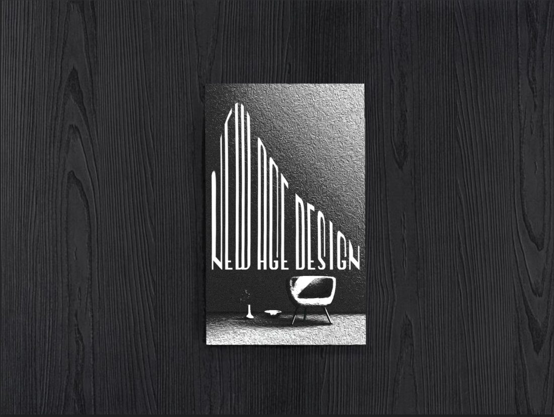
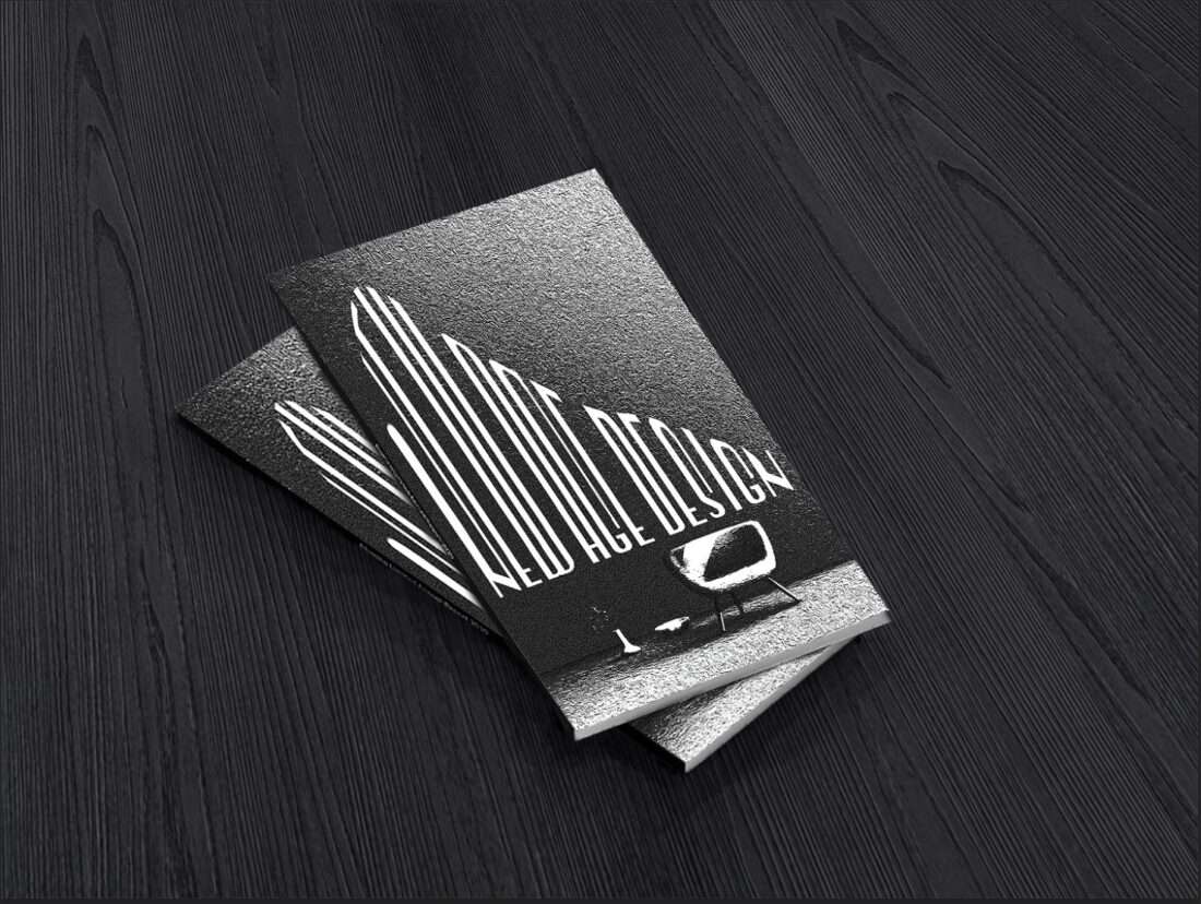
Sarah Cox uses a form of distorted typography that relates exceptionally well to the subject matter and the overall voice of this publication. Within the magazine, falling text is used to connect the feature typography to the feature image, creating an eye-catching and intriguing effect. On the front cover, the text is also distorted in a similarly pleasing and abstract way. The text remains aligned at the bottom and is stretched to the top where the words create a satisfying slope. The type remains readable yet also becomes its own unique artwork which blends into the featured image, becoming part of the interior design itself.
“I used distortion as I thought it showed a grungier and more abstract look compared to other modern and sleek-looking interior design magazines.”

Cut and Crop
This design also features a second form of kinetic typography often referred to as “Cut and Crop”. This effect is seen within the pages of the magazine. Much like the distorted text, Sarah Cox has effectively used this kinetic typography to relate the feature text to the feature image and the magazine overall.
In both examples of this typography, cut and crop is used in a sleek and captivating way that draws the reader in for more. This form of kinetic typography gives this magazine design a cutting-edge feel and a uniqueness unfelt within the popular magazines of today. It portrays the magazine's intended voice while being able to reach its younger audience who crave individuality.
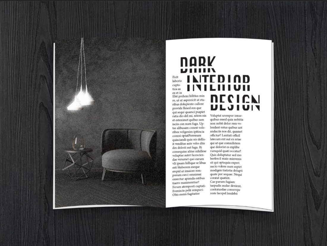
“This design was intended towards a younger audience, and I believe it has the ability to peak their interest through its dark and grungy appearance.”
Monochrome
“I mainly use black and white and monochrome in my personal design style. I find it very aesthetically pleasing and I feel it gives the design a bigger impact.”
Sarah Cox utilises the striking appearance of black and white in a way that is not melancholy or woeful but yet mysterious and intriguing. The absence of colour throughout the entire design works extremely well and allows the featured artwork to stand out. This dark and monochromatic aesthetic, paired with the uniquely designed kinetic typography is able to reach its target audience of the youth of today. This striking magazine design is able to stand out among its peers and attract the viewer to a new and unique experience of interior design.

“New Age Design”, is an interior magazine unlike any other. This publication offers a new and unique experience to today’s youth through striking monochromatic design and captivating kinetic typography. This magazine dares you to be different, challenges you to be unique and opens your eyes to the possibilities of interior design.
“I hope that the viewers will have a new and unique experience compared to other magazines they read/view. I believe my magazine is quite different and stands out from the others.”