PONZO clothing brand
Case Study
Jackson Macnevin
Liam Kearton
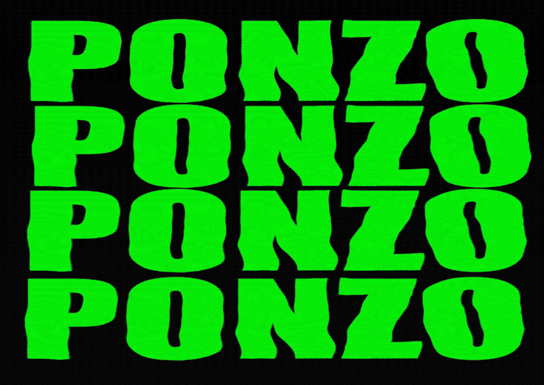
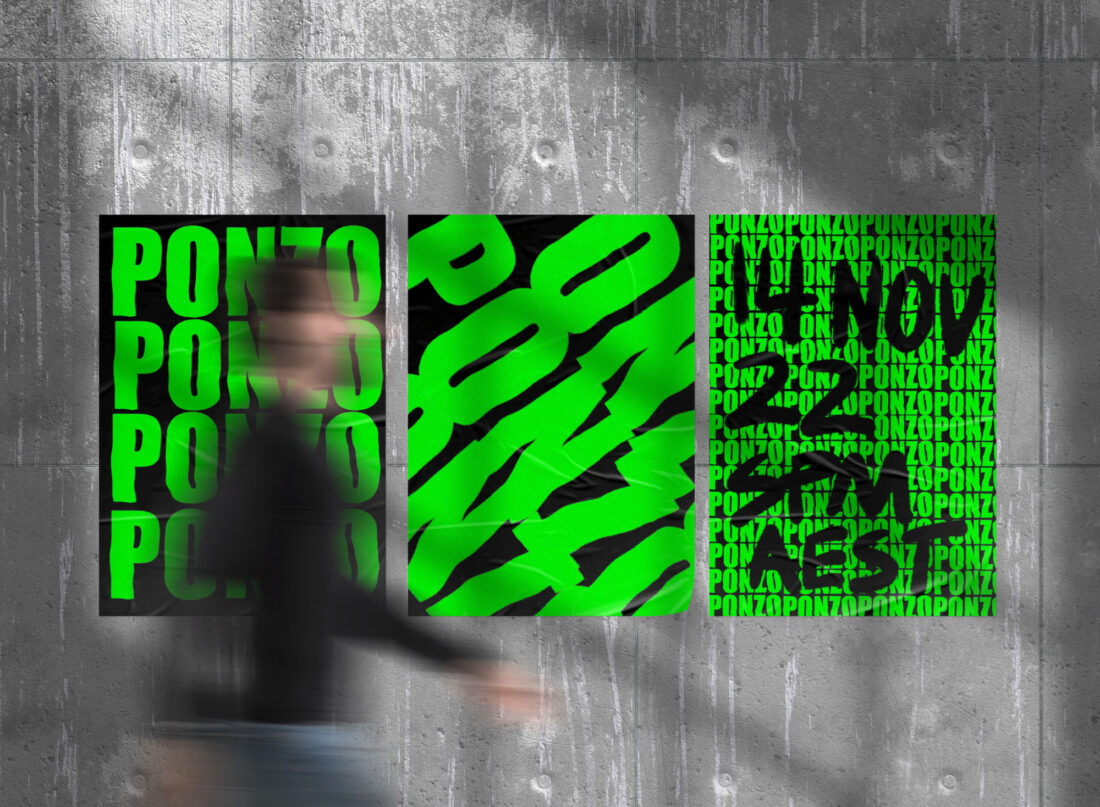
Ponzo a new clothing company using kinetic liquid type font in a print poster format to promote their new launch. Using a simplistic colour styling with the font being neon green draws the attention of the public walking past. Using a black background allows the clothing companies font to become the centre of attention. The liquid addition of the font with the repetition of the brand Ponzo, curates an eye capturing affect. Adding this screen printing grain, the typography pushes the minimalistic styling of the brands identity.

After being asked "What is one thing you sould want the audience to know about the design process and/or the brand", Jackson replied saying,
"Representing this brand as a mysterious, unknown clothing brand, curating a brand identity for Ponzo to be a limited high-class brand. Creating this idea of a brand being hard to buy their products and using simplistic design to not give away too much information on what this brand is"

By taking heavy inspiration from Virgil Abloh, famous designer who has worked with Kanye on multiple projects and ended up being the Artistic Director for Louis Vuitton’s menswear collection beginning in 2018 and until his unfortunate passing in 2021, Jackson has used the heavy bold and repetitive type to evoke a sense of almost plain-ness, in an effort to not give away too much about the brand at first glance and encouraging the consumer to look deeper into the designs, and find out the true meaning of the brand, adding to the allure of it’s presence, or lack thereof, in the market as it is to be hard to be obtained.
After asking him a few questions about his process this is what he sent me:
- What font did you use for the design?
- Impact
- Impact
- What editing apps or websites did you utilise?
- Procreate
- Procreate
- What was your inspiration?
- Virgil Abloh ans his simplistic design methods in promoting for a new clothing drop
- If you could change one thing about the design, what would it be?
- Add some illustration/more impactful design to curate a more symbolic design to the clothing brand
I think this is a very successful brand design jand enjoy the colour pallette used in this project. I do however think that the liquification, while it does add an extra bit of pizazz, I believe that it would have looked better simply as the default "Impact" font that was used. At the same time this adds more character to an otherwise unknown brand, aiding in it wanting to stand out.