Logan's activewear brand REVOLUTION pays tribute to vintage/streetwear brand "Deadstock".
The inspiration for Revolution came from an appreciation of the values behind Deadstock, which operates on the basis of selling excess stock from companies that have overestimated the sales/stock balance for a product. Following this zero-waste fashion cycle line of thought, REVOLUTION was born. Logan's bold yet simple design captures the heart of the brand and communicates it effectively to the target audience of active 16-40 year olds.
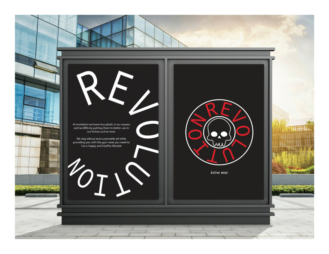
"This brand is all about recycling, leaving less plastic in our oceans and landfills by putting them to better use in our kickass active wear designs."
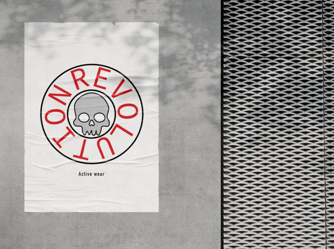
The cyclical nature of the brand is demonstrated in the kinetic type that embodies a circular shape. A skull illustration in the centre represents the discarded material that is given new life in the activewear. By using recycled plastic, the contribution to landfill is reduced and something useless is once again made useful.
We asked Logan about his choice of colours for the designs.
"I mainly used red, white and black as they are prominent, they stand out and catch your eye."


The design can be applied across a variety of products and spaces that could be utilised by the brand in merchandise and advertising. The clean typeface is easily legible and colours are identifiable as an activewear brand. In this way, the brand is clearly defined in a way that will appeal to the target audience.