Smoke + Mirrors
Cook book case study
3 years ago
DESIGNER
JORDAN RITTER
INTERVIEWER & AUTHOR
LILY RAMSAY

Although the rise of technology has decreased the use of physical interaction, everyone loves owning their own cookbook of some sort, something that they connect too. Smoke & Mirrors helps create that lasting connection while also creating a piece of collectable art that looks gorgeous in any kitchen.
Let's have a tour of Jordan Ritter's Smoke & Mirrors to get a closer and deeper insight into the thought process and experimental process behind this professional and timeless piece of practical art.
"I was keen combine my interest in cooking and desire to progress my graphic design skills in this elective course via this cookbook idea"
THE BRAND
Smoke & Mirrors is designed for the everyday person with a passion for food and creativity. For the people who love well made and presented food, but just generally do not have the time to think of ideas or spend the money to eat out at high end restaurants constantly.
"It is a cookbook that aims to dispel the myth that restaurant style food is impossible to achieve at home. With enough time and care, as well the right equipment, you can do it yourself. The book would have tips, tricks, secret hacks, and recipes from an ex-chef that help a keen home cook recreate fine dining level dishes at home."

THE DESIGN
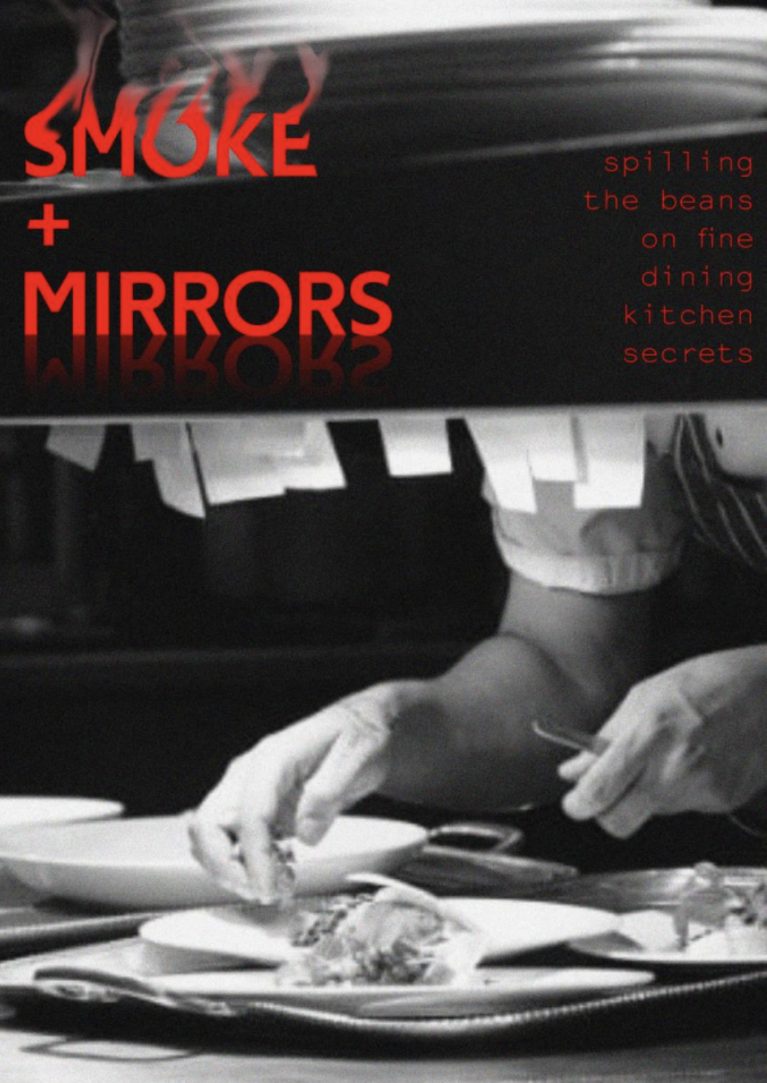
Ritter's design throughout this cookbook is integral to how the audience is drawn in. The darker colour palette and the clever use of kinetic typography allows the audience to connect visually through the use of not only picture, but also words. This well thought-out use of typography describes what the reader is already viewing which allows them to gain a sense of what they are reading before doing so.
"The various treatments I was exposed to e.g., cut/crop, fragmentation, distortion etc. were often abstract. These were often appropriate due to the subject matter or concept. But some had very literal uses. I quickly realised many cooking related words and titles could have a kinetic treatment with a literal approach."
