Stripped Back case study
2021 ADGA awards entry

In today’s world everything is so fast and constantly moving, for creatives this can be a good thing. However, it is important to take a step back, pause and think about what you are designing and why you are designing it.
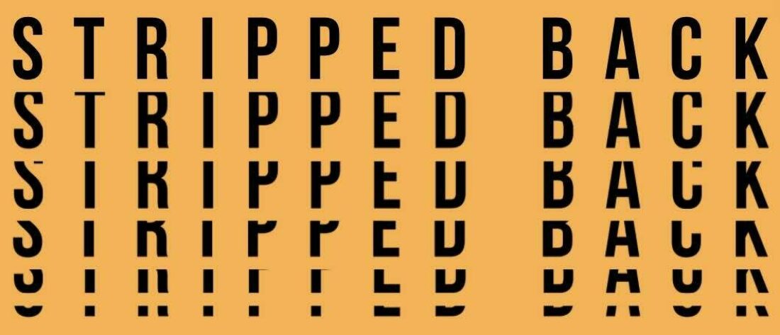
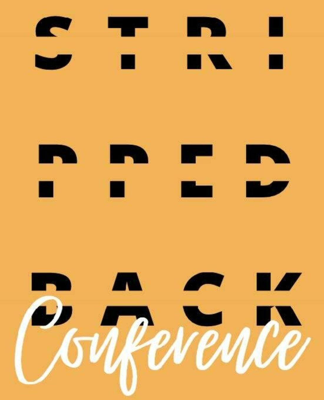
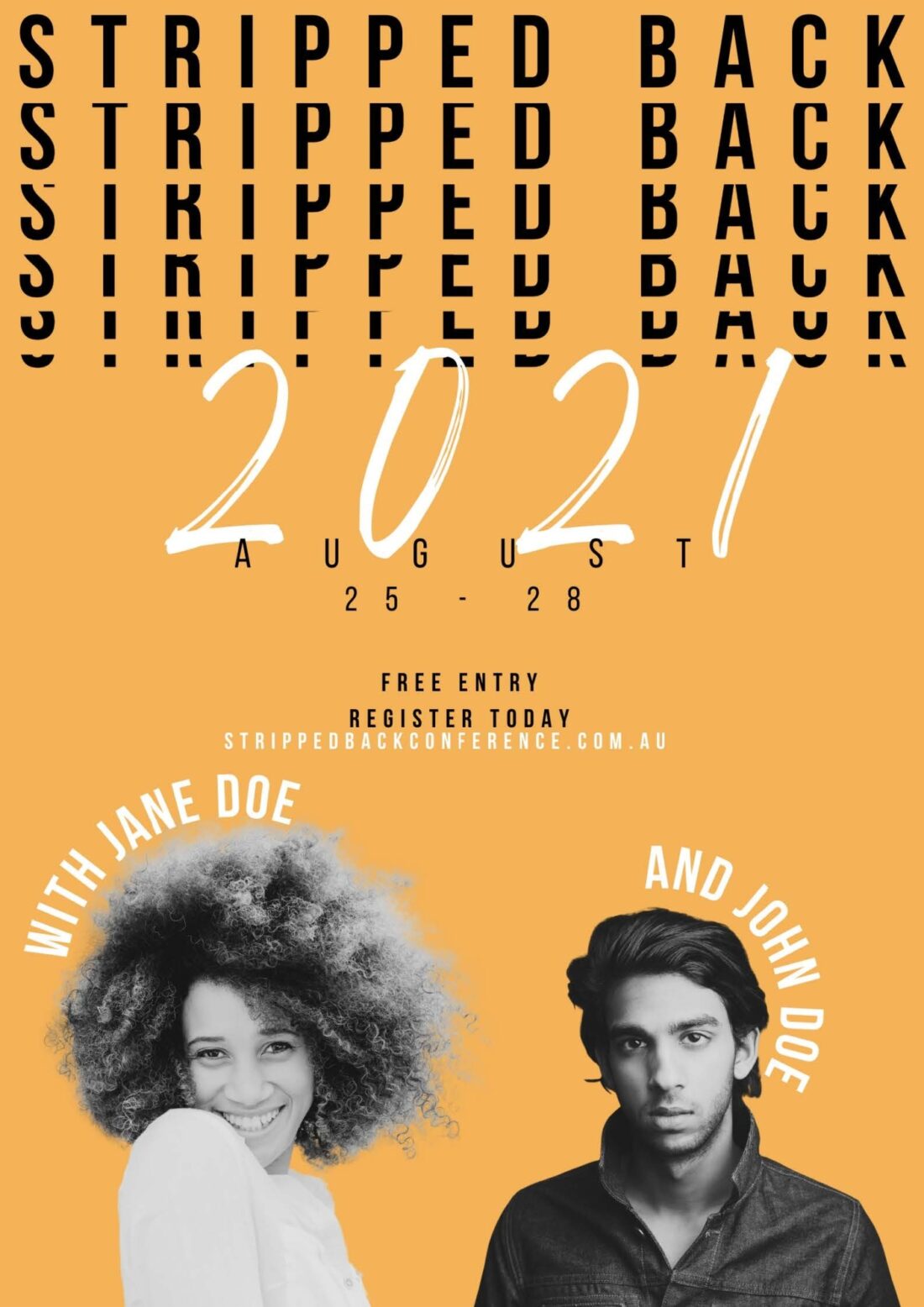
This is the idea behind the Stripped Back Conference marketing material, forcing designers and creatives alike to stop for a moment and contemplate ‘the why’ of the design process. This is shown through the use of kinetic type in the invitations and marketing materials.
“I decided to create a marketing suite for a conference for creatives which focuses on the 'why' behind creativity, life, and who creatives are. I went with a 'pause motif' to symbolise taking a moment to think about the 'why' and employed kinetic type by removing as much of the text as possible to see how much of the message could still be conveyed and understood and literally "stripping back" the text.”- Hannah Rallings, Stripped back rational.

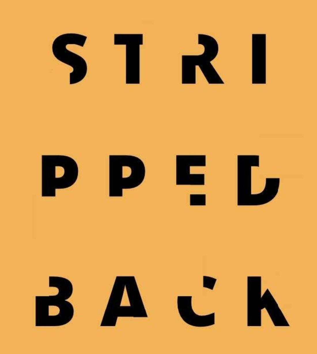
The inspiration for this project came from the designer’s, Hannah Rallings, own personal experience in coordinating events and conferences. Rallings was also inspired by a 2016 ADGA awards entry by Sahra Martin titled ‘Stripped’. Rallings was intrigued by the idea that was proposed by this entry- ‘How much information can you remove to still get the message across to the viewer?’ Using this question to fuel the creative experiments, she began working out just how much you can remove until the message is lost, this included cutting and cropping the typeface.
Rallings said that the program that she initially uses for any design work is Canva, describing it as a good place to start as it is great for idea development due to its manipulation tools are easy to use. After the initial design is roughed up on Canva, Rallings refines and places her designs into mock-ups through Adobe Photoshop. When queried into which typeface was used, Rallings said that she used “Now Bold in my Sans Serif typeface and "London" is my Serif typeface”. Rallings said this was due to the clear, concise and somewhat simple nature of the typography. The simplicity of the type allowed her more freedom to cut and crop the words without losing important information that makes the words readable. She went on to say that the type had “plenty of negative space as this lent itself to my theme of ‘stripped back’”.

Hannah Rallings went with a bold colour scheme of dark yellow, black & white, and grey. When deciding on the colours she said I “wanted bold colours that fit together to create a range of mock-ups but were cohesive through the simple design. The boldness of the colours allowed me to work more simply with the design and leave more negative space as it already felt full.” She also described these colours combined with her design as attention grabbing but simple, as not to overwhelm the audience, which fits back into the idea of pausing and going back to the basics of design.

The demographic that is project was designed for is younger female designers. “I created this for young creatives (Gen Y), more so towards women than men as I wanted to create something that I'd be interested in however anyone is welcome.”
Hannah Rallings has created an interesting and unique look for a design conference, where like-minded designers can come together to take a step back and pause for a moment to ask themselves and other designers not just what a design means, but potentially, what it means to be a designer.
"I really enjoyed the creative process and having free reign over what I could create."