SUMMER SOUNDS FESTIVAL
Designer Felicity Bronner Discusses Her New Visual Identity
Ashleigh Dibbs
Felicity Bronner
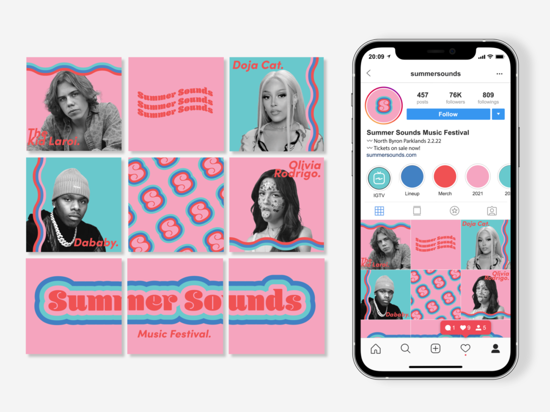
SUMMER SOUNDS is the new fictional festival to be hitting Byron Bay Parklands, headlining popular artists from around the globe such as The Kid Laroi, DaBaby and Doja Cat! This week, we had the pleasure of interviewing the designer behind this exciting music festival, Felicity Bronner!

Bronner is currently running an E-Commerce business with her sister, utilizing her creative skills on managing their social media and their brand identity. They currently have some big goals and dreams for their business, which Bronner plans to focus on post-graduation with the skills she will pick up during her Visual Communication Design degree at University of Newcastle. The business launched in November 2020 during Covid-19 which has thrown a few spanners in the works. Let us hope 2022 is a better year!
Growing up, Bronner has always been a bit of a creative, being referred to as ‘The Creative One’ amongst a large family, drawing from an early age and winning a few competitions. She was always drawn to creative classes and opted for visual art and visual design. Social media opened the world of design, thanks to the freedoms the platforms give other designers to share world. “[I] was always seeing other designers on Instagram post their projects and thought, I could do that!” There are no specific designers she looks up to, but is inspired every day by the designers and artists she follows across many social media platforms.


“[I] was seeing other designers on Instagram post their projects and thought, I could do that!”
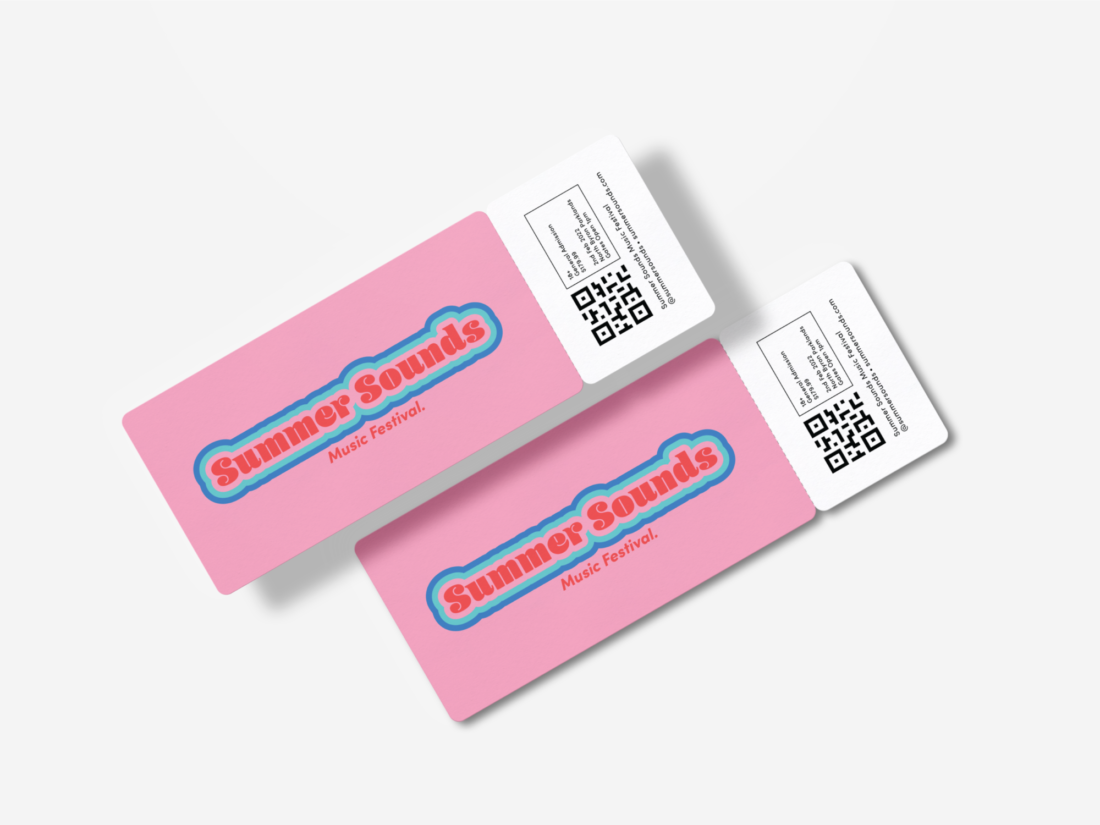
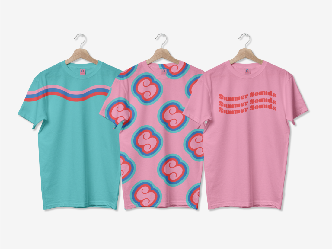
Bronner loves attending music festivals, opting for established festivals such as Listen Out and Field Day! This sparked the inspiration to design her own festival, Summer Sounds. Focusing on visual identity, Bronner experimented with bold color palettes and repeat patterns. “[I] think simple designs are so effective.” Bronner found that many other festivals lacked vibrancy and personality, especially on their social media. “[It made me] motivated to choose colors that helped my brand stand out. I designed it in a way that depicts my own style, so I think my personal touch give it its versatility which is what makes it unique. Apart from being visually appealing, I chose pink for the primary color as it represents youth, energy, and excitement.” The target is younger millennials and Gen Z, both groups likely to appreciate the color palette.

"I wanted to create something fun that embodies good vibes and evokes happy feelings in the attendees!"
Before beginning any project Bronner will always research other similar projects and find inspiration from places like Australian Graphic Design Awards (AGDA), Behance and Pinterest. “Sound waves inspired my choice to explore the kinetic type method vibration, with the offset text and wavy line element conceptually depicting music and dancing.” Bronner designed the logo type, simplified logo, and wavy line so it was recognizable across a range of different applications - screen and print. “I think having unique colors, logo variations and other elements are beneficial to strengthen branding.” Bronner created some gifs to display how the kinetic type could capture attention.
Bronner has submitted her visual identity to AGDA under the Student Identity category, and is currently waiting on the result. “I feel excited, yet I still find it daunting to have others view and judge my work. I gave the project my best shot, so I’m happy no matter what the outcome is.”


