The New Wave Magazine
Case study
Jacqueline Rheinberger
Jack Riches

The Magazine
The New wave magazine is a newly creative magazine with both a groovy and edgy tone. The magazines’ role and purpose are to “give Newcastle locals all their music needs, from gigs, shops, local talent and more” as described by designer Jacqueline Rheinberger. The new wave magazine achieves this while also reflecting the elements of different bands, the Newcastle area, local venues as well as its designer in its work. The New wave comes from a place of emotion and feeling, as designer Jacqueline Rheinberger reflects on her own experiences coming to Newcastle experiencing venues such as the Cambridge as well as her deep personal connection with music. This personal experience is used to craft a style and brand which encapsulates these emotions while also taking advantage of her background with illustration to create a unique magazine. Design elements such as the kinetic typography have been specifically chosen to reflect the movement associated with sound and while also mimicking the soundwaves produced when a sound is made. The typography also captures the names of the magazine as the ‘wavy’ nature symbolizes the name of the magazine ‘the new waves. The colourful colour pallet grabs the reader’s attention as it unique and chaotic nature work as a visual signal to lure the reader in and expand its success within the magazine market. The chaotic and groovy style also allows versatility in incorporating other ads and logos in designs which through their natural differences will add to the chaotic aesthetic and create consistent across the magazine to make for a more pleasant reading experience.
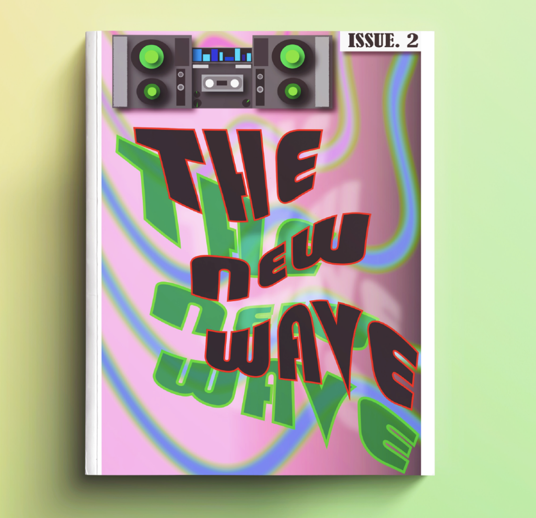
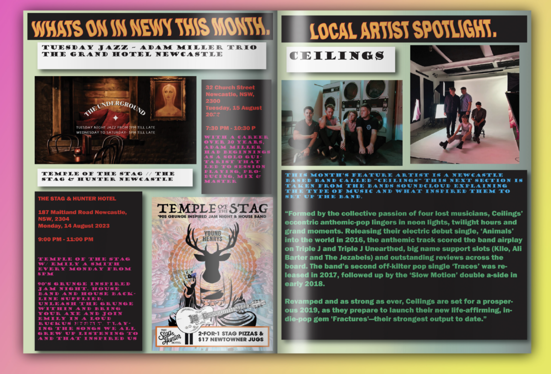
The layout for the magazine is very well thought out and incorporates space for ads and bands of different sizes and different pieces of work to function well as a magazine. The margins, gutters, spacing, letting, and tracking are sufficient for readers to easily read text which is vital to the function and user experience when interacting with any
magazine. Font variety and colour variety in the text make the adds easily distinguishable from one another giving ease to the reader. Overall, the magazine of “The New Wave” and its design portray a unique groovy and edge aesthetic and achieve its goal of function supplying Newcastle locals all their music needs, through the use of well-rounded design and making use of elements such as kinetic typography to stand out in the market and well-rounded text placement to connect with the user and be successful in the print/ magazine market.

"For me it was the concept, I love music it is a big part of my life and so I knew I wanted to design something around that." - Jacqueline Rheinberger
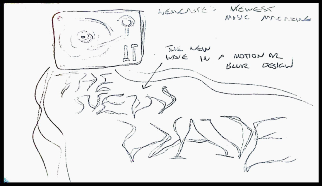
Work in Progress

Can you describe your approach to creating your design ?
So, when creating my design, I wanted to do some in colourful, graphic, and fun. I am not a designer I do a lot of illustration work, so I wanted to go in a different direction. Try something new and have fun with the process. Which I think overall I did have a lot of fun creating this design and it has given me skills I never thought I'd have.

What’s the narrative behind your design?
My design doesn't really have a narrative behind it more of a vision. A desire to have Newcastle’s music Venus highlighted and make it a place people come to enjoy it. Personally, my first time to Newcastle before I moved here was seeing a small band live and the Cambridge and it was so great it really stuck with me.
Did you do any research on similar designs or products compared to your own and how do they stack up?
I didn’t as there wasn't a lot of other music magazines to research. I looked at a whole heap of album covers which is where I got most of my design inspiration from. The only magazine I found was the rolling stones and I think they can't be compared as one is a global scale while mine is very localised.
Design Components as described by Jacqueline Rheinberger
The typeface I used was just something that I felt was right after playing around with the design it didn't take away from the magazines visuals but still stood out on its own. My whole design process was very trial and error a lot of back and forth between making my one thing and using already established typeface. I didn't really incorporate any other elements into my design except illustration skills to create the visuals.
Colours as described by
I liked these colours as I felt they had a real groovy vibe but weren't overpowering to look at, they are mellow but eye catching. As the design was already busy, I didn't want the colours to then create even more conflict. The purpose of the colours was to ultimately highlight the kind of product being promoted something that is inviting to the viewer, comfy and fun.
Which one came first the concept or the technique ? and how did you build on this to get to your final product and did you have many other ideas to compete with to get to your final idea
For me it was the concept, I love music it is a big part of my life and so I knew I wanted to design something around that. As I'm new to the area I thought a music guide would be the perfect thing, as it's a product that if I saw out in public, I'd immediately be drawn to it. My other idea was an art guide, but I felt that Newcastle already has such an easily accessible art scene. That's ultimately what drove me towards the final idea.