THE SOLACE CLUB
3 years ago
Designer
Hannah Attard
Author
Heidz Tomamak

“The inspiration behind the solace club was stemmed from wanting to create a space/platform where I could showcase my own design work"
Through making an online portfolio with a combination of posters and typography styles logo designs and paintings the solace club was formed. After the initial integrity of the brand was established, the idea of the solace club evolved.

- The targeted audience for this project was aimed at emerging designers but really it can be applied to anyone wanting to engage and collaborate. I think the solace club would be very beneficial to others to see different designs being showcased on an online platform, eventually the idea of the solace club would be to have work that can be purchased or used for further job opportunities.”

- "At first my logo for the solace club was completely different but with the help of our teacher Ralph, I was able to play around with the designs to create the words 'the solace club' into an S shape which I loved and stuck too.”
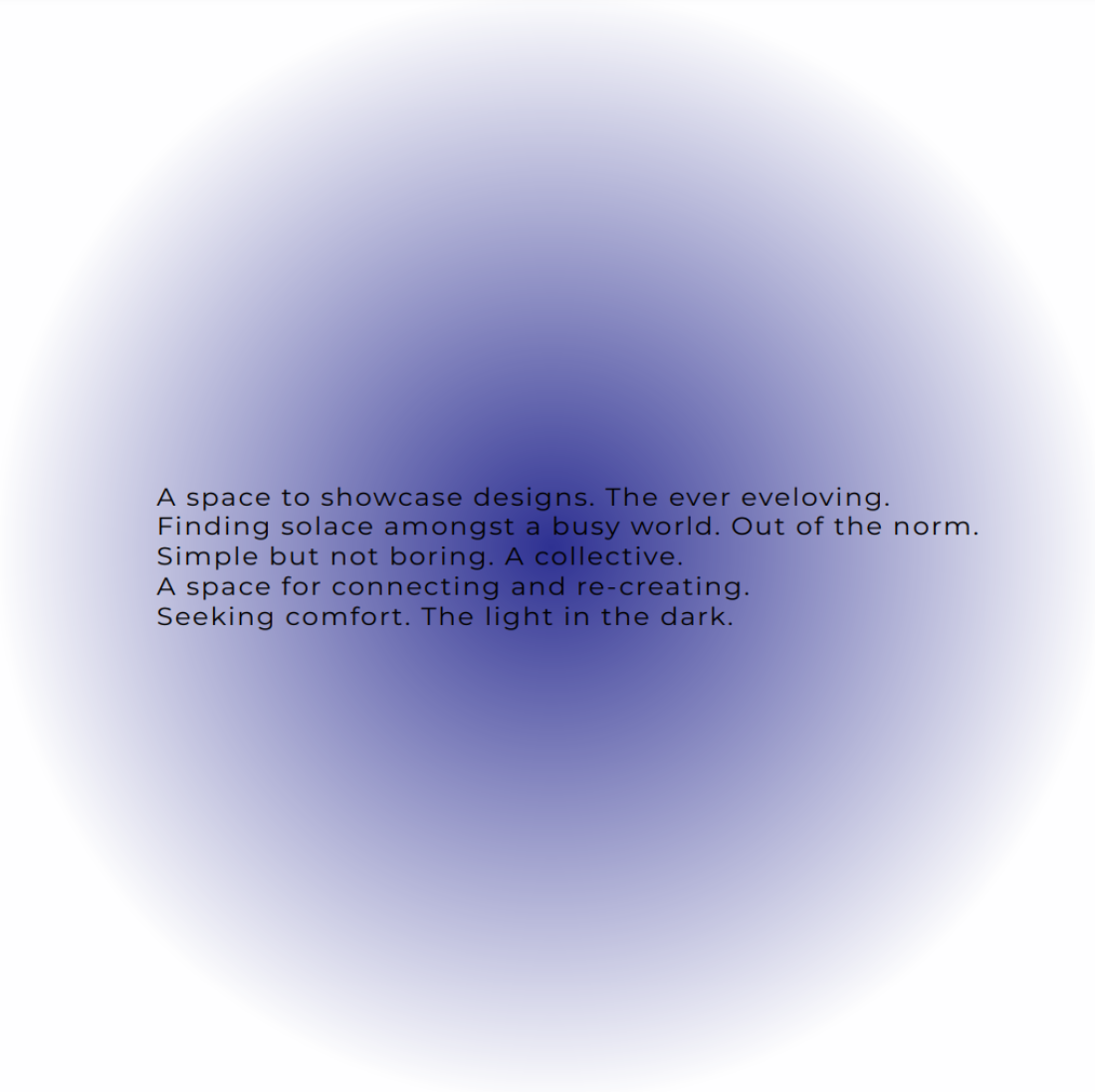
The design simple, but effective demonstrates a gradient effect background, In combination with a Geometric kinetic type. The colours, text and intent behind the brand is welcoming and warm.
