This That
Florence Searle -This That Rebranding Poster Series
Florence Searle
Sam Orme

Music festivals are back and they are here to stay!
Music festivals, like many other businesses, have had a hard job post covid bringing back the large crowds that they had become accustomed to pre-pandemic. With the opportunity to once again host large music festivals and events, the competition to draw an audience in is greater than ever and designers have the hard task to make their works stand out from the rest. Florence Searle has chosen to redesign a series of posters which aim to amplify the marketing of the Newcastle festival “This That” and bring back these crowds.
“I have always been a creative kid, painting and drawing since I was little, always finding a way to let my creativity flow.”
Florence has always been a creative person, loving to draw, paint and design and is studying visual communication at UON as a way to bring these interests into one place. Besides her studies at uni, Florence has an interest in live music which she wanted to incorporate into this project as well as trying to do a rebrand for an existing company which is something she wanted to experience.
“I chose “This That” as a festival as its… colourful which enables creativity.”
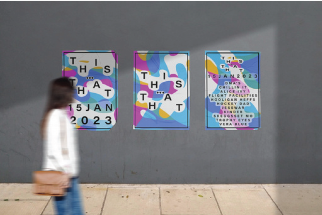
The “This That” festival has a lot of opportunities for rebranding as it hasn't been able to put on a festival for over 2 years and needs to capture a new and existing audience. To accomplish this Florence has created a series of brightly coloured designs which stand out and create a brand image which is clear and easy to remember. Across this series of designs there are ribbons of colour which overlap and mix to create a minimalist psychedelic pattern which is used to create a recognisable identity for the brand which is simple and easy to remember.
Alongside the bright colours of the project Florence has used “Helvetic” a simple san serif font which contrasts the brightly coloured and crazy patterns of her posters to make the key information stand out and easy to read. To create a more unique front for the project Florence customised the outlines of the text to create a unique typeface to suit the overall rebranding.
This is paired with fragmented text to break apart the letters of the festival's name to make people slow down and really read the poster to ensure they get all the important information. To improve the legibility of the poster white space is used around the letters to focus the eye to the key parts of text and make the information easy to find and read at a glance.


Overall this series of posters and designs have created a strong brand image for the “This That” music festival that has employed bright colours and kinetic type to capture the attention of people and make a recognisable identity.