Triad
Inspired by the songs of Mitski, Phoebe Bridgers and Lucy Dacus, Triad explores feelings of confinement, loneliness and restrictment.
Daniel Howarth
Bronte Jenness

Designer and Illustrator, Bronte Jenness, explores feelings of confinement, loneliness and restrictment in their poster series, ‘Triad.’ Inspired by the songs of Mitski, Phoebe Bridgers and Lucy Dacus, Bronte’s treatment of their lyrics through kinetic typography and coupled with their illustrations creates even stronger imagery as to how these powerful words may feel. Through the imagery that they use and the powerful lyrics of the songs, they prompt the audience to explore feelings they have never had before.
Design
Each of Bronte's posters convey a unique but related message. It's intended industry use is Print. This collection of works isn't Bronte's usual design style as they usually doesn't include text and works in Procreate over Adobe illustrator. They chose to experiment with colour, steering away from blues and grays associated with sadness and giving them more meaning.
"I'm not as much a graphic designer as I am an illustrator, so starting this project was a little hard for me. I tried my best to take the most illustrative approach with what little Adobe illustrator knowledge I had." - Bronte Jenness
Class of 2013
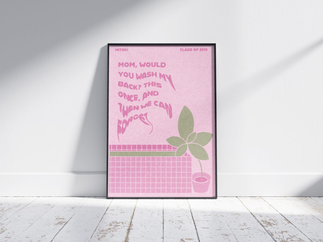
Poster #1, Class of 2013 by Mitski, is about the fear that young people feel in finding their place in the world after graduation. Bronte felt inspired to create an Illustration that included a 'body of water, either literally or figuratively.' Based on experiences in their own bathroom where they had listened to these artists frequently, they drew inspiration from these moments, whether it be feelings of sadness, or just something as simple as having a shower. The distorted lyric is being run through by a body of water, creating the idea of drowning, a feeling many young people experience when faced with confronting the next stage of their lives.

"A way for them to see they're not alone." - Bronte Jenness
Moon Song
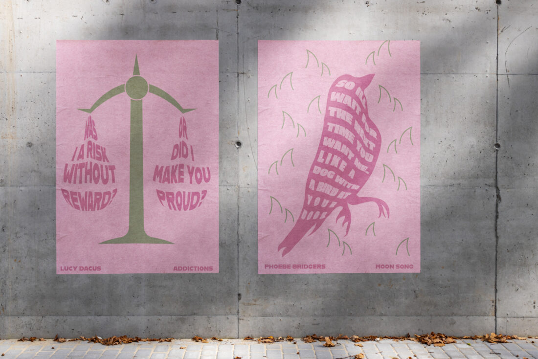
Poster #2, Moon Song by Phoebe Bridgers, is about giving up your identity to benefit another. It's about being stepped on to feel something. "So I'll Wait For The Next Time You Want Me. Like A Dog With A Bird At Your Door." Bronte has placed this lyric in the body of the bird to illustrate this feeling of desperation to not be alone. Bronte uses the dog-and-bird motif to make their point. The dog brings a dead bird to its human, lovingly placing it at their feet, just for the gift to be ignored.

Addictions
Poster #3, Addictions by Lucy Dacus, is about being addicted to a relationship past its use by date. "Was I Risk Without Reward or Did I Make You Proud?." Bronte has illustrated this lyric balanced on a scale, asking if the risk of being hurt again balances the reward of making your way back to that person when the relationship should be over.

Typography
As an illustrator, Bronte's regular design style doesn't often contain text. They knew that it would be difficult to do these artists and their moving lyrics justice but they do and beautifully creates even more emotion through their use of kinetic type.
"I hope that my treatment of these words helps give the viewers some imagery as to how these words can feel if perhaps it's something they've never felt before. " - Bronte Jenness
While a simple typeface, its distorted treatment carries meaning and easily captures the audiences curiosity. Each posters use of distortion compliments its chosen song. Its role in poster #1 as a body of water, its role in poster #2 as the dog-and-bird motif and its role in poster #3 as different sides of the scale.
Through their beautiful illustrations and use of kinetic type, Bronte has managed to create three deep and engaging posters using the tragic yet powerful words of these artists.
