TYPE FEST
A Typography Festival where professional type designers are showcased through their Creative work
Tanaya Lahrs
Parris Killeen

With the design world in a digital stronghold, people are forgetting the basics of type design, especially the physical part of creating design with ink and pens.
Digital Design is not a bad thing in the design world but we can embrace old techniques and traditions while also recreate and resurrect them digitally.
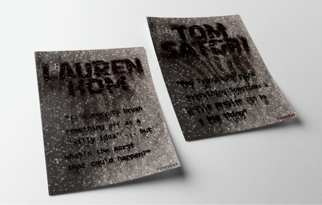
The idea with TYPE FEST is to get famous type designers such as Abi Connick, Lauren Hom and Tom Satori to showcase their typography styles in a professional setting.
“It mimics the style of an old poster with the typography dripping down/fading whereas newer posters are clean and modern. To make a statement” ~ Tanaya Lahrs

Inspiration
By other designers and professional type designers such as EBLTS & Letas, and Roman Post.
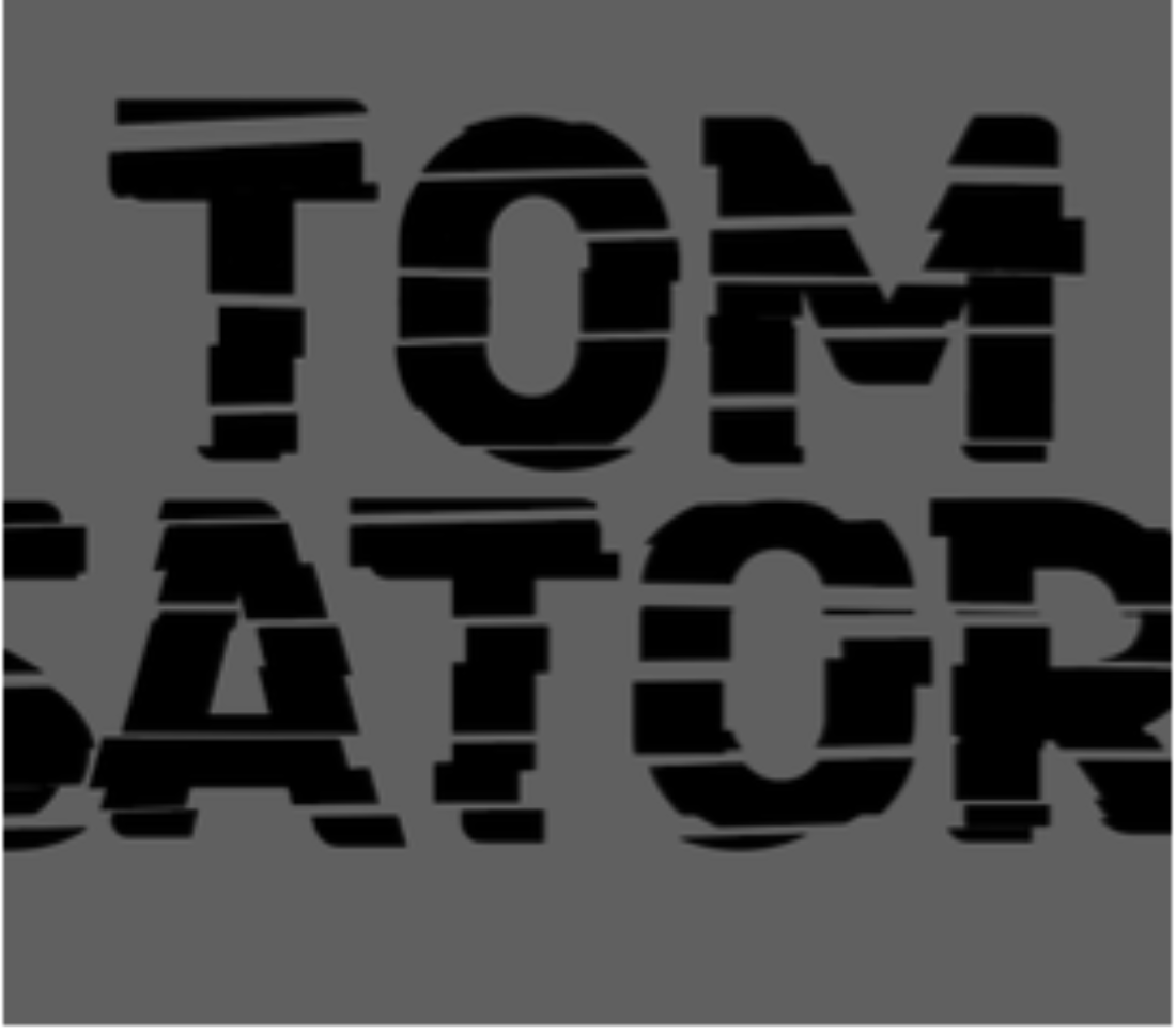
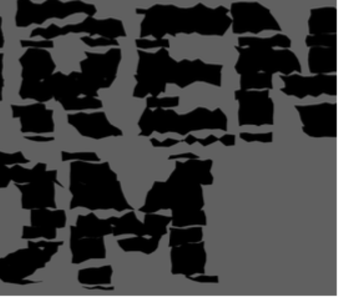
By using kinetic types of Revealing, Cut & Crop, Fragmentation, and Distortion. Mixing these styles together to get a creative style of work that is uniquely theirs. In this type design they have used a treatment of bold typography, print style and a limited black & white colour palette to create a strong eye-catching piece that engages the audience.
Tanaya's Target audience is people who are into type posters and their aesthetics. And also people who are into the type designers themselves, and how they are able to express their thoughts and feeling with monochrome colours and kinetic type.
Tanaya's Target Design Industry would be Print, Publication and Identity as she created a new festival around the publication of designers work who print their design.
"Also creating a Type festival inspiring type designers to share their art within a creative community that will improve the valve of work."
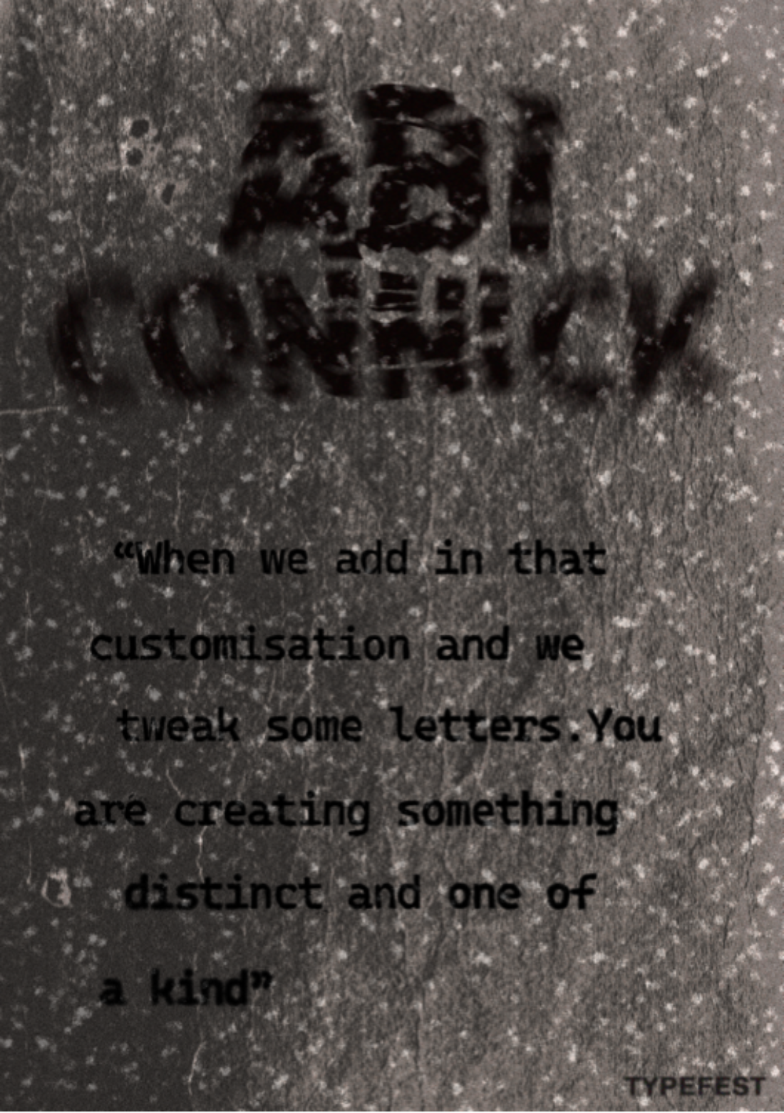
ABI CONNICK
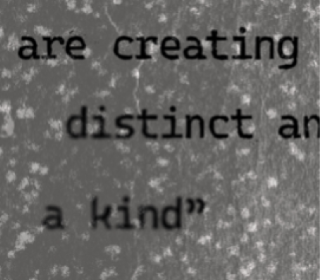
"When we add in the customisation and we tweak some letters. You are creating something distinct and one of a kind"

LAUREN HOM
"It's easy to brush something off as a silly idea ... but what's the worst that could happen?"

TOM SATORI
"Bad typography ruins everything! Sometimes a subtle problem can be a big thing"
Challenges
The most challenging part for Tanaya was figuring out the layout of the poster design.
In her design of the 3 posters, she went through many different design iterations and development changes to successfully display the poster’s gradual bleeding effects, saving the colour profiles in the correct formats, and much more.
There were many different design sampling stages so she could create the poster designs and perfectly edit the mock-ups and progress to a successful creative outcome for her Type Fest Posters.
“I’ve never created a digital print-like design and wanted to test a new territory in the design field when creating these posters, so I researched and watched many tutorials to work out what was best for my design. “

Software
Firstly, Tanaya designed her kinetic type design in Illustrator, then experimented with different techniques, cut up the text and found a distortion effect that blurred/twirled. She used brushes & object effects to create an ink splattering look on the letters while also cutting up the text to make a fractured look.
In Photoshop she created filters and found paper-like textures that are rough and bumpy than overlapped to create paper bleed effects into the text. I used grain, colour overlays, texture overlays, field blur, liquify and more to texturize the piece all together. Tanaya used all these techniques to create a printed look to the posters so the gradual intensity of design would look like bleeding ink.
“Most Proud of the new techniques that I learned and experimented with.” ~ Tanaya Lahrs
Illustrator
Illustrator
Photoshop

Photoshop

Illustrator

Photoshop
Photoshop
Design
Tanaya’s Creative Process includes; Research, gather inspiration, start drafts, start experimenting with different types, mess around with the page layout, photoshop starts exploring textures and overlays. Repeat until she gets the final product.
These TypeFest posters feature kinetic types revealing, distortion, cut & crop, and blur to create a unique visual look of dark visual territories. The use of a grayscale palette brings the poster’s visual aesthetic into a dark, mysterious, and gloomy effect. Along with use of bold, loud typographic font types to further represent that style.
The designs use multiple techniques to create a printed-like look, such as ink bleeding and printer scanning/ink splattering. The use of these techniques gets greater and greater going through posters 1 - 3, poster one uses less harsh bleed effects whereas poster three has a deeper ink seeping effect.
Tanaya's example and re-trialling with different design techniques on the typographic style created within the illustrator software was to create that gradual ink bleed/seep effect that gradually grows within the posters.