UNMASKED
New Beginnings in the New Year
Masks have been put to more use than ever before and have quickly and intensely become part of our shared social vernacular. Taking off a mask is more symbolic than just the action of doing so, it represents fear, division, safety for our health and for others, and hope for our future.
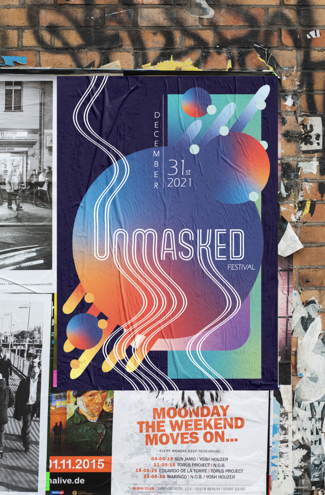
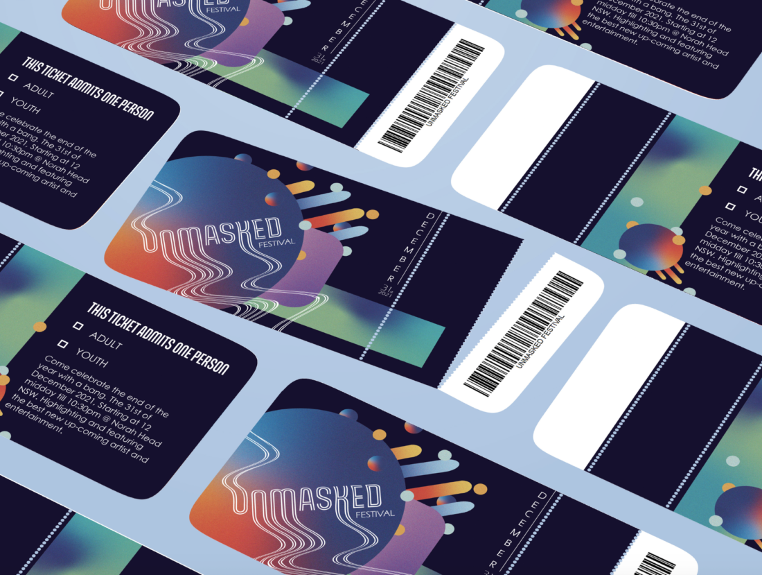
UNMASKED an envisioned celebratory party for the end of Covid-19, and new beginnings in the new year. Vaccinations rates have soared particularly in New South Wales, and this means we can start to see our friends and families again and enjoy life how we used to before this pandemic was unleashed upon us. UNMASKED is a party designed just for this, lockdowns are beginning to fade only to memories instead of reality, 2022 is fast approaching, and the festival season is gearing up. UNMASKED is a fusion of music, food and good times for all, with something for everyone.
“I chose the name unmasked as taking your mask off after work or anywhere it's a relieving sensation” - Jade Palmer

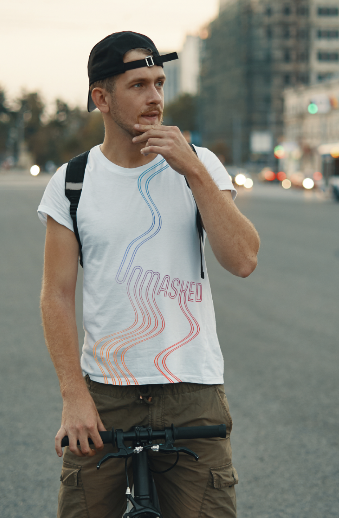
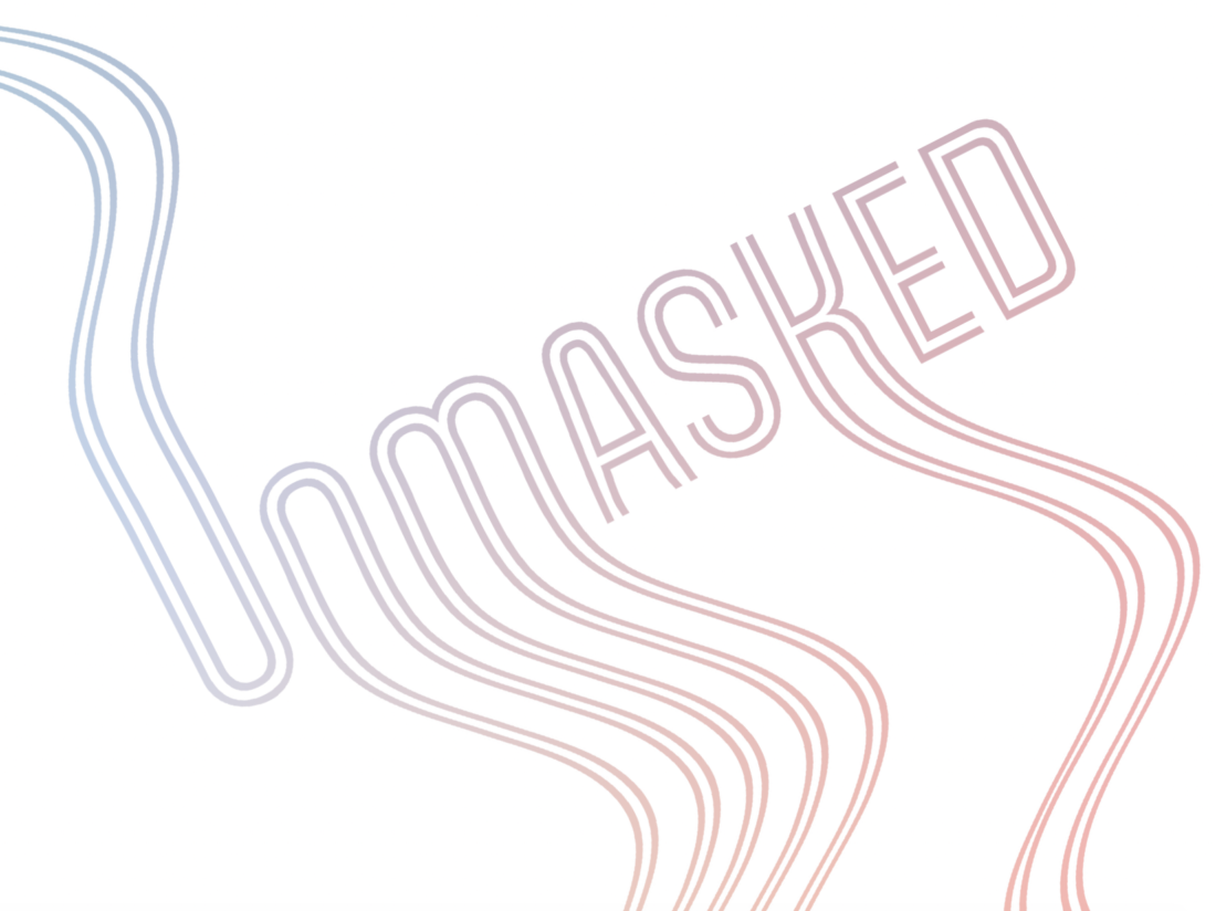
UNMASKED branding by designer Jade Palmer plays with colour and type distortion, a design that exudes fun and excitement, but also alludes to chill times and relaxation. The design has all the elements of readability and structure but at the same time cleverly walks the fine line between the brink of chaos (with the expanding bubbles and high energy colour bursts) and the contained, methodical but fluid type design that sits above it all. Although the kinetic type sits above the design it’s not out of place and compliments exceedingly well, not to mention that because of this it becomes a versatile stand-alone design element that can be replicated across any number of accompanying products or services, like Jade has done for the merch and the tickets, and because of the nature of the treatment it can be passed on to any other word like for the staff lanyards.


“…I made the type quite distorted but readable so it could be a standout element alone but also with other elements as well” – Jade Palmer
Jade drew inspiration from music history, specifically retro album covers, and you can certainly see how she considered that in her design. The outlined almost bubble text and the trailing fluidity of the main title UNMAKSED in combination with the abundance of colour is so obviously inspired by music, to be even more specific it looks like it could be straight from the 70’s and 80’s disco era.
“I chose to do the wavy look as I thought it created a very chill, fun, and exciting vibe to it, also looking a little like a retro music cover” – Jade Palmer
The smart and simple sans serif type, Eras Light ITC, is the perfect finisher for such a fun design. Like the unmasked title it sits away from the colour and movement of the poster design and is like the ribbon that wraps it all up in a neat package. The perfect orderly companion for the inspiring chaotic colour design.