Venom Vinyl Packaging
Distortion and Motion Kinetic Type in Design
Sarah Scott
Lachlan Sarv

The use of Kinetic Type in design is an interesting and compelling way to grab a consumers eye when it comes to product design.
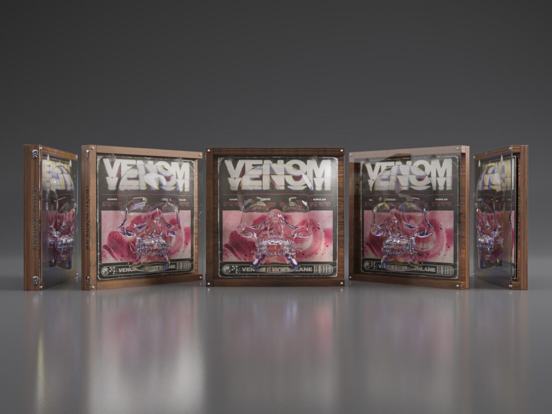
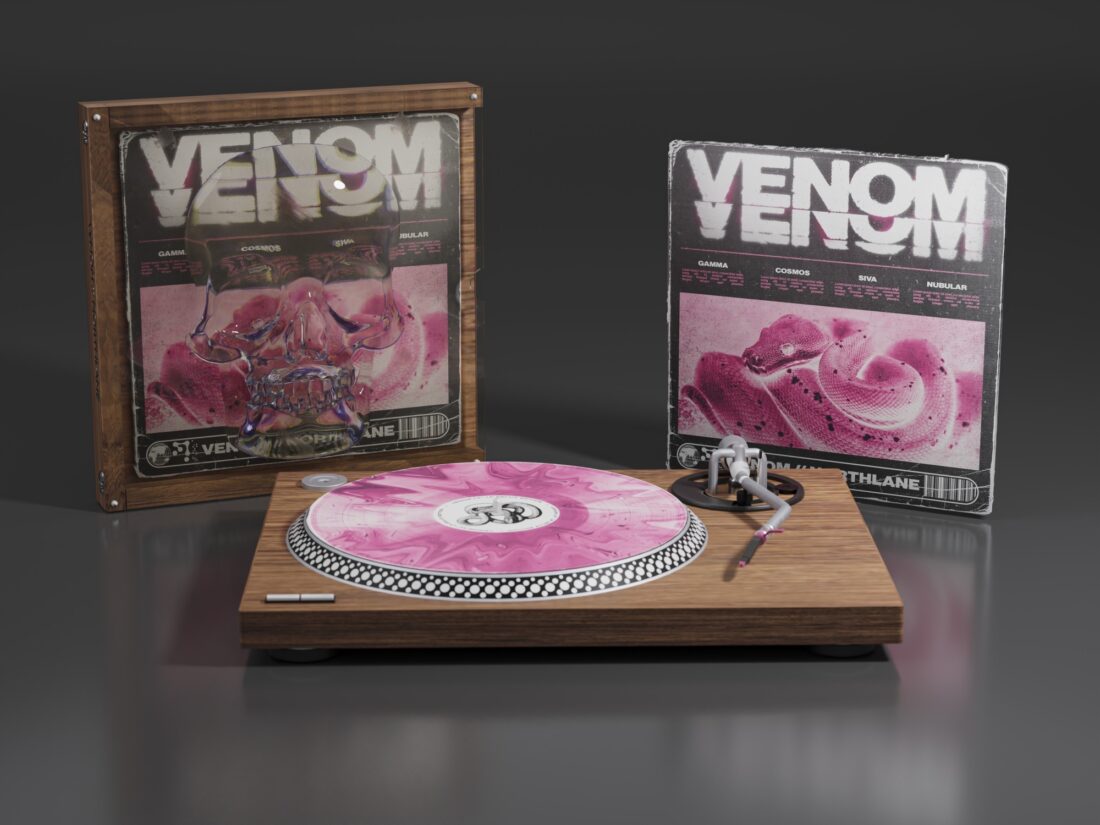
There are many ways to achieve Kinetic type in a design which we have looked out throughout this semester. Lachlan Sarv, a fellow student, has used distortion and motion kinetic type to achieve a phenomenal result for the packaging he designed for a vinyl album.
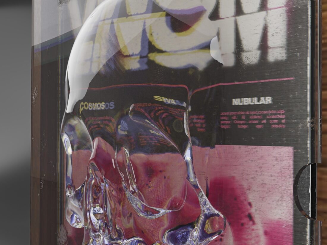
Distortion and motion kinetic type uses various methods and software to warp and curve the type to create movement and depth to a typeface or art work. I interviewed Lachlan about his process for his Venom vinyl packaging.

He tells me he used a number of programs to create the distortion effect on this design. The album cover layout was made in Illustrator. He then imported the file into Photoshop to edit the snake image and the header text to create a layered ink bleed effect with some Copy & Scanner layers which helped him create a vintage look.
Lachlan goes on to explain that the display case was created in Blender which is a free to use, open source 3D software website. You can use it for many applications including modelling, animation, rendering and video editing. After using Blender he then used Lightroom to create a uniform colour profile.
The type that he has used is Neue Haas Grotesk (Bold 75). He says:
“It’s the original Helvetica and is pretty much the only typeface I use. I found that I was getting overwhelmed with so many type options, so I found one and have used it for 95% of everything I do since.”
He was inspired to incorporate the skull imagery by his love for pop punk & hardcore music. He also knew that to achieve this type of result he would need a rounded shape to bend and distort the image beneath, because if the design was flat the type wouldn’t distort as well. This case was designed to be used as a special edition case with only 100 made, perfect for the eager super fan of the band.
Lachlan was inspired by Studio Innate, Harry Vincent, Dan Barkle and Jesse Nyberg when he was designing this packaging:
“They have all done design work for similar bands such as Bring me the Horizon and Northlane (the band I made this for). Due to their style being very similar to mine, I admire their work and prove that not all design has to be clean cut and by the rules. For doing this though, honestly I have just started using Blender and love it! So honestly the main reason was just to learn more in Blender and push myself in 3D design.”
I think we can all agree that he has achieved an incredible result for only just recently teaching himself to use the software. This design is a great example of how important typography is to a design and how kinetic type can enhance a design.