WakeKUP Coffee
case study
Matt Enrique (Matthew Weule)
Chloe Burns
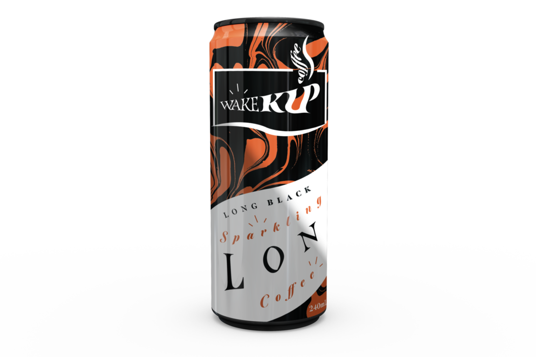

While traditional coffee is timeless and will never flourish out of its charm, it is exciting to see how coffee is reaching people in new ways. ‘WakeKUP Coffee’ is a unique sparkling canned beverage designed for those who are on the go and have little time to waste.
The designer of this brand Matt Enrique captivates his audience through the use of movement with kinetic typography and patterns, as well as his loud choice of colours, to engage his audience with the temptation of taste for energy.
The kinetic type applied emulates the distortion of movement and flow, that has been inspired by the steam of freshly brewed coffee.
There is no doubt the brand packaging of WakeKUP Coffee is designed prominent, unique, and appealing, with distorted patterns to ensure the beverage brand stands out and grabs the attention of those who need a coffee fix.
“Instead of mimicking what is already there in the market I wanted to create something that would stand out and would be different.”

Below is an interview i had conducted revealing more about the design and the designer.
Interview
What kind of visual experience do you think viewers would have when seeing your work?
“I wanted to convey flow with not just the kinetic type, but also with additional assets like curvy and wavy distorted patterns and lines in the design. As a result, I want the package design to make the viewer feel excited to drink WakeKUP Coffee and also feel energized just when looking at the colourful and energetic design itself before taking a sip.”
Do you believe that your work accurately represents your personal style and vision as a designer?
"Yes. I do believe that this project accurately represents my personal style that I’m trying to craft and refine as a designer."
"I feel like I am finally refining my personal style and vision by staying consistent to my own ‘design constraints’."
Was there any specific design or external inspiration that influenced your work?
“I've been wanting to design a brand identity for a coffee brand for a long time and when I was concepting for this design brief, I was mainly inspired by the steam of hot brewed coffees that I make for myself every morning. With this I was able to create what I had envisioned for my brand with creative use of kinetic type.”
Matt also added, “Even though sparkling canned coffee isn't 'technically' a hot beverage when served, it still requires hot brewed coffee to be made during its process to becoming sparkling coffee, so in a sense it still will have a steam element to it.”
Has this project inspired you to continue identity design for other events/projects in the similar field?
"Yes, by designing and finishing this project to the best of my abilities, it has motivated me to continue pursuing brand identity design."
Conceptualizing the use of Brand and Identity there is no doubt Matt has created an alluring and captivating brand, By using the techniques of kinetic typography, distorted patterns, and bold use of colours to achieve a unique way to captivate his audience.
